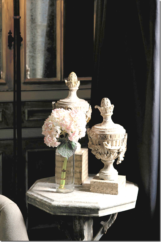
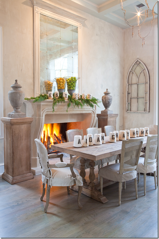
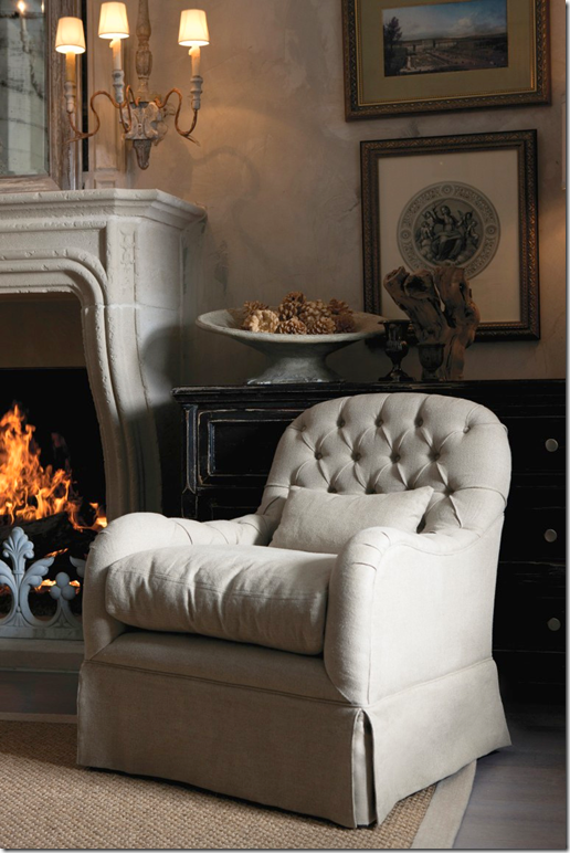
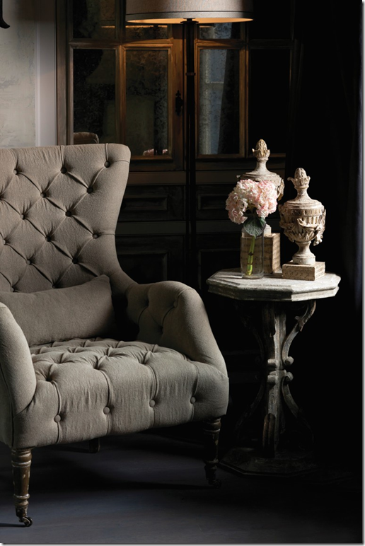
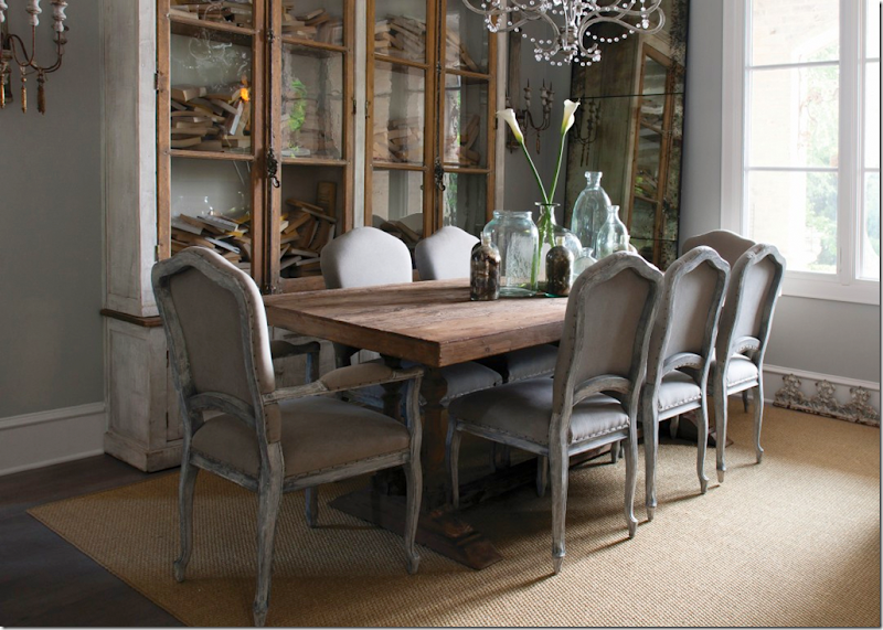
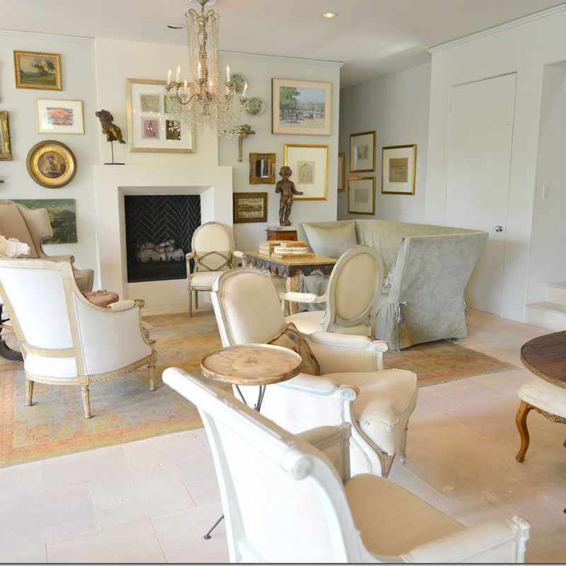
Photograph from the Aidan Gray catalogue.
Recently, Randal Weeks and his wife picked the winners of the Aidan Gray catalogue contest. I have already notified all six winners by email. As I said, we got a large response from readers who live in all different kinds of houses – ranch houses, houses on vineyards, castles, country houses, lake houses, suburban houses, and houses in the city. I’ll be showing the winners along with all those who entered, house by house over the next few months because I think everyone is really curious to see how we all live!
I know I was thrilled by the photographs. Reading all the entries made me realize how many of us truly care about our houses – which is probably why you read the blog in the first place. But more important, so many of us are truly proud of our houses, which was evident by what you wrote in your entries. Our houses are so much more than just pretty, they are where we share our lives with the people we love.
I know I joke a lot about house envy and burning down my house whenever I tour a prettier one, but the truth is…Ben and I have lived here around 18 years now – far longer than any place either of us have ever lived in - and the thought of ever moving away makes us both sad. There are so many memories here – our daughter grew up in this house – and we raised a lot of cats and dogs along the way. Actually, Ben and I both grew up here too. We were in our late 30s, freshly married and new parents back then, and now, we are staring down 60 – almost a lifetime. Every corner of our house reminds us of good times and some sad ones too. And thinking about our future here causes some concern. Will the stairs become too much for us to handle one day? Could we add an elevator to the house if we did ever need one? Will there be room for a mother-in-law to move in? Would Elisabeth want to live here with her own family after we are gone? Questions, I have no doubt, that everyone thinks about.
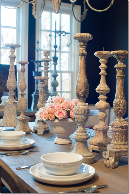
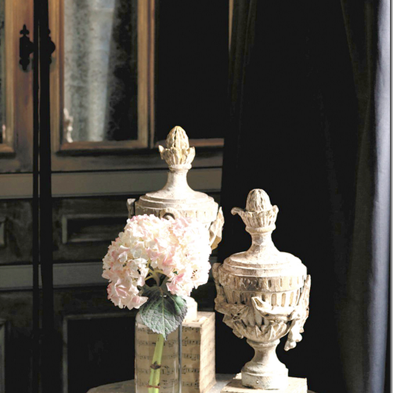
Aidan Gray tablescape.
And so, reading everyone’s entries, I felt your pride and excitement when sending in your pictures. It made me wish everyone could be a winner – because, in truth, how do you judge the “best” house? The six winning homes aren’t any more special than the ones that didn’t win. I came to realize that Randal had specific goals in mind when he picked a winner – things I hadn’t even thought about. He looked for light and space and he looked at specific corners and hallways. It wasn’t a matter of which house was the prettiest, it was more a matter of – this house has an entry hall that would work for the catalogue. Or, this house has a bathroom that would make a good backdrop for a French chair. Or this fireplace would be great with Aidan Gray sconces flanking it. In other words, he was very specific when looking at the choices – which probably is why it took him so long to pick them!
Look at photographs from different catalogues to grasp what I mean:
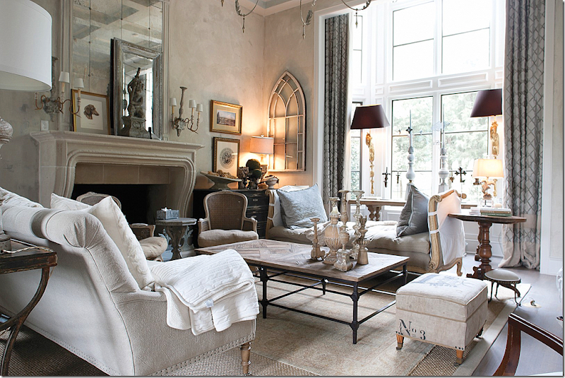
Here is Randal’s living room as it usually is.
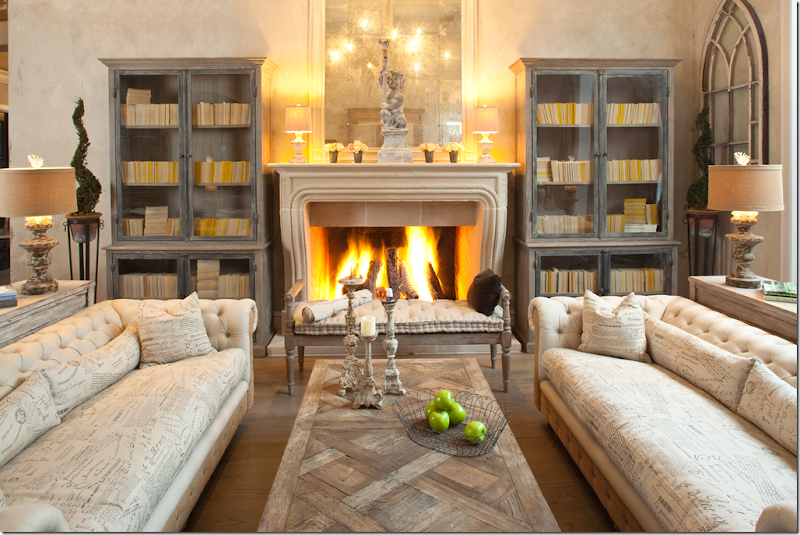
And here it is, styled completely different for an Aidan Gray catalogue. The only things that remained are the mirror, the window, and the coffee table. The fireplace becomes the most important element in the room.
And here is the same living room – styled as a dining room for a catalogue. It’s amazing how different the same room looks in each picture! Notice how important the fireplace is in the pictures. You can see what I mean when I said that Randal wasn’t looking at what people owned, but rather what angle would look best in a photograph. It didn’t matter if the furniture you owned was perfect, new, or even if you didn’t have any! He is using his own furniture for the pictures. His criteria for the spaces was which one would make HIS furniture look best.
Here, in another catalogue picture is the same living room – this time focusing on just a chair and the sconces.
And here, again, another chair, table, and lamp.
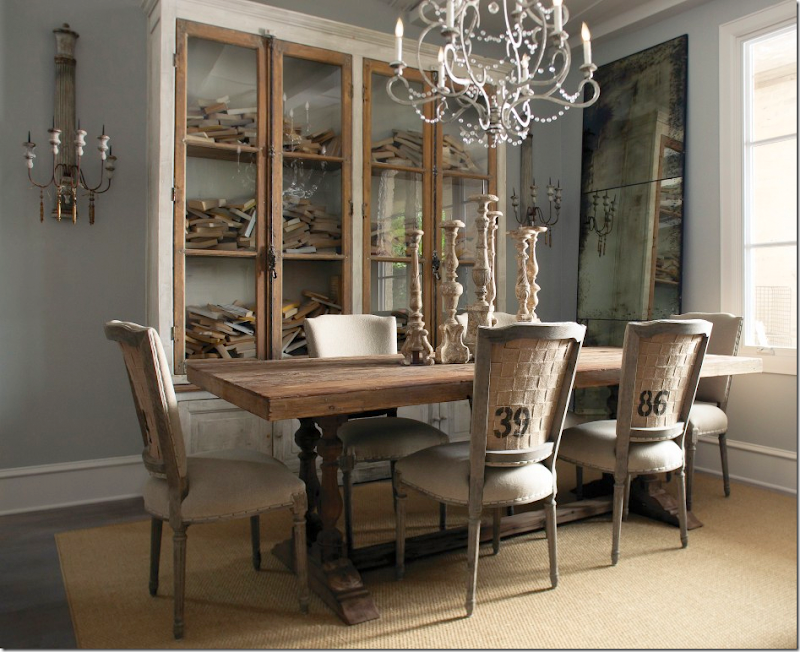
He styled his dining room for the catalogue, this way….
And that, just by changing chairs and the tablescape.
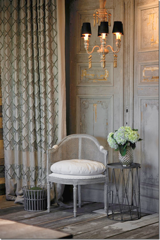
But most interesting are the studio shots – taken with a rough board floor and a wooden screen. One chair, a chandelier, a table, and a drape.
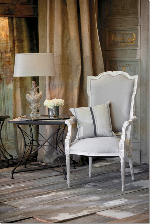
A burlap drape makes the space look different.
Here, add new furniture – for a new look.
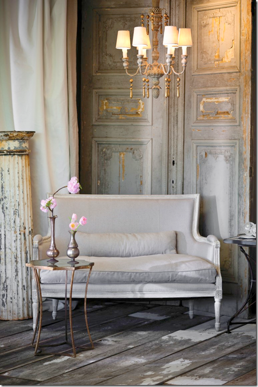
And here, a settee, a white drape, table and a chandelier.
You can see how different all of the looks are that I’ve shown – with only 3 different backdrops in all: the living room, the dining room, and the studio corner. I can’t wait to see what he does with the new catalogue taken in the readers’ houses!
And now, here is the first place winner:
The house is located smack in the middle of the state of Louisiana. It was entered into the contest by the interior designer who worked with the homeowners on the floor plans and all the finishes. The house is brand new and the decorating process is just beginning. Stacey Serro is owner of the design firm “p-l-a-i-d inc.” (which cleverly stands for paint, lighting, accessories, interiors, design) who worked on the house. Besides the interior design, p-l-a-i-d was involved in space planning, schematic design, architectural detailing, finish selection, millwork design, and furnishings. Several important pieces came from Paris where Stacey and her clients shopped together.
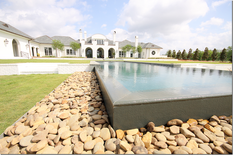
The house is located on a large piece of property – where the swimming pool’s infinity edge seems to fall into the expansive pond. There are also several verandas including one with an outdoor kitchen. There’s also a hot tub, and an orchard on the property. Architecturally, the circle is a design element found throughout the house. You can see here in the above picture, the circles in the windows, the front door, and the attic window. Another design element is the arch – again found in the windows and main doorways.
Of all the houses presented to Randal, I felt this one would be #1 for several reasons. I liked the lines, the arches and circles, and thought they would appeal to Randal. I also liked the large rooms and felt he would be able to take a lot of pictures and have many choices for smaller vignettes. The fact that it was new and was still being furnished was a plus because it would mean Randal could bring in a lot of furniture without much upheaval. Still, I was shocked we both picked the same house for #1. Of all the six winners, I only guessed two as winners! I’m hoping he will run this contest again next year so that my choices will get another chance at winning!!!
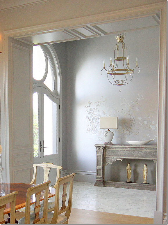
Here is the entry with a marble floor and handpainted wallpaper. I love the gray tones of the paper and thought that would work well with Aidan Gray furniture. Also, in each room there is a fabulous light fixture. Now, I don’t know this for sure, but I do think that many of the fixtures came from Louisiana’s Julie Neill. They look like the fixtures in her catalogue. One guest room actually has an Aidan Gray chandelier in it! As you can see, the dining room is off to the right of the entry hall.
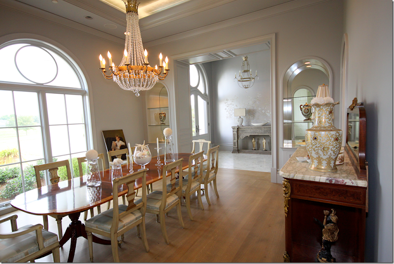
And here is the expansive dining room. I love those painted chairs and the chandelier! As you will see throughout – paintings and mirrors were still needing to be hung. Rugs hadn’t arrived yet and some rooms were lacking curtains. The owners had just moved in and decorating was just beginning. I can’t wait to see it when it is completely finished!!! Notice that the shelves are arched here, a design element that is repeated throughout the house.
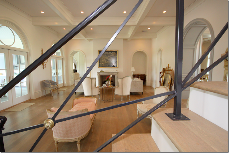
Here is the main living room, which looks out onto the veranda with the outside kitchen and the swimming pool. The room is furnished with French furniture. At the end is a beautiful marble fireplace. Notice all the arches here – the doorways and the transoms over the French doors. This picture was taken on the staircase through the beautiful iron railings – which inspired Randal, as you will see:
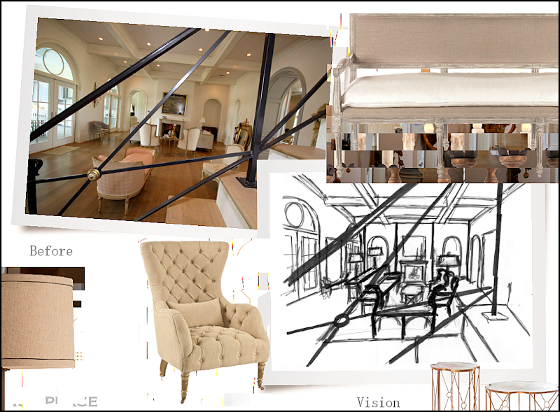
Here is what Randal envisions – taking a photograph from this same position for his catalogue. This picture is a mockup of his plans. He will add his own furniture, these chairs and two settees and tables and lamp. You can see how Randal drew out the furniture placement in the living room. I wonder if when he gets there, he will take other pictures from other angles in the room. Now, notice on the left side of the room – by the windows – there are sconces and a cane chair:
Here is that window wall – along the back of the living room with the gold sconces and cane chair. This photographed also inspired Randal:
And here is how Randal envisions this view – with his sconces and a settee and chair.
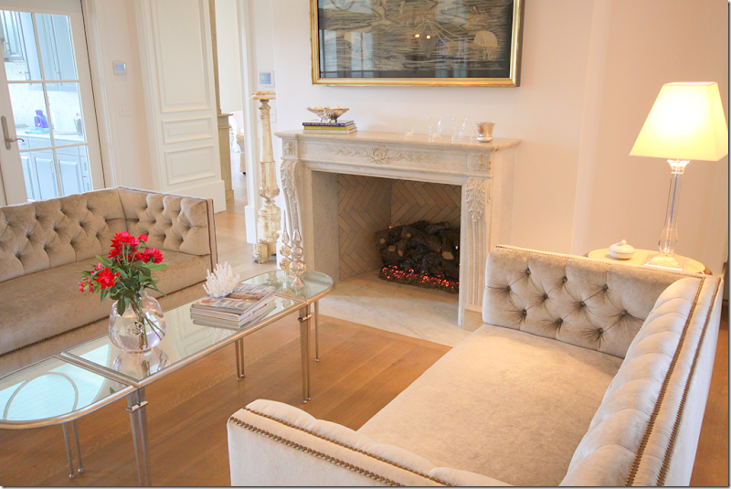
And in the living room – the two tufted velvet sofa which flank the carved marble fireplace.
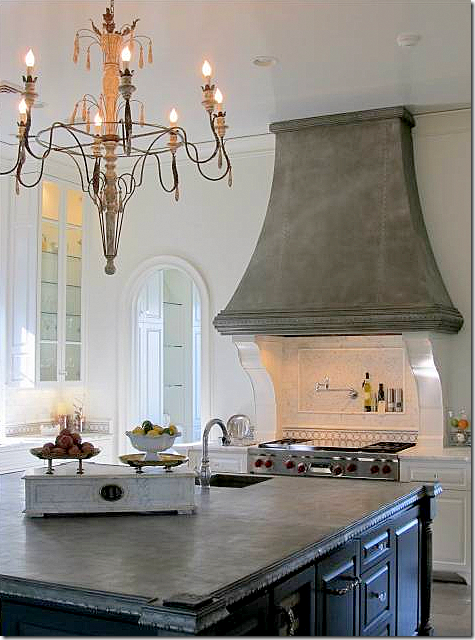
The kitchen is off the dining room and living room – both through arched doorways. Here you can see the wonderful large island and range hood with marble backsplash.
Another view showing the range and chandelier.
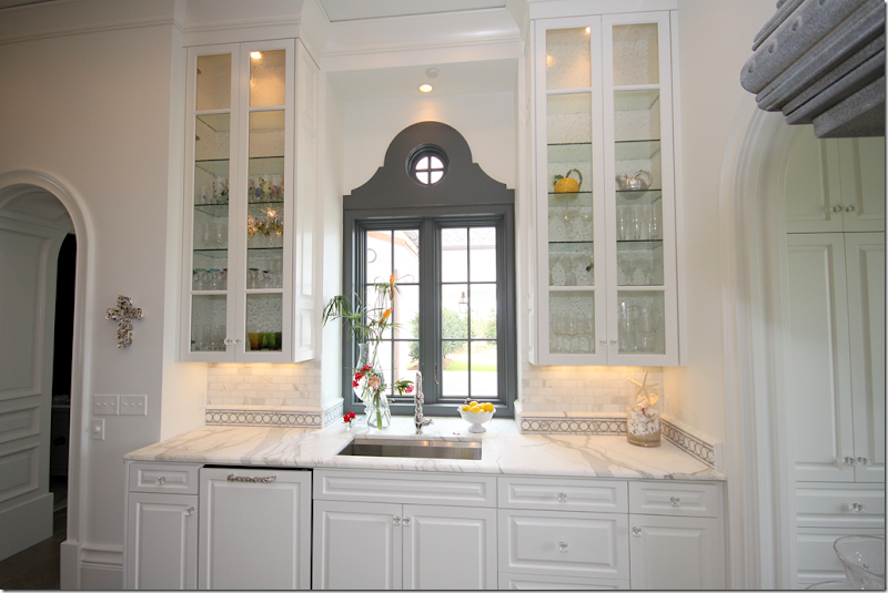
The view of the sink – with the gorgeous veined marble countertops. I love the backsplash with the circular tile motif. Notice the circle element is repeated here – in the windows and in moldings.
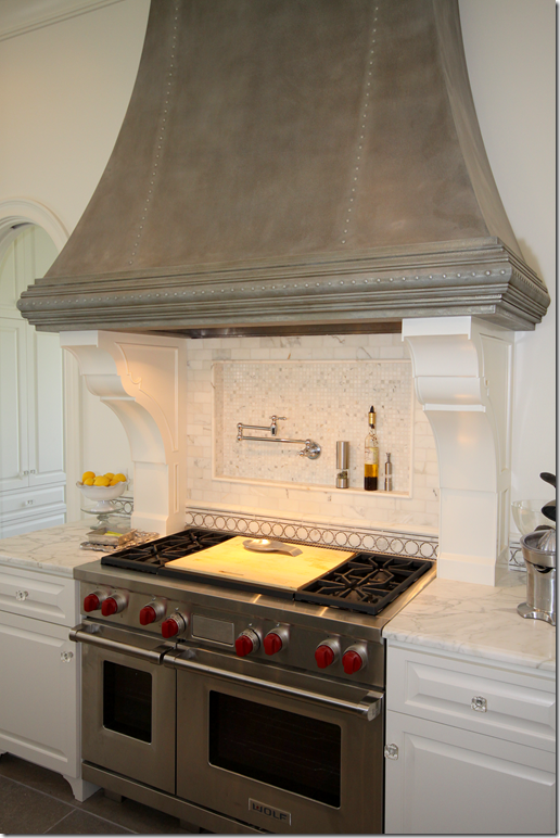
Closeup of the Wolf range. The gray hood is so pretty.
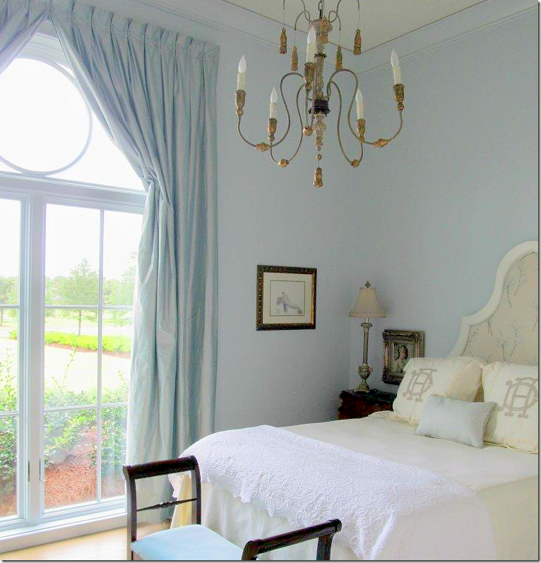
The guest room with the Aidan Gray light fixture hanging. Here you can see the circle element repeated in the window.
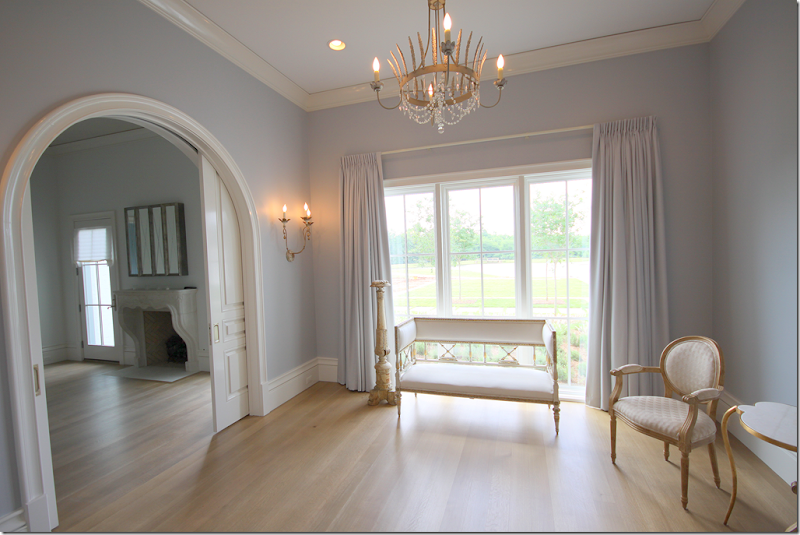
The sitting room off the master bedroom – with it’s pretty chandelier and sconces. I really love the color of the walls, so soft! And the silk curtains match exactly. Through the arch is the bedroom with another beautiful French mantel. Notice how pretty the millwork is – especially in the carved door.
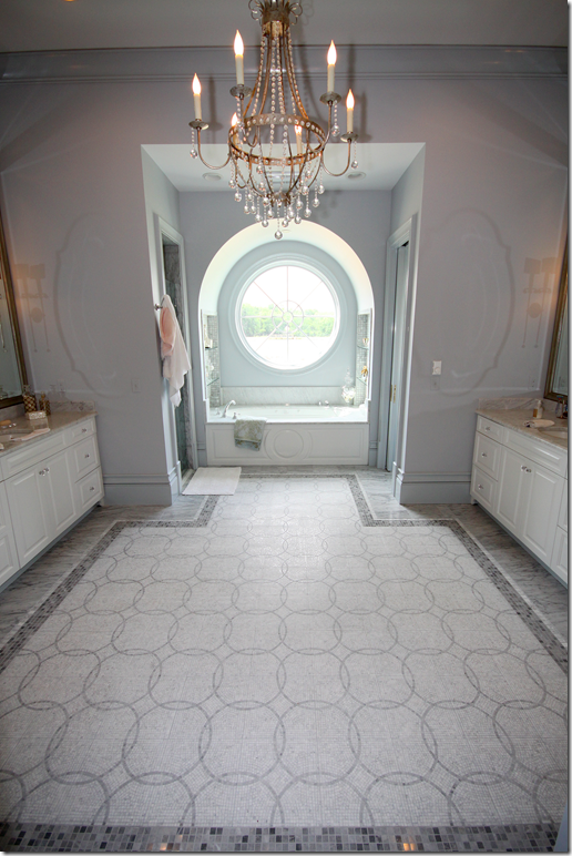
The master bathroom has a large circular window over the bathtub. The floor tiles repeat the circular motif with a darker marble border.
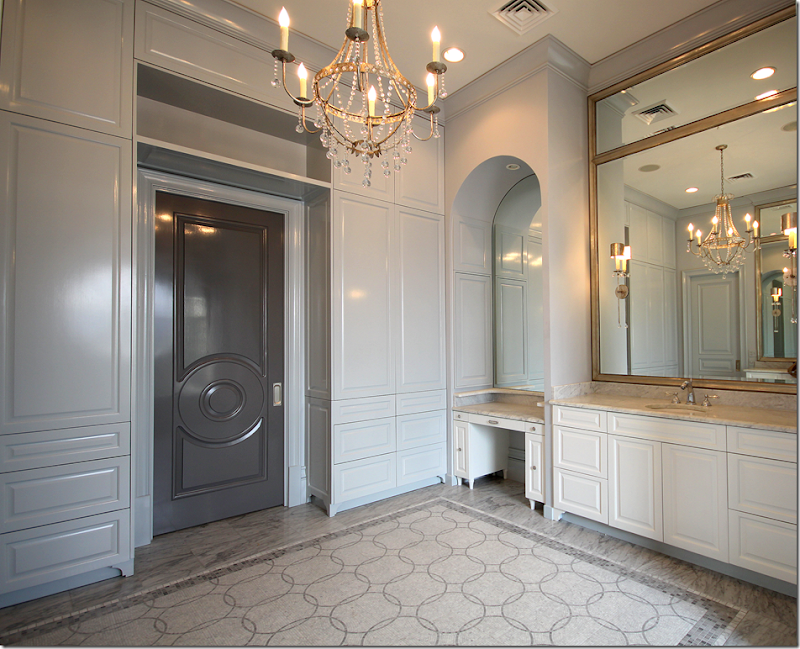
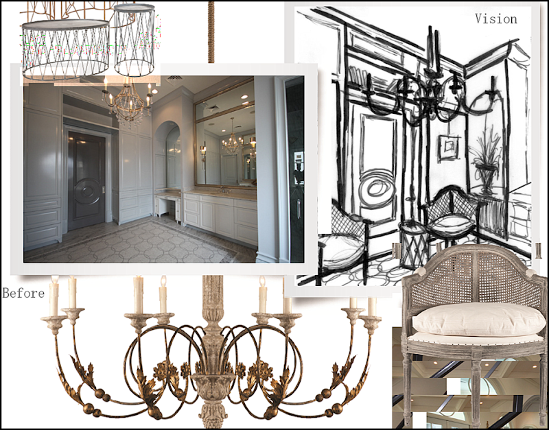
Looking at the other way – the door is painted a darker gray with a circular motif. Love the door – and love the cabinets. Randal was really impressed with the bathroom. This picture was taken before the hardware was finished being installed on the drawers.
And here are Randal’s plans for the bathroom! He will use this as a room, not a bathroom. You can see in his drawings that he will skirt the vanity’s legroom. The two caned chairs will flank his table. The focal point will be the beautiful dark gray door with the circular motif!
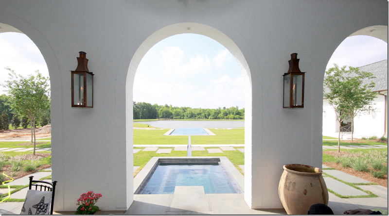
Here is a view of the back veranda. The pool has an infinity edge which looks like it is cascading into the pond!
Here is a shot of the back of the house. The orchard is on the right side of the house. You can see the master bathroom also at the right of the house – that’s its large circular window over the bathtub.
I can’t wait to see how the finished photographs from the catalogue look compared to Randal’s drawings. Hopefully we’ll get to see the pictures long before the catalogue comes out. Hint, hint! This is going to be quite a journey and I’m so excited to share it with all of you!
And a huge thank you and congratulations to the homeowners and Stacey Serro who submitted the house!!
To visit the web site of p-l-a-i-d, inc., go HERE.
One last word:
Be sure also to check out Paris Finds – a collection of décor items imported directly from Paris by Stacey Serro of p-l-a-i-d. Paris Finds recently just got in a new shipment of items bought on Stacey’s last visit to France. To see the Paris Finds’ inventory, please go HERE or HERE on Etsy.
I hope you enjoyed seeing House #1. Next, we’ll show House #2!
Home »Unlabelled » AIDAN GRAY CONTEST WINNER–FIRST PLACE!
AIDAN GRAY CONTEST WINNER–FIRST PLACE!
6:39 PM
Unknown











No comments:
Post a Comment