Last week I showed the renovation of Charlotte Moss’ East Hampton weekend house – the Before and After photographs. Charlotte was sweet and tweeted me that she had forgotten about a lot of the décor themes!! She also said is working on a new book, but it isn’t about her NYC townhouse redecoration. Hopefully a magazine will do a photoshoot of it for us! Her new book will be all about gardens and the book tour will start next April.
Today, Part Two of Designer Renovation is Mark Sikes’s house – the beautiful 1920s Spanish inspired home in Los Angeles that the popular decorator and blogger lives in with his partner, Michael Griffin.
OK, OK– I know every blogger has shown the new pictures from Veranda (and I’ve linked my favorite blog stories about Mark at the end) but I wanted to put it all together – all the Before and After photographs in one neat package.
I actually hate repeating stories that others have already blogged about – but there are so many of us out there now, it’s almost impossible to be original, so I try to add something new if I can (hopefully I don’t fail too often.) Some of these Before photos are new, not seen before, but they show how much hard work and decision went into making this house as beautiful as it is today.
When Mark’s house was first seen in House Beautiful just two years ago (!) – I flipped out and immediately wrote about it because I felt like I was looking at a design twin. So many elements that Mark used in his house, I did too. It was like we had the same aesthetic, although Mark’s taste level is miles above mine. Umm, I’m just being honest here. Still – he loves blue and white, and blue and white garden seats, indoors and out, and mirrors, and wicker, and slipcovers, and handpainted wallpaper, and crystal chandeliers, and striped & zebra rugs and seashells and seagrass, and on and on – all design elements that I have in my own house. I’m sure Mark wasn’t too pleased that I dared to compare his gorgeous house to my POS (google that on www.UrbanDictionary.com) – read the story I wrote HERE.So, when rumors began circulating that a major remodeling had taken place at Mark’s house, I was beyond excited and couldn’t wait to see the results. I couldn’t imagine what he had changed. I mean – Mark’s house was beyond perfect as it was. Perfect! It was warm, inviting, sophisticated yet casual, just a perfect house. So, why change a thing?
Well, Mark has excellent taste and he has a brain full of wonderful inspirational designs. His blog showcases the classic designers and style setters of today and yesteryears that he loves. And he is a designer and designers get tired of their house. Of course he would want to update it!
And the Veranda spread proved that the changes he made are even better than the original. Each room has been improved upon, some rooms have more dramatic changes than others. I would have been scared to change a thing, but seeing it updated, I get it. It’s a huge improvement on perfection. Is that even possible? I love that he didn’t move, but worked with what he had - which is great breakdrop for his ideas.
Let’s look at the befores and the afters and see what you think. Better? Yes? No? I’ll be curious to see your comments.
Finally, the most fun of all is that I found a cache of photographs of the house before Mark bought it. OY! What he has accomplished is really a masterpiece! When you see these original pictures, you will see what a beautiful job he truly has done with his house. Fasten your seat belts!!! Grab that coffee!!!
The first cover. Mark Sikes started his blog before this cover story and since then he has become quite famous and extremely popular. His style struck a chord with so many people – they identified with his house and his decorative choices. Who wouldn’t??? After this pictorial, Lonny featured him in a large photoshoot. After these two stories, word leaked that Mark was redecorating. I couldn’t imagine why. But now….!!!!!
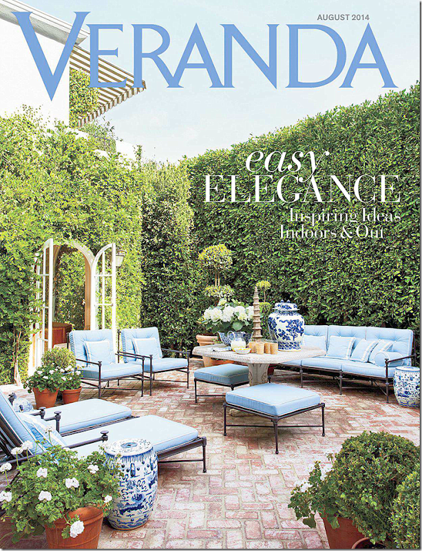
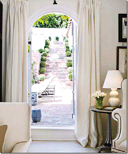
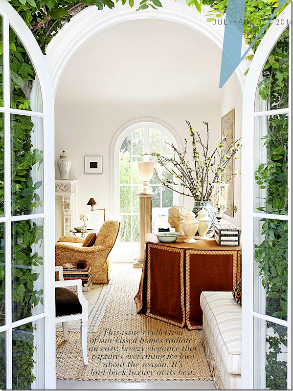
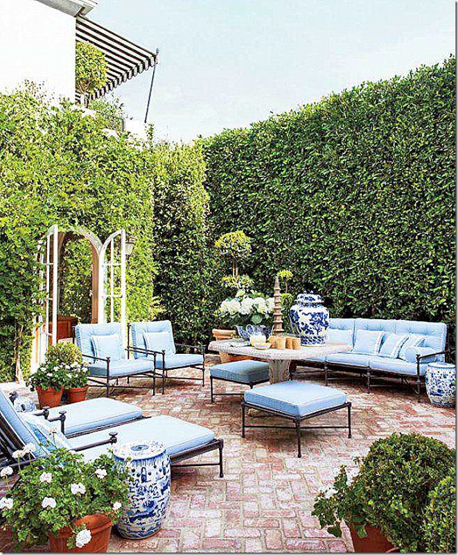
The new Veranda with Mark Sike’s redecorated 1920s house. All rooms overlook this terrace. He told Veranda you can hear the fountain from each corner of the house. So romantic! The living room is seen through the double arched French doors. Guests eat either here or in the living room, never in the dining room which has become a library of sorts.
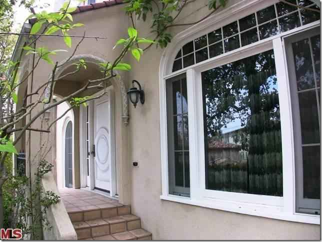
ORIGINAL: This is how the house used to look! Beige stucco with this crazy, modern metal gate??? What is that? Why?
ORIGINAL: A view of the house with the gate opened.
AND TODAY: Barely recognizable, the same house now painted white, with tamed landscaping and a beautiful iron gate that Mark designed for the driveway, along with the stucco gate post.
ORIGINAL: Here, at the front door – new paint, new lanterns, and lots of box woods, make a big difference to visitors using the front door!
TODAY: Steps lead up to the white house, which is hidden from the street behind vine covered walls. When Mark and his partner first built the house, they did a major renovation. He told Lonny that he used the Dominican Republic houses of both Bunny Williams and Oscar de la Renta as inspiration for his interiors. That was his first go around.
This second time around, the house seems much less beach inspired, more classic.
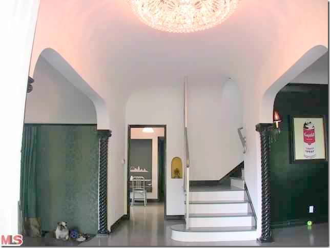
ORIGINAL: The columns were a lacquered black and the door was painted black and white.
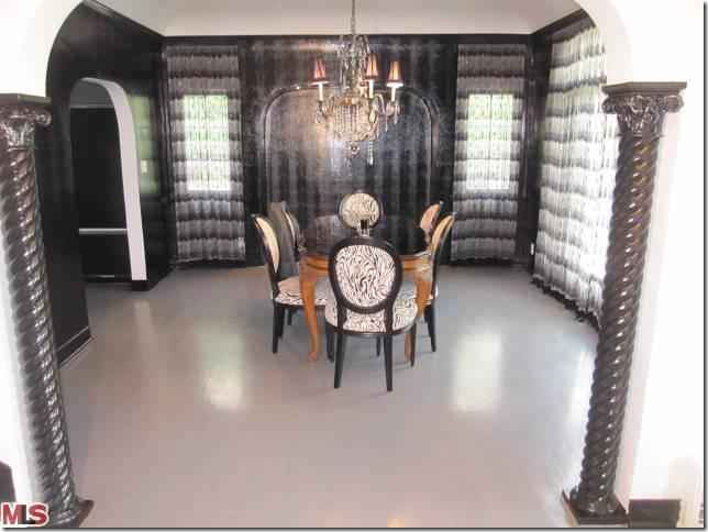
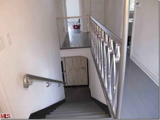
ORIGINAL: Black walls in the dining room and dark damask wallpaper in the living room all had to be changed. But – the metal railings on the stairs were a real surprise! I suspect those were removed the first day!
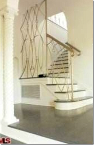
ORIGINAL: More of the Art Deco metal rails.
BEFORE – the first remodeling:
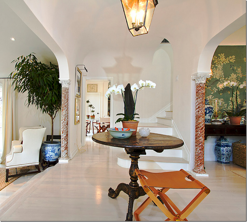
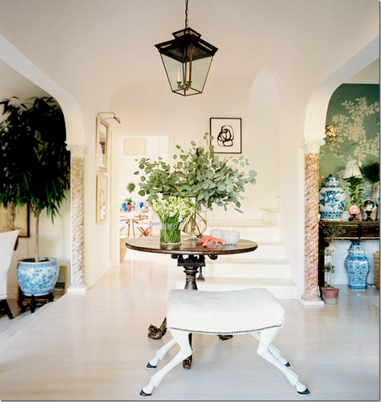
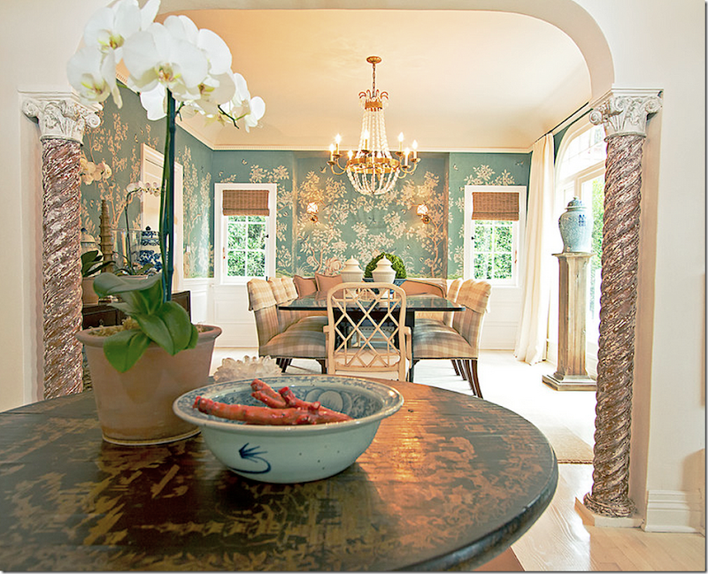
A series of photographs were taken when Mark first moved in, before the House Beautiful spread. The walls were painted white and the floors were stained to match. The columns were fauxed to look a bit rustic (so much better than lacquered black!) The living room and dining room open to the entry hall through large arches and columns. Towards the back is the family room/kitchen area.
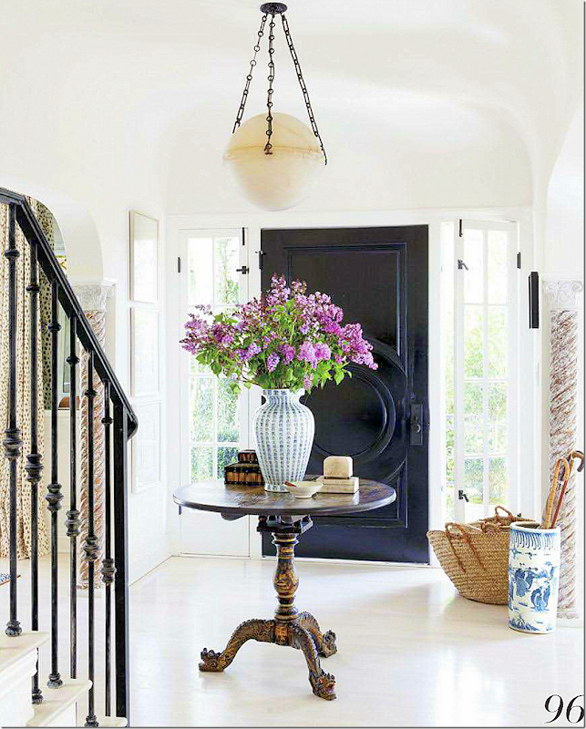
HOUSE BEAUTIFUL: entry hall staged for House Beautiful, 2012. Love the chinoiserie center table. Straw baskets and blue and white porcelains. The doors were painted black. Mark added the lantern.
LONNY: staged for Lonny – new bench.
TODAY for Veranda: The newest changes – there is a new light fixture – updated from the lantern. I never realized those windows next to the front door open. I never thought I wouldn’t prefer a lantern, but this alabaster light is a chic update.
ORIGINAL: The dining room. Yikes! The large arch on the left wall has been covered up, replaced with a door.
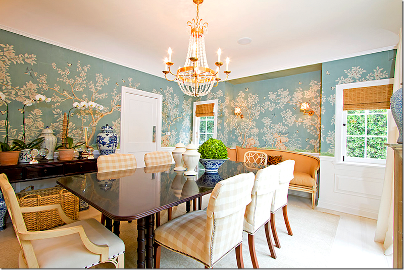
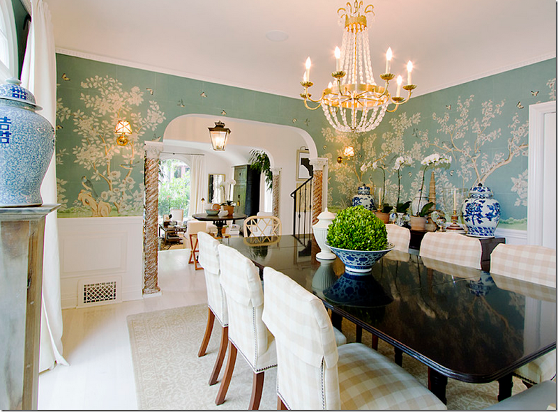
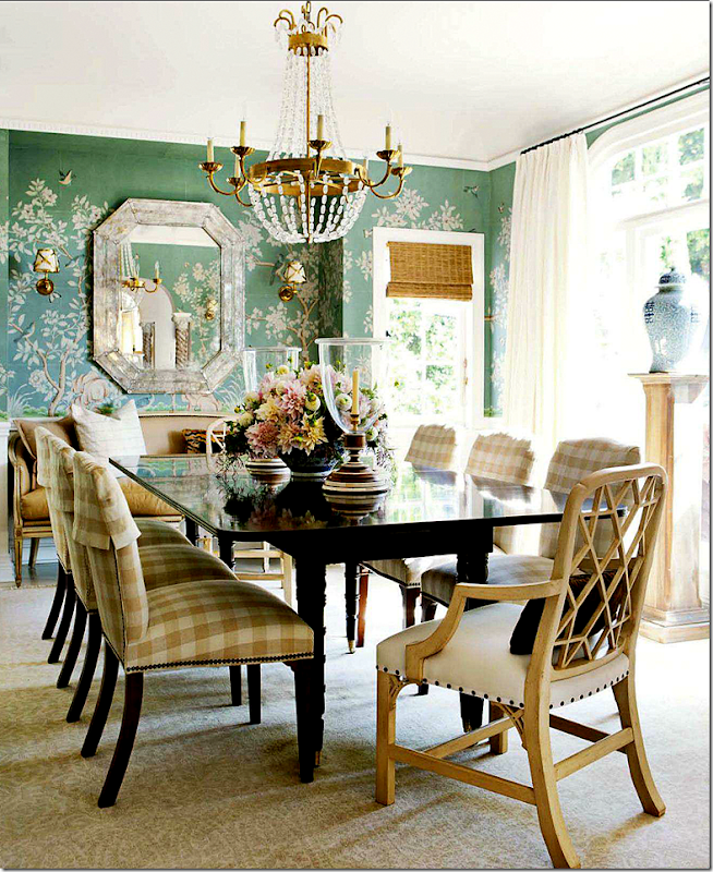
BEFORE – The First Remodeling: From the foyer into the dining room with the handpainted Gracie wallpaper. The crystal chandelier is a reproduction, but it has the classic lines found in antiques. These pictures were taken before Sikes added the Venetian mirror on the back wall. Just beautiful!
Mark mixed chairs at the table. Some had checked fabric with slipcover headrests. In the alcove is a sofa (which is later dramatically moved to the living room in the remodeling.)
Looking into the living room and foyer.
HOUSE BEAUTIFUL: Photoshoot. A gorgeous shot of the room – with the mirror, now in place. It’s amazing how much prettier a professional photographer can make a room. Just beautiful.
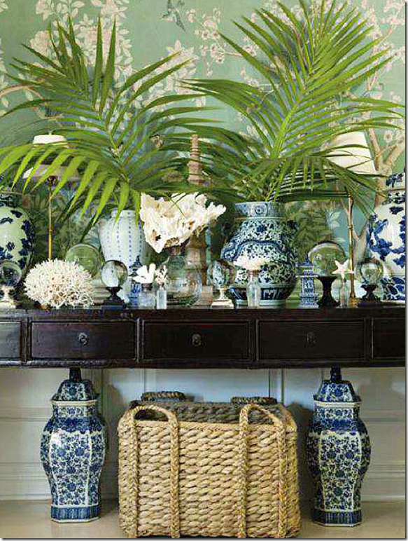
HOUSE BEAUTIFUL: This shot of the console piled high with Sikes’ blue and white urns and shells was pinned a million and one times!
Mark says that he had decided to update his master bedroom, and of course, he would only want Gracie wallpaper in there. But...the dining room already had handpainted paper – you can’t have two rooms with similar paper. What to do? This dilemma created a domino effect. In order to redo the bedroom, the dining room had to be redone, and then – so did everything else!
AND - Today, are you ready????
TODAY FOR VERANDA: The dining room is completely and totally different. Gone is the Gracie wallpaper. Let’s talk about that first. When I saw this, I was disappointed at first – because I loved the wallpaper that was there. I didn’t realize he had papered the master bedroom. BUT, once I saw the Master Bedroom, I totally understood his choice. While the paper was so pretty in the dining room, it really didn’t “go” with the look downstairs. And the wallpaper looks so perfect in the Master bedroom. Good choice.
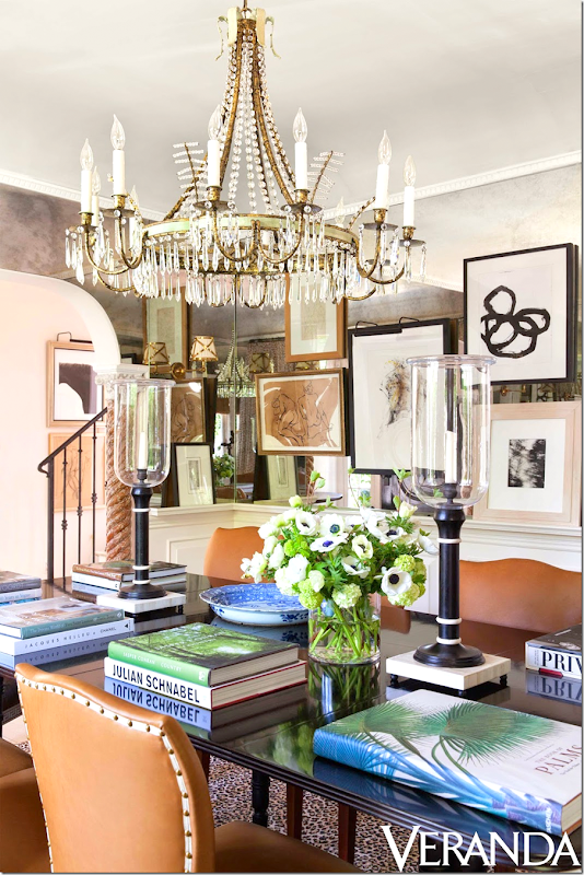
Now – the dining room is not really used for eating. That’s not how Mark and his partner entertain. Because of this, he has turned this space into a library of sorts. It’s a place he can go and spread out his books or he can use it set up buffets at parties. The gilt console from the living room was moved into the alcove where the sofa once was, and the light fixture was replaced with this new David Iastesta chandelier. Wallpaper was replaced with the antiqued mirrors.
The rug is trendy Starke. The chairs? The same, just covered in chic orange leather with nail heads and trim. The art – mostly collected in Paris. I’m going to guess that this room looks spectacular at night when the lights and candles play against all the mirrors.
The dining room is one of the rooms with the biggest change.
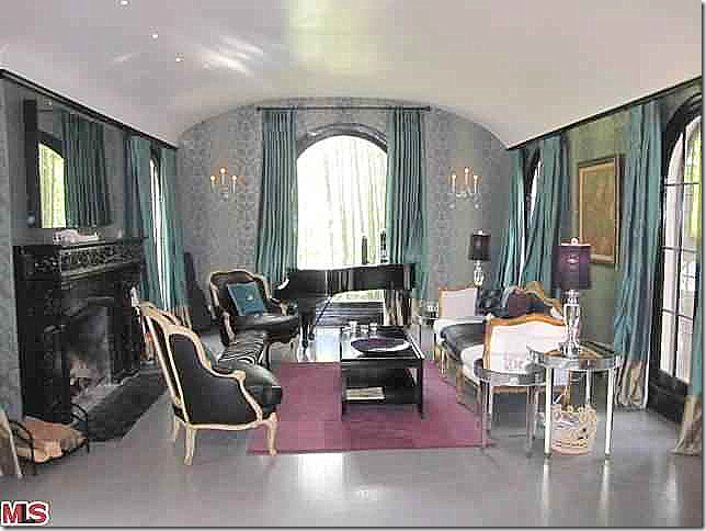
ORIGINAL: A pretty room despite the furnishings – with an arched ceiling. The mantel was painted black and the walls were wallpapered – all had to be changed out.
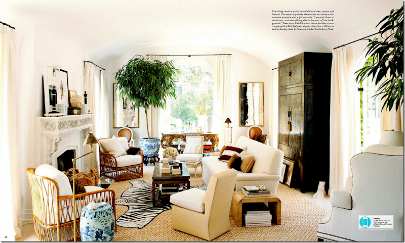
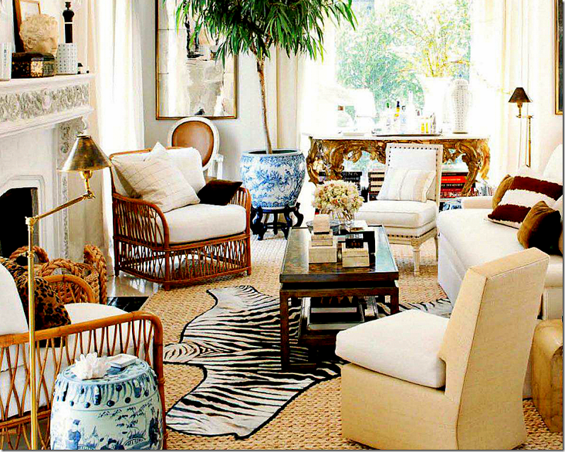
BEFORE - the first remodeling: This early photo shows the lightened up fireplace. I love how the room was decorated with the zebra rug, the rattan chairs, and the slipper chairs.
Love this SO much! Just wonderful. I love the large trees in the blue and white vases, the tall, black oriental piece, the gilt console (now in the dining room) – all the textures.
The view from the French door out to the terrace. Pretty alignment.
Totally crazy over this décor!
Mark added a large tortoiseshell in the fireplace.
AND NOW, THE LIVING ROOM TODAY:
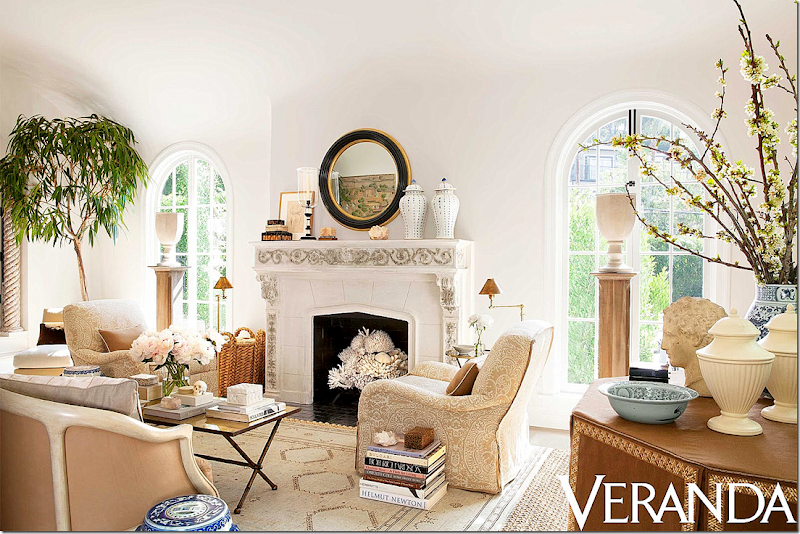
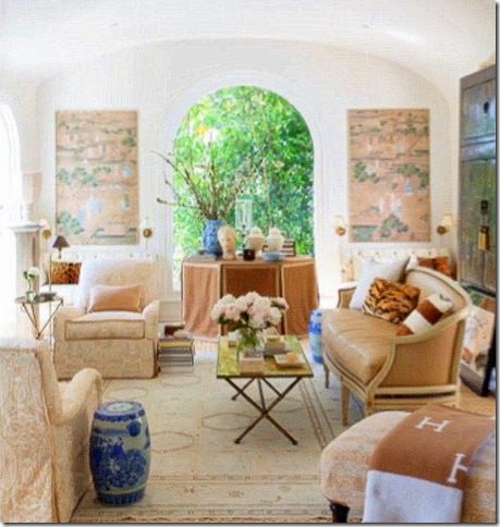
TODAY FOR VERANDA: WOW!! I love the changes Mark made!! It’s all more sophisticated. He added a beautiful round mirror to the mantel and filled the firebox in with his shells. Tall pedestals hold urns in the window. A Moroccan rug replaces the zebra for a subtler look. Two beautiful club chairs are placed instead of the more casual rattan ones. The Jaspar sofa from the dining room is moved in here instead of the white one, that now looked too big. Funny, how I never noticed that before – but the smaller settee just fits the space better. Mark took down the curtains for a cleaner look.
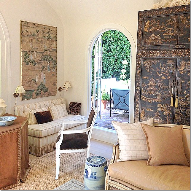
The mirrors are gone, replaced with Oriental screens and twin tufted banquettes which sit underneath. A skirted table sits in between the two banquettes.
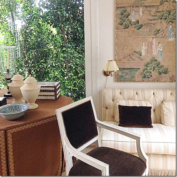
Close up of the striped banquette and the skirted table with creamware.
A look inside from the outside.
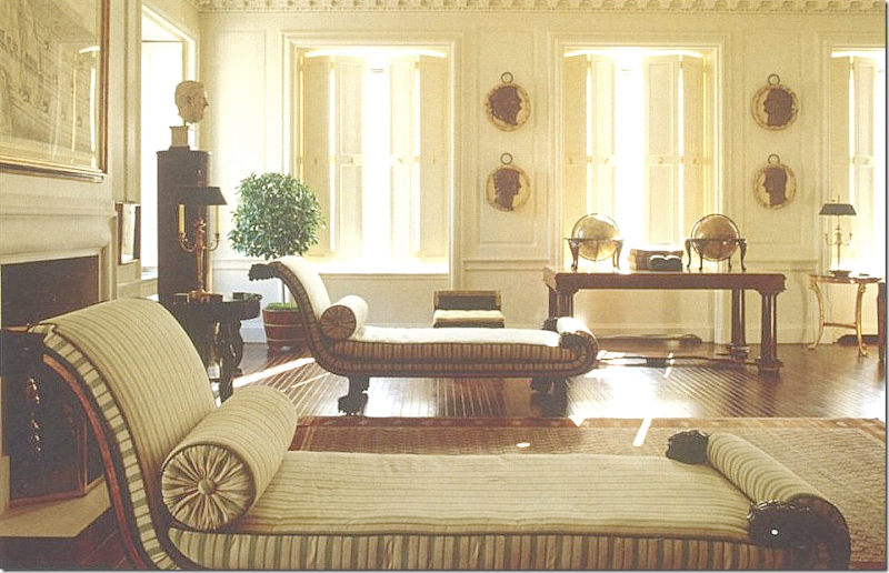
And a blurry picture – the only one that shows the symmetry of the two banquettes at the back wall and the chaise longue on the right. That chaise came from the guest room upstairs.
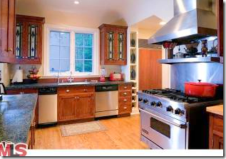
ORIGINAL: The kitchen is a huge change. I’m not even sure how it was accomplished and which wall was opened to make the one large family/kitchen area that it is today. It appears that the left wall was taken down and an island replaced that row of cabinets.
And floating around the internet is another version of the kitchen before the wall was removed. This version is more in keeping with the style of the house.
BEFORE – The first remodeling: Here is a photo just after Mark’s renovation was completed. He extended the cabinets up to the ceiling, making them look more in keeping with the age of the house. He also added beadboard and marble countertops and backsplash.
I love this space. And you can see from the before pictures just how far this space has come!
LONNY: Looking out towards the terrace
LONNY: A view that shows where the tiled powder room is located.
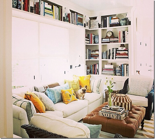
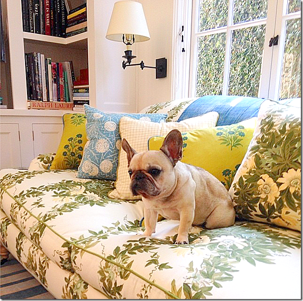
House Beautiful: a mass of colorful pillows plus Mark’s darling puppy!
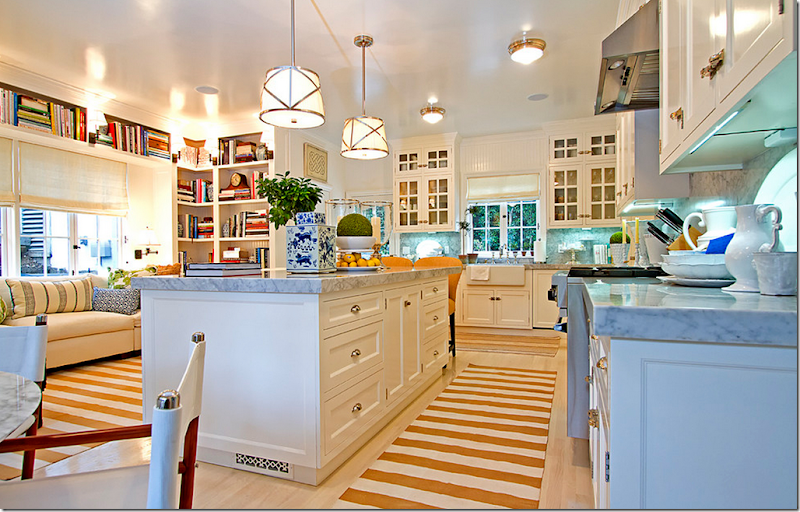
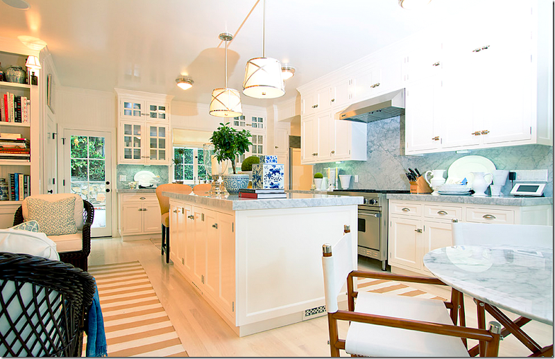
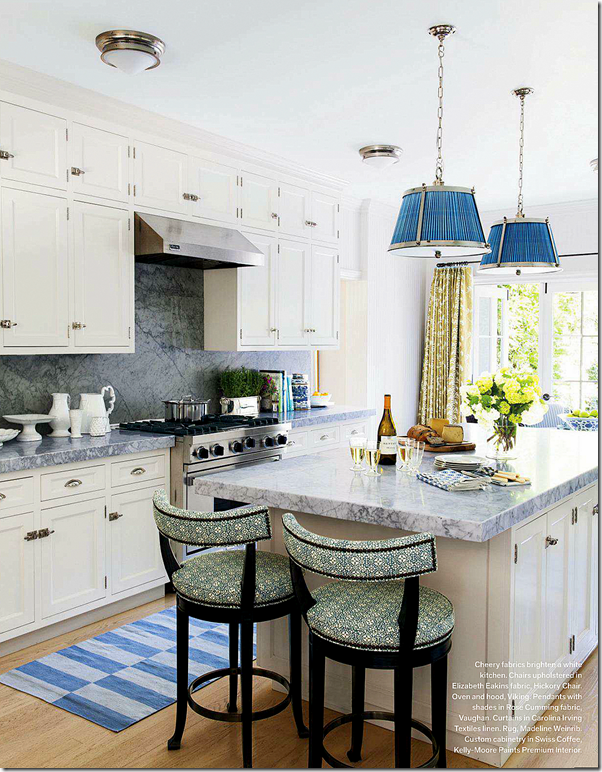
AND THE KITCHEN TODAY:
TODAY FOR VERANDA: The changes are all in the fabrics and rugs – yellow stripes were changed out for blue striped Madeline Weinrib rugs. White fabric in the light shades is now a bright blue. Curtains were added in a green Carolina Irving fabric. Finally, new bar stools wear more new fabric by Elizabeth Eakins.
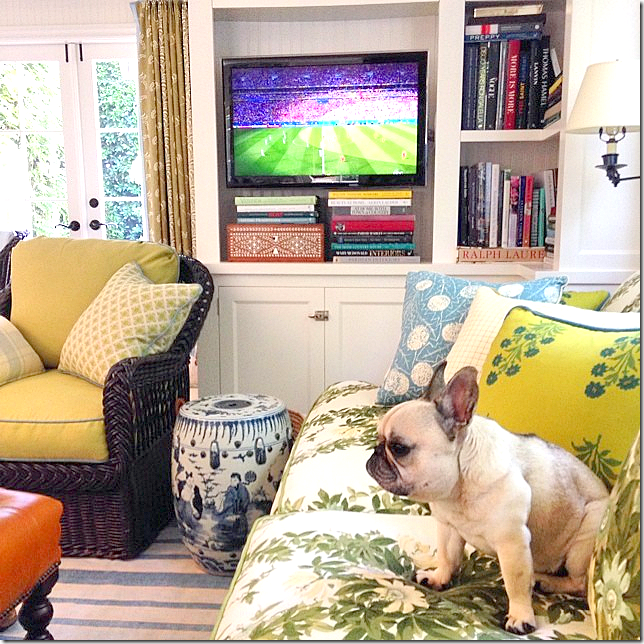
Love the changes here. The new Jasper sofa fabric is fabulous- as are all the pillows in greens and blues. Now THIS is how you mix fabrics. Compare the pillows now and before. If anyone ever wanted to know how to mix and match fabrics, I would show them this picture. The mix is perfect, IMO. Love the window shade with the blue trim.
And a close of Mark’s darling Pug. Crazy over that sofa fabric!!!!
Love this view of the room with the chair and the curtains showing.
The beautiful tiled powder room off the family room. Gorgeous!!
Original: Upstairs, here is more of the strange railings.
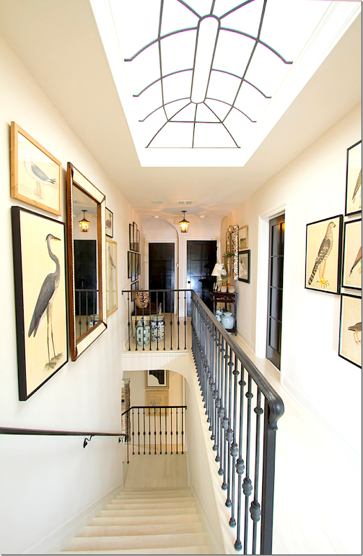
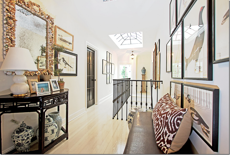
AFTER: And, here is how Mark Sikes redid the upstairs hallway. Notice the beautiful skylight!! The doors are painted black, which I love.
And, a look down the opposite way. The landing looks like an art gallery – which is a good lesson to take home – don’t neglect to decorate spaces that are in private areas only. Most people would probably just leave an upstairs hall blank – but here, you can see that by adding a few paintings and some furniture – the space becomes dramatic.
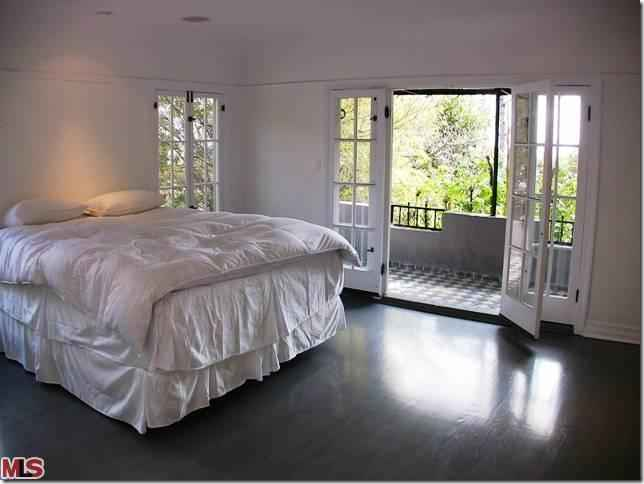
ORIGINAL: The guest bedroom and porch – when the house was for sale. The windows and hinges are so pretty.
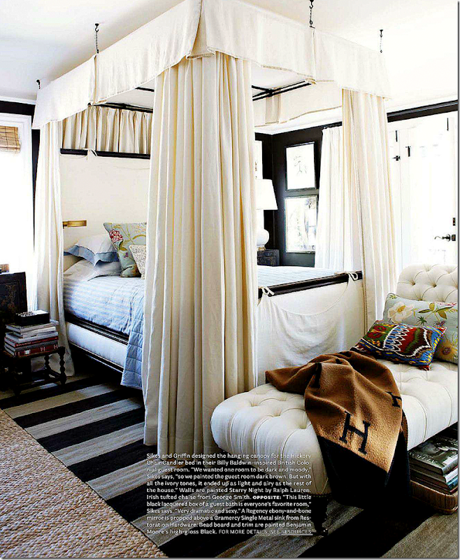
BEFORE – the first remodeling: Here’s a rare shot that shows the guest room before Mark added the canopy. What a difference the canopy makes as you can see below!
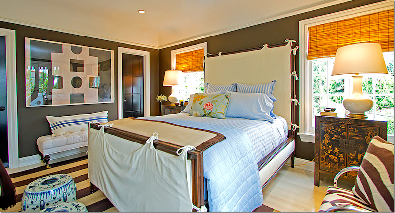
HOUSE BEAUTIFUL: The guest room with the canopy bed. Mark said the room was inspired by Billy Baldwin and the British Colonial style. Today, the chaise has been recovered and is now in the living room.
LONNY: a view of the Indian inspired armoire across from the bed.
Now, this guest room is perfect! Why would anyone change it? Could it be more perfect than it is now? Well….the answer is YES!!!!!
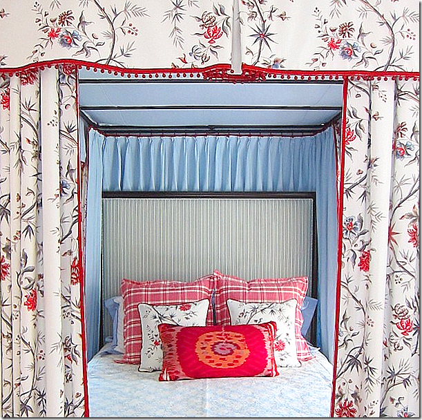
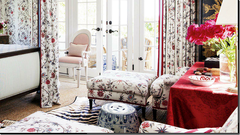
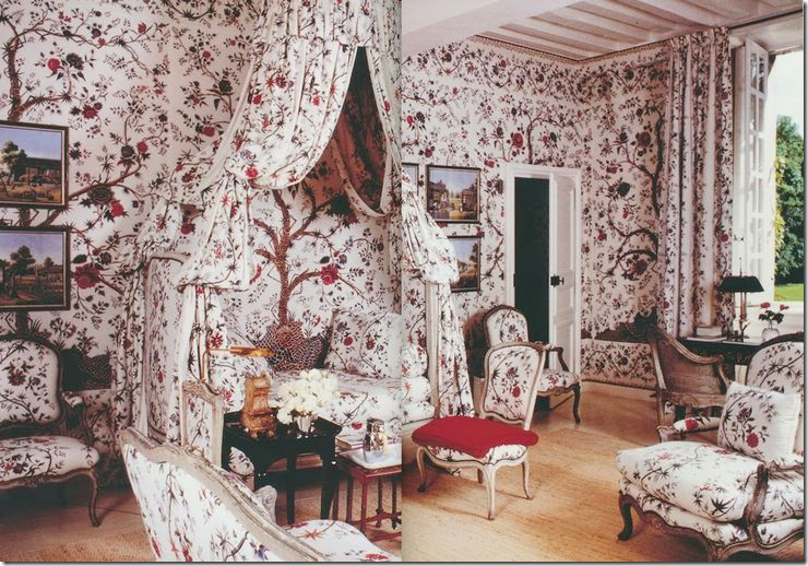
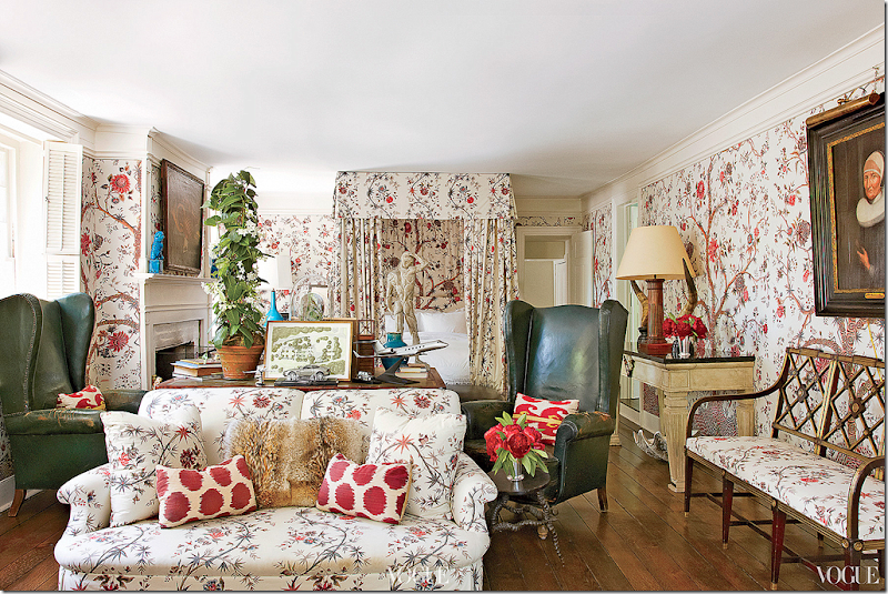
TODAY FOR VERANDA: The guest room today – simply GORGEOUS!!!! Just fabulous!! Inspired by Givency’s country house with its guest room where the same Braquenie fabric is used. I love how he mixed the green striped fabric on the bed frame. This has to be the prettiest guest room I’ve seen in a long time!!!! Wow!
A close up of the inside of the bed with its blue fabric. Love the red bobble trim on the toile fabric.
Across from the bed are two chairs and ottomans with a square red skirted table between them.
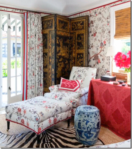
Wish this wasn’t so blurry – but in the corner is an oriental screen. Love that touch!
The decorated patio off the guest room.
Mark says he got his inspiration for his new guest room décor from Givency’s own guest room – using the same fabric. Both rooms are beautiful. This is making me want to use this fabric too!! (bad crop/scan)
My personal favorite use of this fabric is in Daniel Romualdez’s bedroom. All three rooms are to die for, that’s for sure, and it shows how important a wonderful fabric can be. Would any of these rooms look as good in just white linen? Hmmm…
The link to this Pierre Frey fabric is HERE in case you are inspired to go full out on this tree of life pattern.
Original: the tub was ultra contemporary, as was the sink. Total gut job.
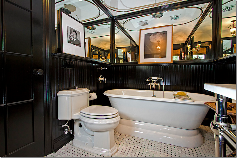
AFTER THE FIRST REDECORATION: And a look at the guest bathroom. Here – it is seen without a shower curtain. Love the bead board painted black.
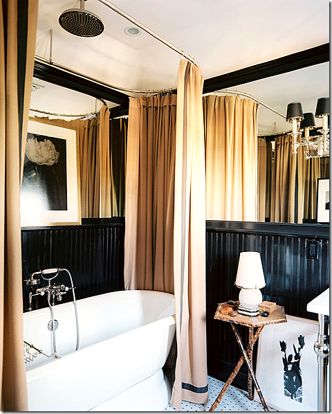
And here there is a curtain. I have a feeling this bathroom has been completely changed to match the Tree of Life décor.
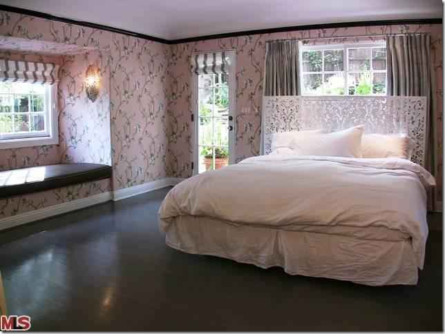
ORIGINAL: Not that bad! I could probably make this work. Pink wallpaper, dark wood floors. But of course, Mark had MUCH better ideas for his master bedroom:
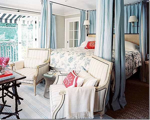
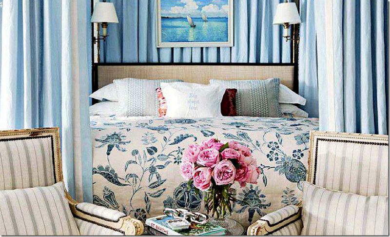
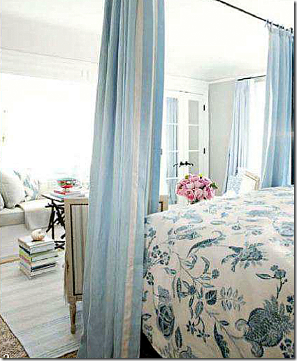
BEFORE: Now, the room that started it all. When planning to enlarge this room, Mark wanted hand painted wallpaper in here – but there was already a beautiful pattern in the dining room. With that – the total redecoration began. Again, the master bedroom before was wonderful. A canopy bed, striped chairs, and a pretty linen print on the bed.
Two chairs sit in front of the canopy bed.
Striped rugs were layered over textured matting. There is a large window seat and a balcony.
AND NOW TODAY, THE MASTER BEDROOM:
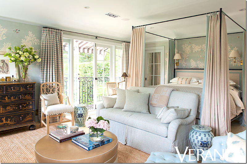
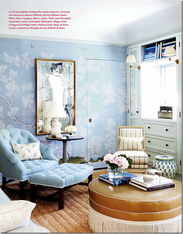
AFTER FOR VERANDA: The room has the same blue color scheme and California feel – but with the wallpaper, it is taken up a HUGE notch. Plaid curtains and creamy linens on the bed. The remodeled master bedroom looks more sophisticated with the wallpaper. The sofa and the curtains on the canopy also make it seem more sophisticated than before. The before was beautiful – but this is just a bit prettier, a bit finer.
Beautiful tufted chair and ottoman.
The mirror has moved from the downstairs living room.
Oriental chest and art work.
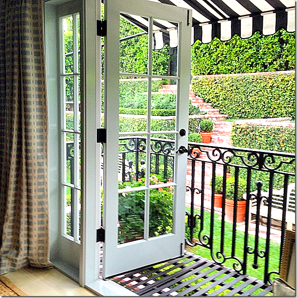
And the view from the master bedroom’s balcony.
Original: the bathroom with the pink and black tiles. Pretty, but surely Mark can do better!
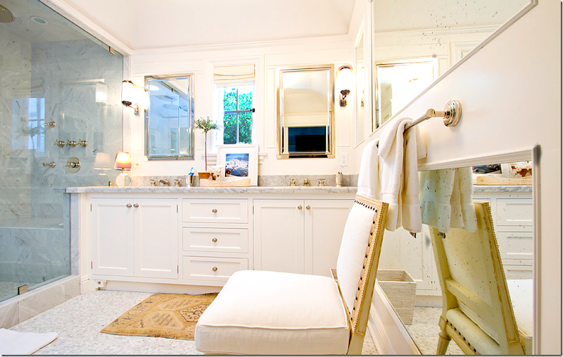
AFTER: Beautiful, perfectly executed combination of classic elements – marble, mirror, nickel, cabinetry.
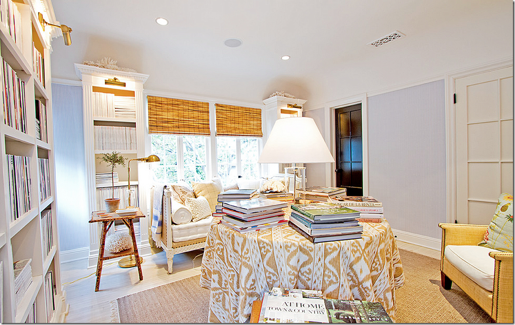
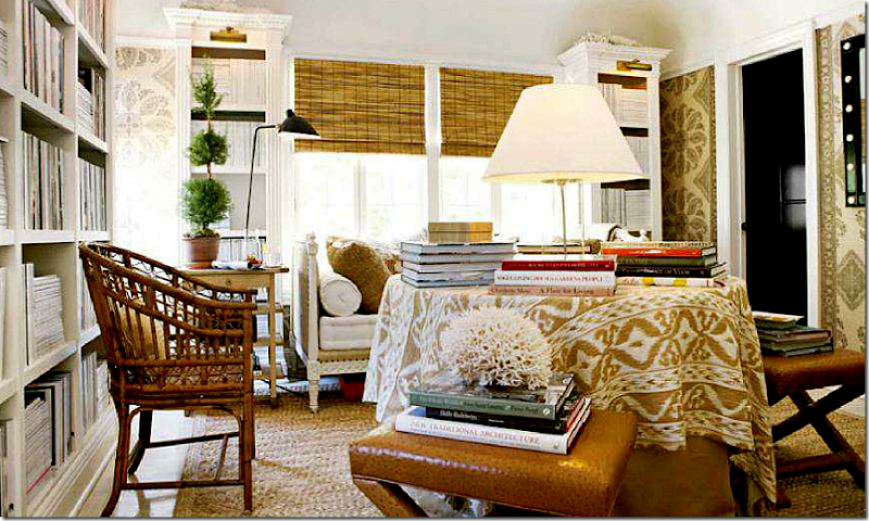
BEFORE – THE FIRST REDECORATION: The upstairs library as it once was before Mark wallpapered it in the familiar Peter Dunham Samarkand pattern. He added all the shelving with lights – turning a bedroom into a reading room.
HOUSE BEAUTIFUL: Here, a while later, Mark added the Samarkand pattern to the walls, along with chairs and ottomans.
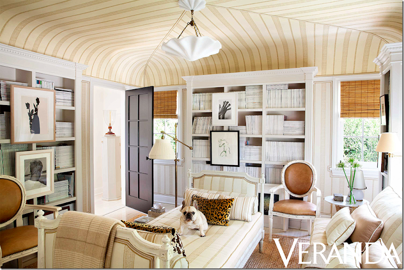
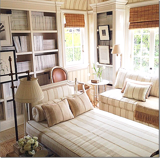
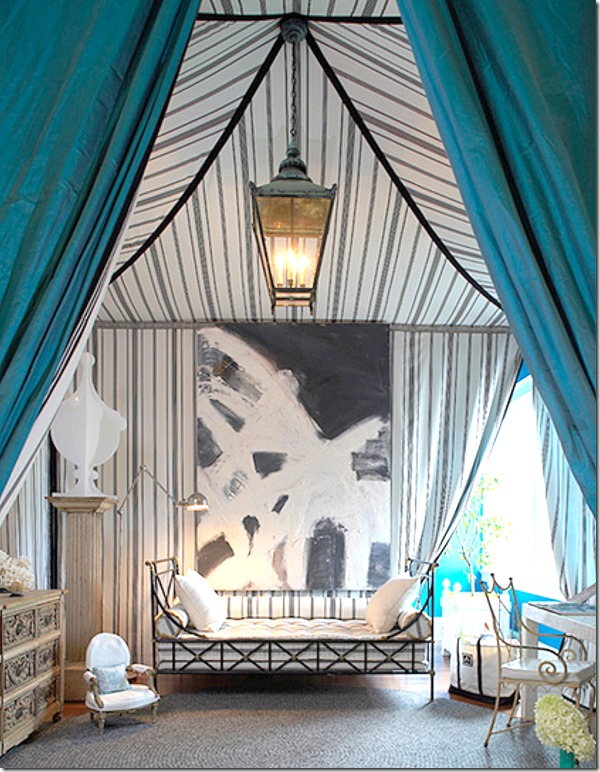
AFTER: A complete change! The ceiling is now tented – inspired by the Charlottenhof Palace in Germany. The skirted table is replaced by the day bed, while a new banquette is added by the window. Topping it all off is the new light fixture. The new tented ceiling really makes the room seem so much more substantial.
Mark said the inspiration between this new design is the tented room at the 1829’s Chartlottenhof Palace in Germany:
Charlottenhof Tent Room – Mark’s inspiration for his library.
Paula + Martha, interior designers based out of NYC, also used the Charlottenhof Palace tent room as an inspiration for their Hampton Designer Showcase House room HERE.
And, Mark had another inspiration for the library – Bill Blass’ living room in NYC HERE.
Little Augury wrote an interesting blog about Mark’s fashion inspirations HERE.
Library bathroom.
ORIGINAL: You can see the terrace was not always such a beautiful place.
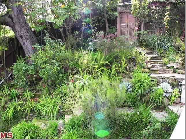
ORIGINAL: And an even bigger mess was the back yard that is now neatly terraced. Before, this back portion of the yard was a total mess – a jungle!! This really shows how important landscaping is. Mark’s gardens turned this space into another room, a place to entertain or just to be alone with the paper and a cup of coffee.
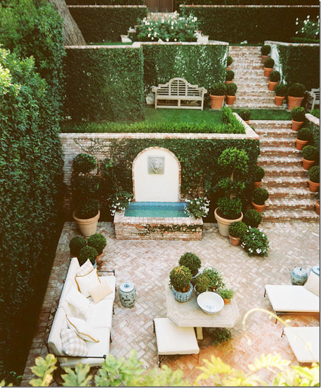
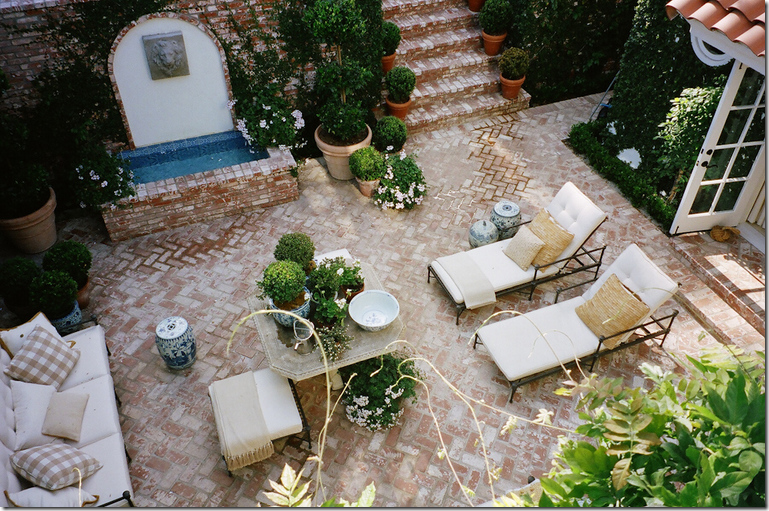
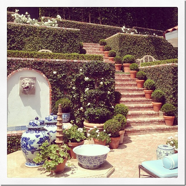
HOUSE BEAUTIFUL: Here is how Mark changed it all. The back hill was terraced with a set of brick steps, creating small rooms along the way. The brick terrace is now surrounded by walls of greenery.
Instead of a contemporary fountain, now it is the focal part of the garden. Mark says that the fountain is heard throughout the house. LOVE!!!!!
A view of the living room below and a balcony, in the guest room, above. Is this France???
TODAY: And finally – a new look to the outdoors with fabrics in blue to blend in with the décor inside.
Makes me want to go out and buy some more blue & white!!
So – how do you like the changes Sikes made to the house? The new dining room is now mirrored, no longer papered in the beautiful Gracie? Do you like the more sophisticated and coordinated living room in shades of golds and taupes? What about the bedrooms? Do you like the new wallpaper in the master bedroom? Do you think it makes more sense to paper the master bedroom than the dining room? What about the new guest room with the beautiful tree of life fabric? Do you prefer it like this or before, in the more British Colonial Style? And finally – the library? Do you like it tented or not, as it was before?
My vote is for the redecorating! I love all the updates – especially the bedrooms, the master and the guest room alone is worth it all! I love the new living room and the library. And I really like all the new patterns and colors in the family room/kitchen. My only regret? I do miss the Gracie paper in the dining room, but I understand the thought process behind the change.
In all, I think it’s a total winner and Mark Sikes continues to be someone I love to watch and follow. To read his blog, go HERE.
To following his travels and antics at home – visit his Instagram – Markdsikes
To read more about Mark Sikes’ renovation, here are some good blogger stories:
La Dolce Vita HERE
Colour Outside The Lines HERE
and Little Augury HERE
Home »Unlabelled » Designer House Renovation Part 2
Designer House Renovation Part 2
3:05 PM
Unknown





























No comments:
Post a Comment