Last time we discussed decorating with one fabric. This house, above, featured in House Beautiful, was different though – the entire house was decorated in just one fabric – which judging by the comments seemed a bit much to a lot of you.
I personally liked the house designed by Justine Cushing, but I’m a fan of one fabric decorating. Still I did wonder – is it a sign of good design or is it just lazy design? After all, picking out coordinating fabrics can be tricky and it’s not always easy. I know when I am deciding on fabrics for a client, I agonize over the prospect way too long. I look at the chosen fabrics inside my house for days and then I take them all outside to be sure the sunlight doesn’t change their look.
After a few weeks of this inside and outside ordeal, you then have to order the fabrics and pray that they are in stock and not backordered for months on end. Judging by the project, if a key fabric is unavailable for months, you might have to start the process of picking out fabrics all over again. Suddenly decorating with just one fabric seems enviable.
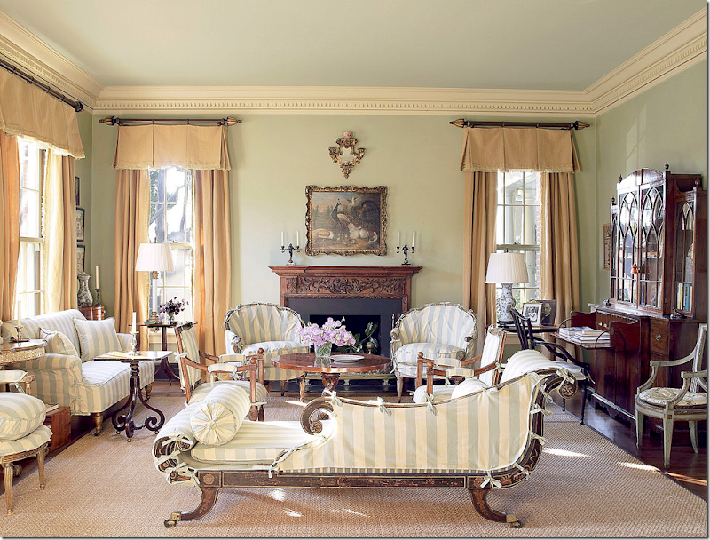
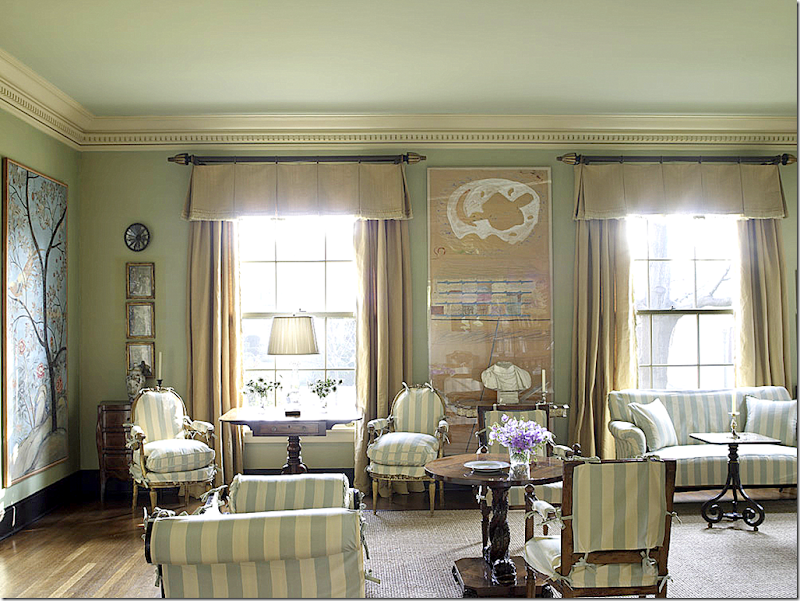
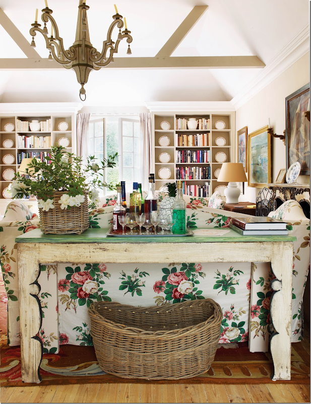
Suzanne Rheinstein’s living room – covered in their striped summer slips – another personal favorite. The curtains were designed for the room without the slipcovers. Would the room look better with summer curtains too – or would that be too much, too many stripes, too much of just one fabric? Rheinstein is a genius with fabrics, she even designed her own line for Lee Jofa, so certainly choosing just one fabric for her living room was a choice, not done because it was easy – or she was lazy.
Although some clients might like just one fabric decorating– most clients prefer a mix of patterns and fabrics and colors. If the client doesn’t want the room to look busy, choosing solid fabrics in different shades can be a nice compromise. But – decorating with a plethora of different fabrics and patterns can produce a house that is too colorful and too busy. It’s a tricky balance to design a house that looks cohesive, as if it was designed all at once – but doesn’t look too matchy-matchy. Many people want a house that doesn’t look like it was designed all at once, but rather they prefer that the design look as if it evolved over a period of time – adding layers over the years.
The difference between a decorated house and an evolved house is something that would be discussed with the designer at the earliest meeting. Many designers don’t like to design an evolved house. It’s much easier and faster to just pick furniture from a catalogue, rather than scour for unique pieces in antique shops around the globe. Finding JUST the perfect chandelier may happen long after the initial installation and many designers and clients don’t want to wait for that discovery.
Another view of Rheinstein’s living room in its summer slips.
A cohesive design can be wonderful and very practical. I learned this lesson from my sister. When she bought a new house many years ago, she hired the wonderful designer – Billy Frances. He decorated her house in shades of persimmon with touches of Provencal gold and greens. When she moved – all the furniture worked together – and we were able to move chairs from the family room into the living room and vice versa - because the original design was cohesive.
It was an invaluable lesson for me to see how a basic plan can work from house to house. There was no sofa or chair or antique armoire or buffet that didn’t “work” in her new house. Even her custom rugs made for her family room looked perfect in her new living room.
House #1
A pro at this type of cohesive designing is Alessandra Branca, as seen in a recently finished project shown in the new Veranda. Branca loves to use red and black in most of her designs and this house was no exception. Another important color was gray – which showed up in wallpapers and fabrics.
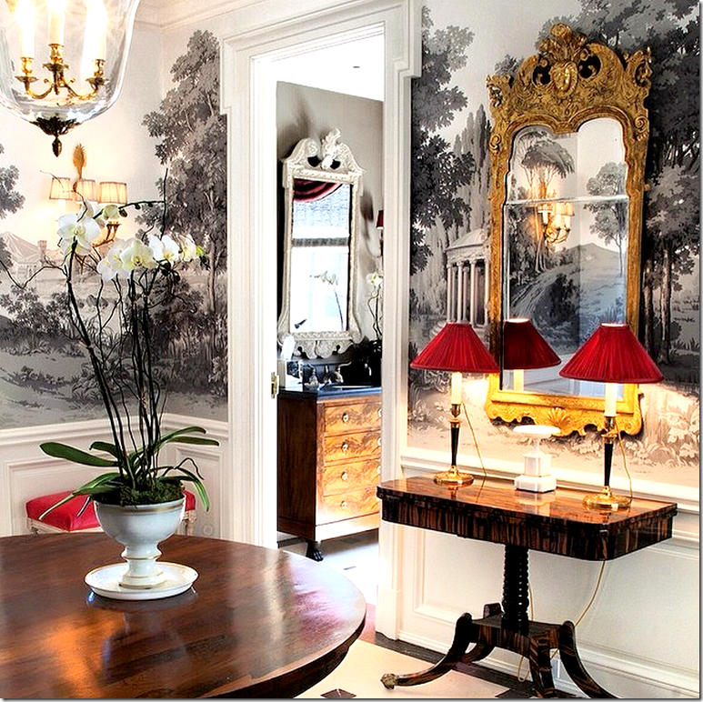
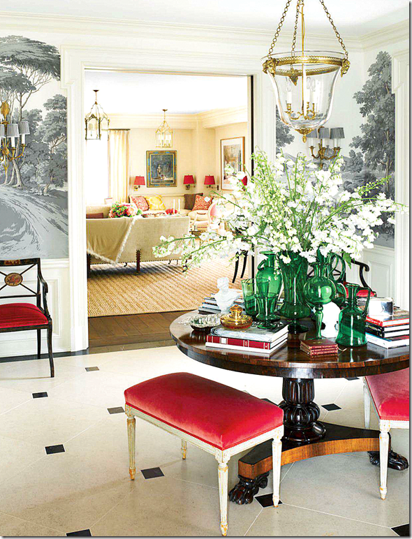
The main rooms of the 1930s Chicago apartment are arranged off the large entry hall. Here, Branca introduces the color scheme: gray, red, gold, and black. A beautiful Zuber wallpaper lines the upper walls.
The living room with its light yellow walls is seen through the doorway. A center table with benches underneath are a Branca trademark.
Off the entry hall with its grisaille wallpaper, the yellow walls are the base for the gray damask and colorful paisleys. The stairway has a red runner.

Another trademark – a banquette - sits in the corner of the living room – with pillows in Fortuny red and white. Red pleated shades pop off the yellow walls.
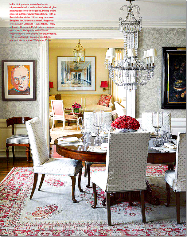
Off the living room is the gorgeous dining room – my favorite room in the apartment. The room is a study in constants – a fancy antique Swedish crystal chandelier is mixed with simple cotton slipcovers in gray and white. The walls are covered in a gray damask.
The rug is gorgeous – with a grey ground and red paisleys. Where in the world did she find it? It says antique!
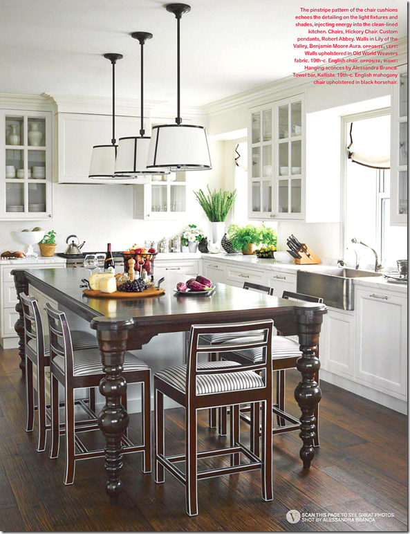
The family room continues the color scheme with the gray velvet sofas and her own Branca fabric on the sofa in gray and white. Major touches of red pop up on the coffee table and sconces’ shades. The light fixture picks up the gray and the window shades are gray and white ticking stripe.
The stripe fabric is continued onto the barstools.
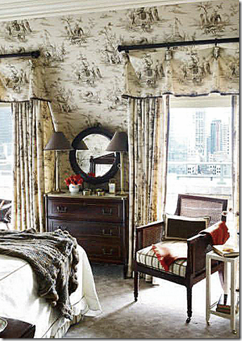
The guest room is covered in the popular Old World Weavers toile in the black/gray colorway.
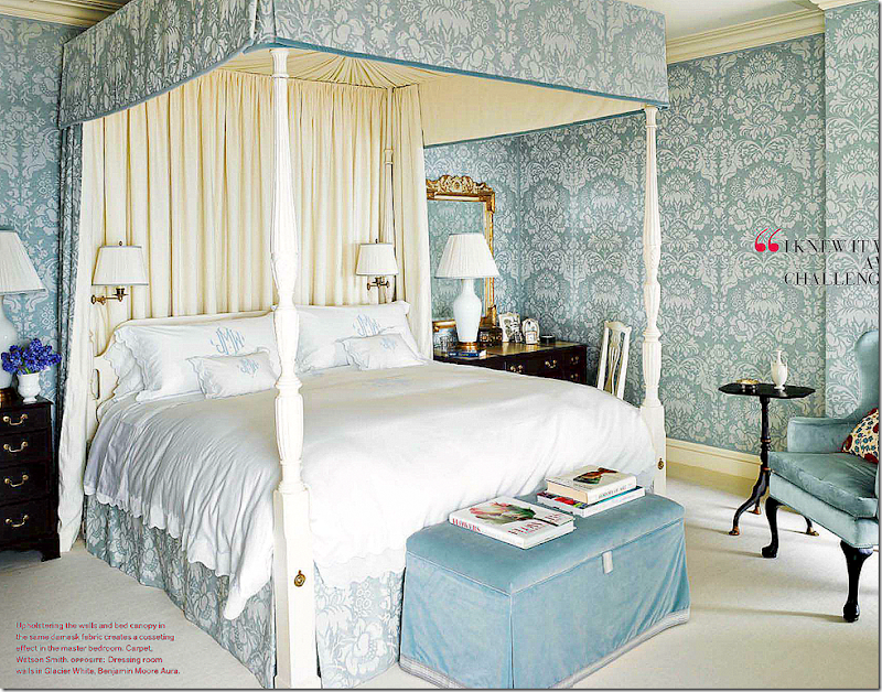
The master bedroom is the only departure in the apartment from the basic gray/black/red/gold colorway. A lot of master bedrooms are done like this – an oasis of its own colors. Here a blue and white damask is mixed with velvet. While the colorway differs – the Damask pattern is the same as found throughout the other rooms – which adds to the cohesiveness of the design.
House #2
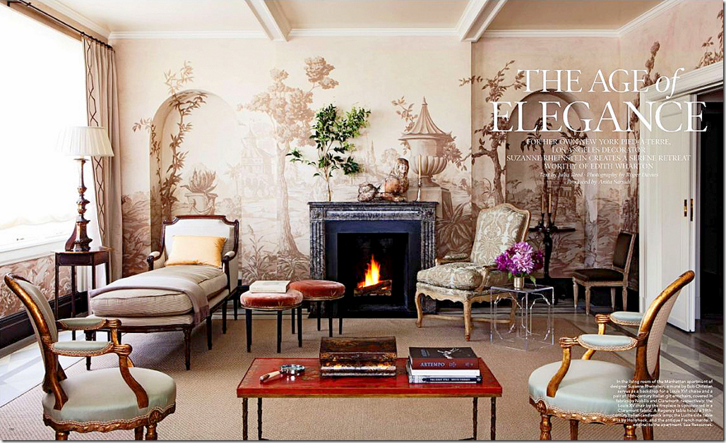
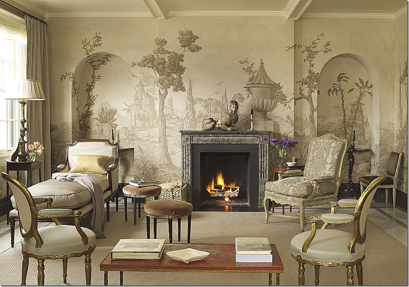
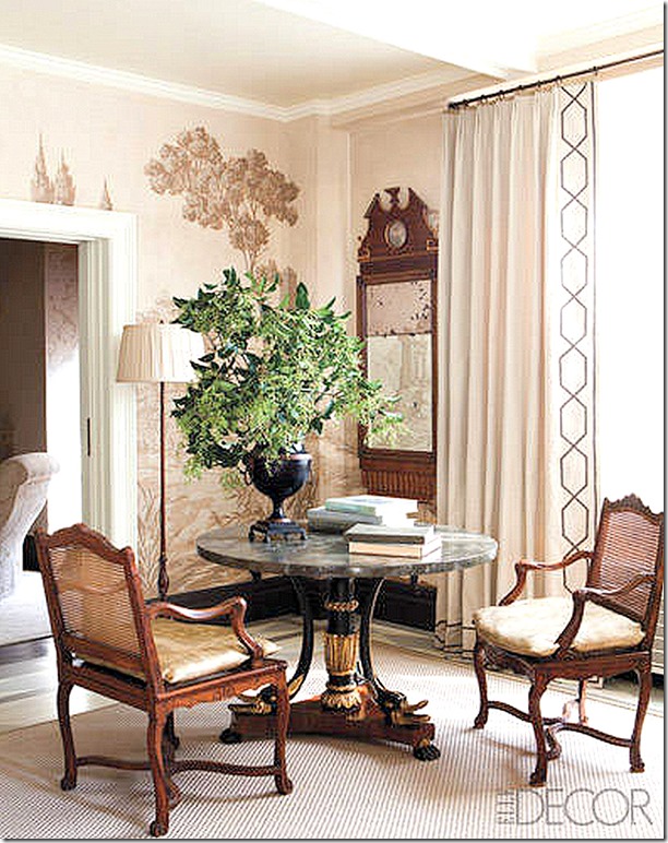
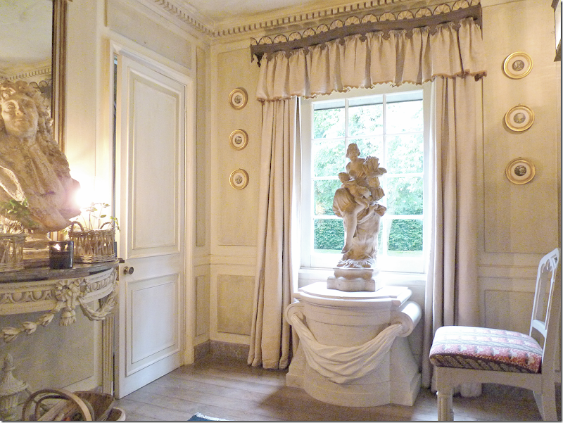
Suzanne Rheinstein is another designer whose houses flow from room to room. Though not quite as decorated as Alessandra Branca, her projects are filled with hand picked antiques and mostly muted fabrics. For her own personal apartment in NYC, she used the decorative painter Bob Christian to paint the floors and the living room walls. Here in the entry hall – the entire apartment’s colorway is introduced - mushroom, taupe, gray with touches of apricot. Another element – silver – is introduced in the molding and the antique mirror and sconces. Rheinstein describes her apartment as a “single decorative statement” – and indeed it is!
The double living room/dining room is L shaped - here is the main seating area with two gilt French chairs, a chaise and the sofa. The focal point of the room is the gorgeous Christian mural in the Pilement style.
The fabrics are in shades of mushroom and taupe – as is the mural.
The aubergine velvet sofa divides the front part of the room into two seating areas.
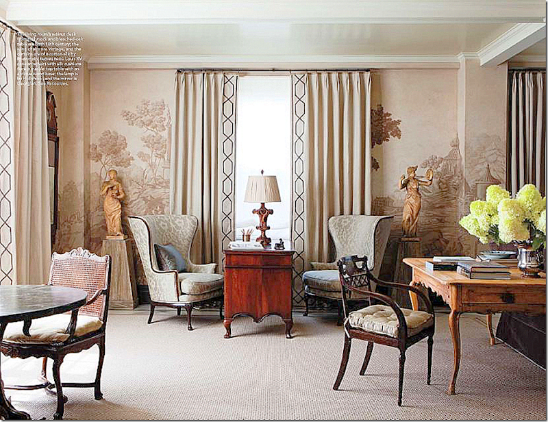
The dining area is across from the desk and the two wing chairs which are flanked by gorgeous garden statues.
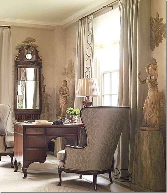
Close up of the antique desk, chairs and mirror.
The dining table. When guests come for dinner – the desk behind the sofa is used as a table that seats more people.
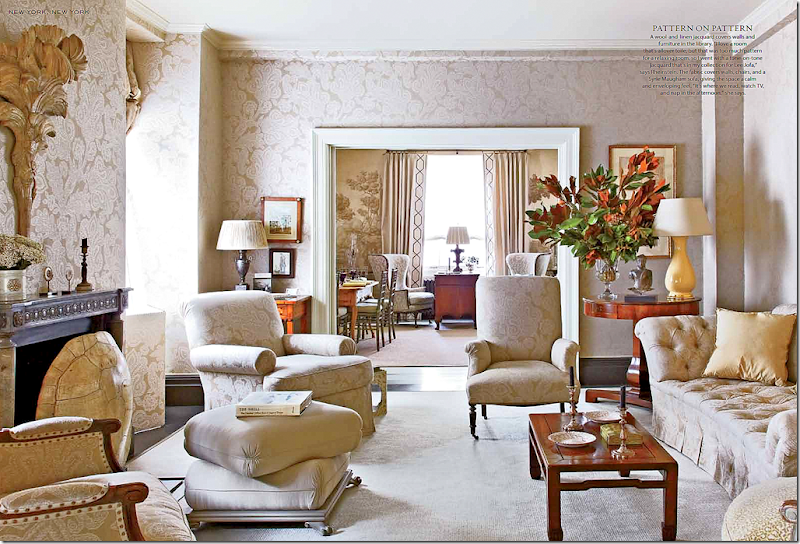
Past the L Shaped living room is the sitting room with its walls upholstered in Rheinstein’s muted jacquard fabric for Lee Jofa. Most of the upholstery wears the same fabric. Silk pillows in apricot pop, as does the lamp. Notice the large tortoise shell acting as a firescreen. Stunning.
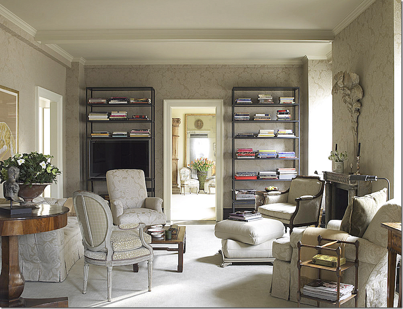
The same room – facing the other direction – and looking different in this light. Through the door is the bedroom where a large floor length mirror fools the eye into thinking the space continues on and on.
Two twin canopied beds divide the master bedroom into mirror spaces. The same color schemes continues through to this room – with just a hint more yellow.
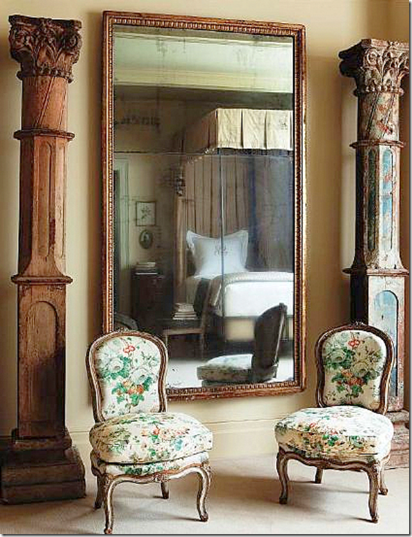
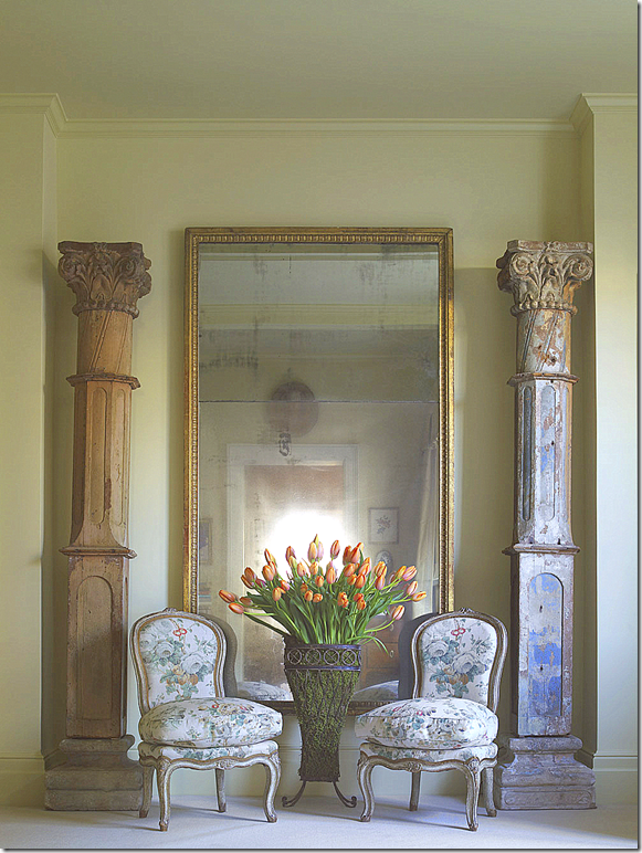
Two chintz covered French chairs are some of the only patterned fabric in the apartment. This vignette is so beautiful – and so typical of Rheinstein.
And another photograph of the vignette with a standing metal vase. Couldn’t resist showing it again!
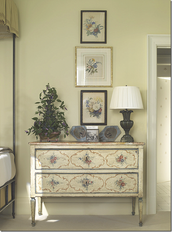
A painted chest sits outside the bedroom.
House #3
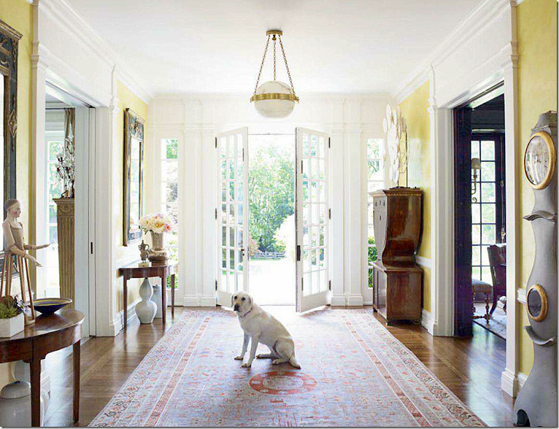
This large house was designed for a young family by Bunny Williams. Williams usually designs with a more acquired, layered look than a color themed look that runs throughout the entire house. But, for this family – she used a predominate color scheme of gray, yellow, peach and blue. The yellow is introduced in the large entry hall that shares space with a gray painted Mora clock from Sweden.
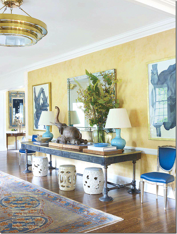
The large foyer that continues off the front hall – features the yellow walls and blues – with touches of gray found in the art work. The antique rugs lend a more acquired look to the foyer.
The living room is a study in yellow and peach with gray painted chairs. Gray is also found in the fabrics.
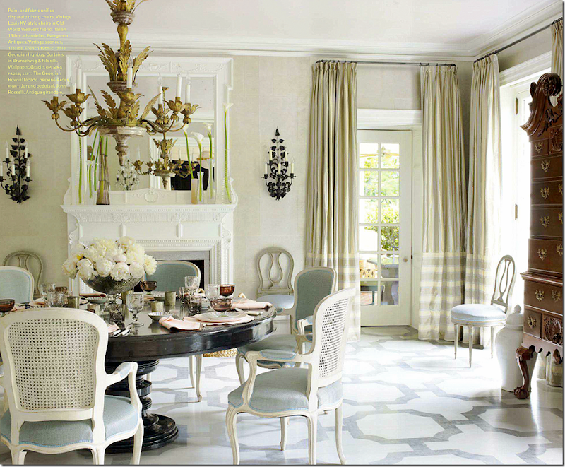
In the dining room – grayish light blue is found on the chairs and the painted floor. I love this room.
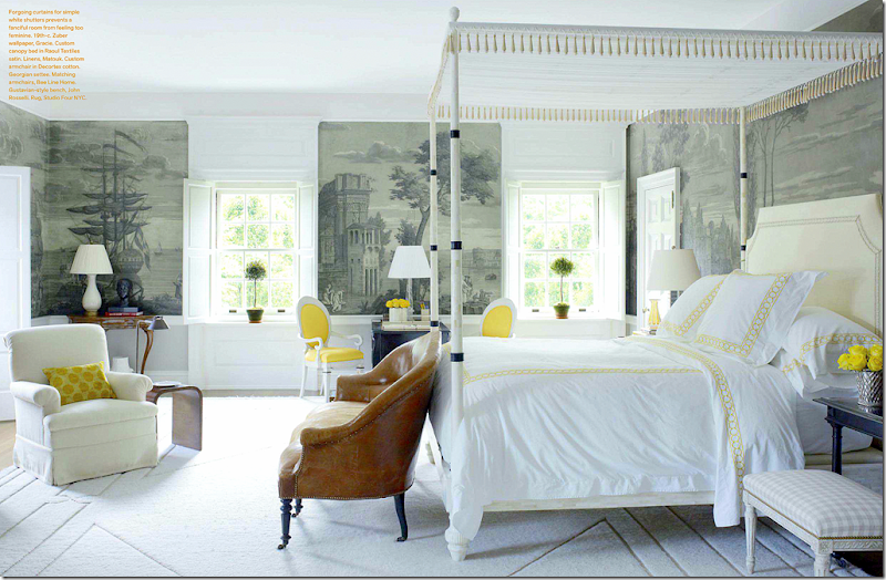
Zuber wallpaper in gray and yellow pops brings the house’s color scheme into the master bedroom.
House #4
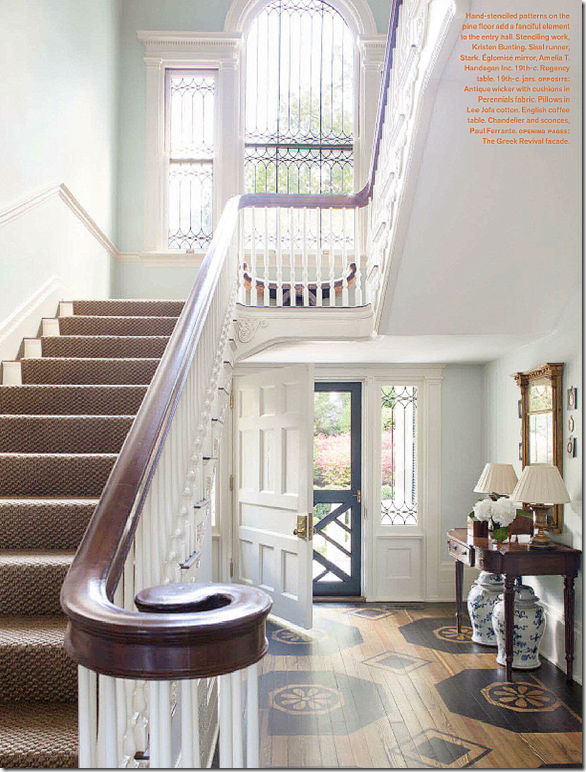
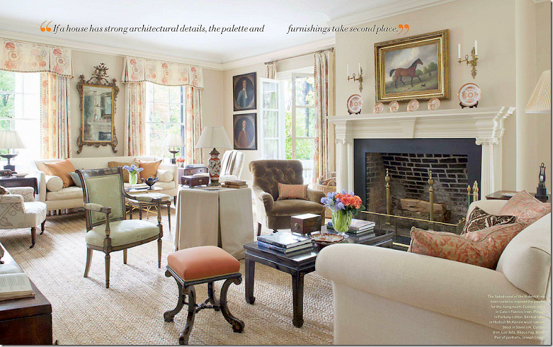
Amelia Handegan is known mostly for her work in Charleston, but she is so popular people from around the country hire her for her quiet, sophisticated, yet casual interiors. Her houses are mostly a muted vision of antiques and fabrics most often in warm tones. The entry to this house shows a painted floor and stair runner in these warm tones – a hint of what is to come.
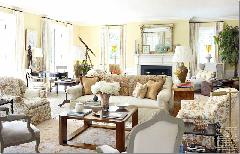
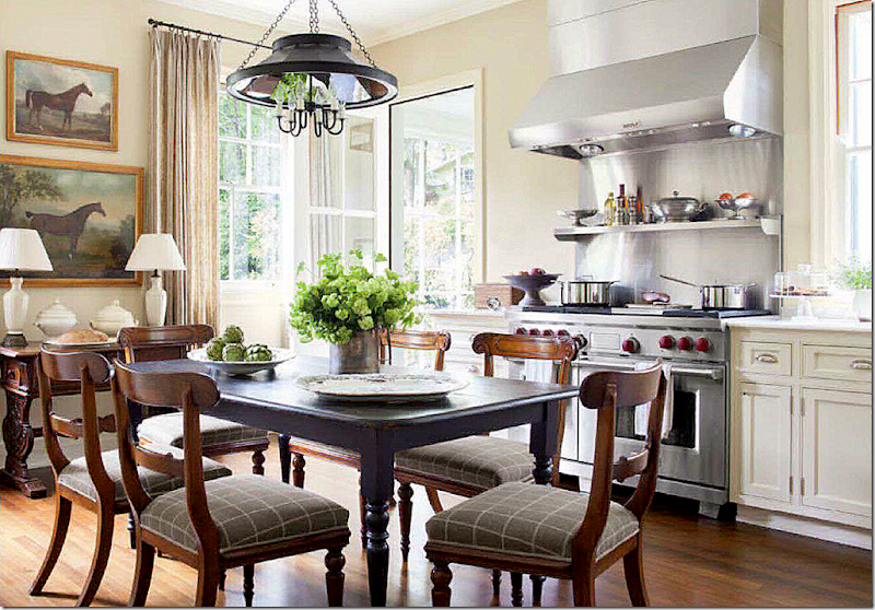
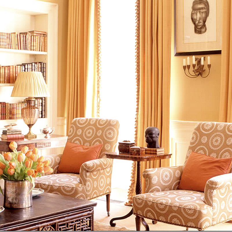
The living room is beautiful in creams with persimmons, apricots, browns and greens. Most fabrics are solid with a Robert Kime coral print at the windows. I love her style!
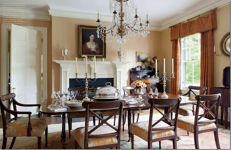
The apricot continues into the beautiful dining room – the walls are lighter than the dark apricot curtains. The muted antique rug picks up the warm colors. Such a pretty room.
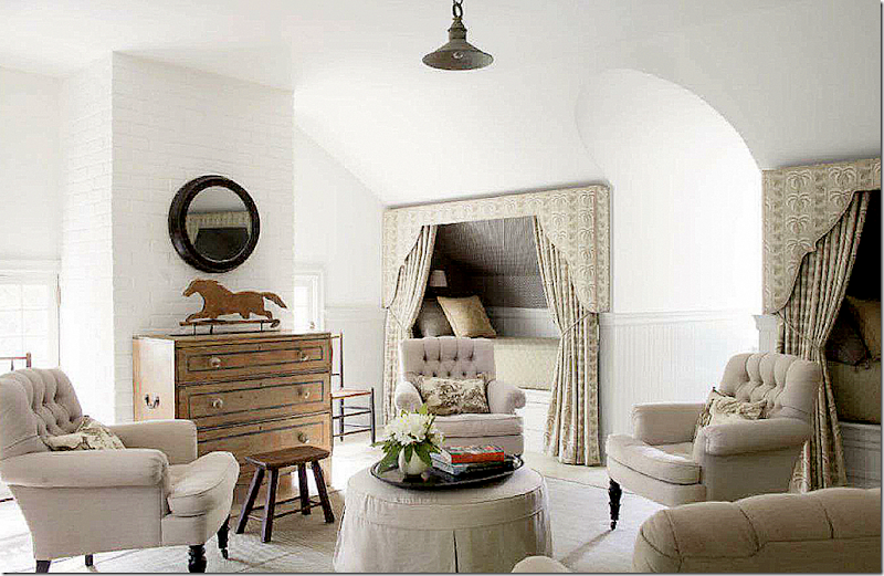
The attic guest room with built in bunks in a muted print. This is a great furniture arrangement for a vacation house – four chairs for guests to talk late into the night – while the beds are put into bunks so as not to take up too much floor space.
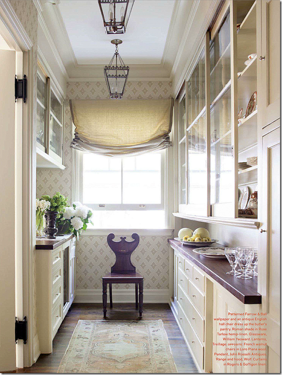
The warm tone is continued into the butler’s pantry with an antique rug in greens and apricots and a wood countertop.
More English and American antiques in the kitchen.
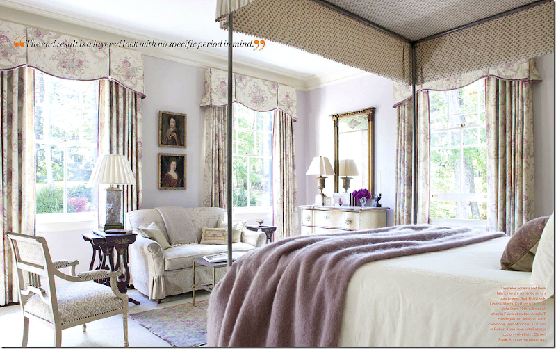
The guest room is done in soft lilac with another muted Robert Kime fabric at the curtains. The lilac is a departure – but the repeat of a Robert Kime floral curtain ties it in with the rest of the décor.
House #5
Here is a fun house by the younger, hip designer from L.A. Ruthie Sommers. I get a lot of complaints that I tend to show mostly subdued designs from older, conservative designers and well, I am guilty of that because that IS the kind of design I love. So, here to show that I can show other designers besides Gerri Bremermann and Charlotte Moss, this is from the new House Beautiful:
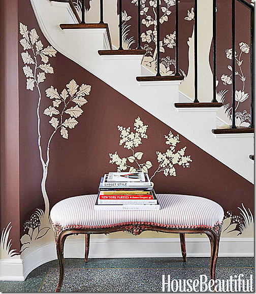
In this 1920s classic Illinois house, Ruthie Sommers had a mural painted in the entry hall. The brown and white mural sets the tone for the fun that is coming.
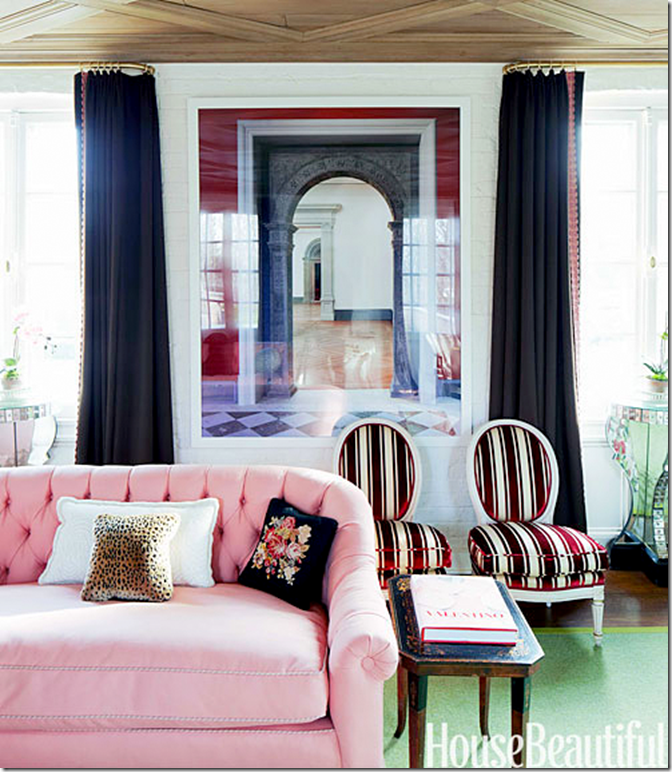
Ruthie started with pink and green in the living room. The brown velvet sofa is flanked by beautiful painted consoles. A green rug grounds the seating group. The owner had been seriously ill and her mother had the house decorated all in neutrals. After she recovered she craved color and trim and fun. Ruthie found a soulmate.
And another view of the room. Ruthie mentioned the amount of pillows she used. I’m not a fan of too many pillows. I like them to be purposeful and spare. Two or three at most on a sofa. And I like my pillows big – depending on the sofa size – either 22 or 24 inch.
In the dining room, pinks continue – though with blues, not greens. Those lamps from Swank are gorgeous!
The homeowner started with the main Ikat that her grandparents once had. Ruthie added all the rest of the patterns in bolder shades of the colors found around the house. Too much? The room is a departure from the living room and dining room which is a shame – a softer collection of ikats would make more sense with those other rooms.
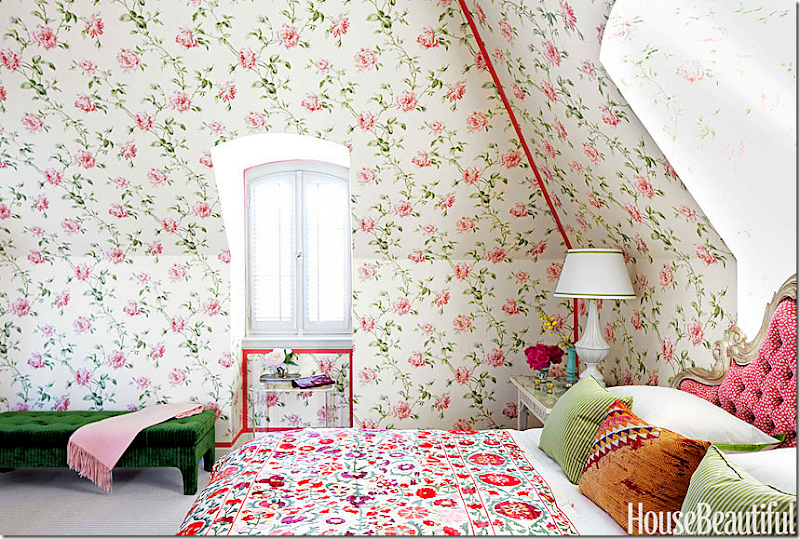
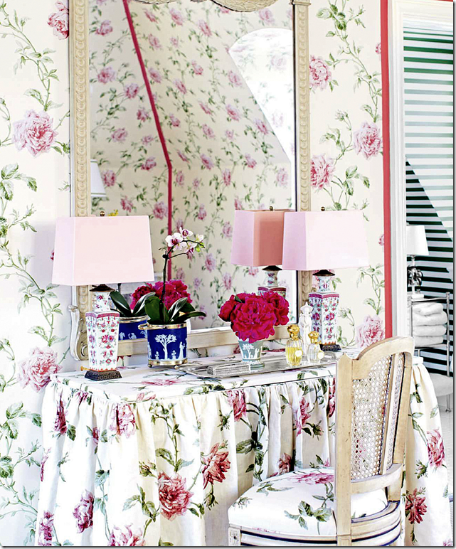
The guest room is decorated in a pink and green chintz – Cowtan and Tout’s Amelie. Notice the darling headboard in pink and white dots.
The vanity table is beautiful! I love the lamps with the pink shades. You can see the bathroom with its green and white striped wallpaper through the door.
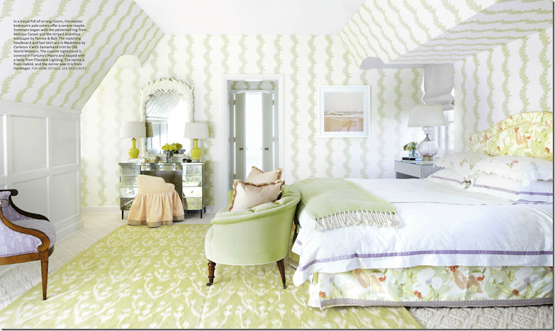
The master bedroom is in greens and corals. The wallpaper is Farrow and Ball.
Ruthie Sommers was the darling of the domino set for years after the magazine published her house and her sofa in a David Hicks fabric was featured on the cover. Ruthie’s sofa probably sold more yards of that fabric than anyone combined. For years a book was talked about – but it was never published and at end of this article Ruthie said she only takes on new jobs with old clients and is basically retired, although her web site is still online.
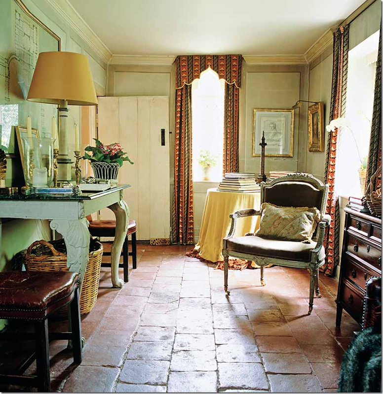
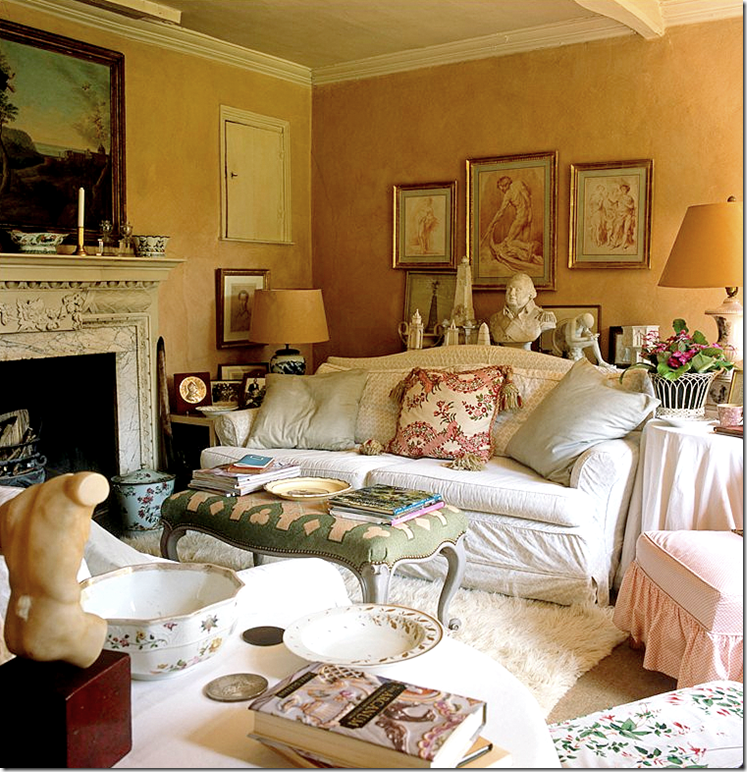
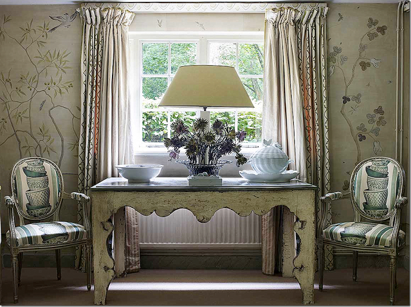
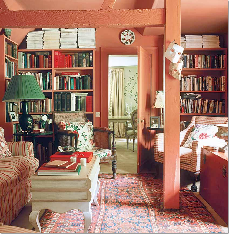
It’s really hard to find a house that isn’t decorated from one end to another, because of course – those are the houses that are published. But – a good example of a designer who decorated a house one room at a time, without a cohesive design, is Nicky Haslam’s country house that was once owned by John Fowler. The house has no decorative scheme or color palette. Instead it is just furnished in a very casual matter without any regard to how the other rooms are done. The house is filled with fine antiques and some not so fine antiques. Nicky Haslam is one of the world’s most famous interior designers – he certainly knows how to decorate a house with one cohesive design – but for his own country house, he chose to make the designer invisible.
The new entry hall – added by John Fowler.
The old entry and dining room – now a pass through. Beautiful original tile floors.
The sitting room – with its original faded slipcovers, although Nicky says they still look perfect today! Hmmm.
The newly decorated dining room.
The library in the former barn. Another mix of colors and furnishings.
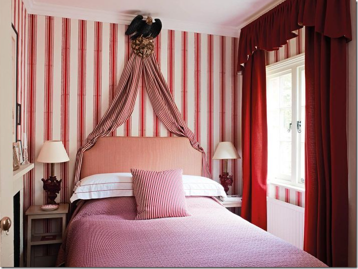
One of the bedrooms in red and white stripes.
The most recently decorated room – The Garden Room. The beautiful chintz had me rethinking whether I wanted to start using this fabric again!!
What I found interesting about “one decorative theme” designing is that some of the master bedrooms seem to be exempt from the basic design. It might be that bedrooms tend to be upstairs or away from the public rooms – so their different color theme doesn’t seem so noticeable.
Decorating with one theme throughout is easiest done when the entire house is designed at one time. It’s harder to have a cohesive design when a house is decorated one room at a time over a number of years. And of course, there are many people who don’t want their house to look like a decorator was hired at all.
Which style are you? Do you prefer a house where all the rooms flow together with colors that coordinate throughout the house? Or do you prefer a house that evolves over time where the designer’s hand isn’t so obvious?














No comments:
Post a Comment