The popular blog, La Dolce Vita, Here, recently showed a beautiful house for sale in Houston’s posh River Oaks neighborhood. The house had been put up for sale after a total renovation by the fabulous Bobby McAlpine of the McAlpine Tankersley architectural firm from Birmingham. Susan Ferrier from the same firm did the interiors.
When I first saw the house on La Dolce Vita – it looked eerily familiar and I knew I had seen it before, but where? A quick look into the archives of HAR produced the original house when it was for sale before – and then I remembered. I had admired the house when it was for sale at that time and I showed it to Ben saying – what a great house to restore! To me a total renovation looked impossible – but seeing the house in the talented hands of Bobby McAlpine and Susan Ferrier – it seems all so obvious what should be done and how.
So – enjoy seeing how this important Houston house – built and designed in 1938 by the renowned architect Charles Oliver – was totally renovated!
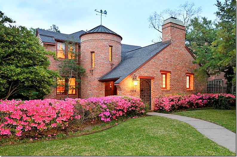
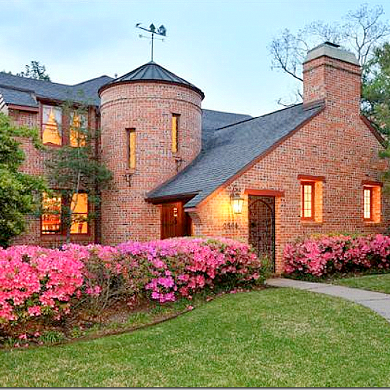
Here is the house as it appeared when it was for sale. The house is only two bedrooms which may be a factor on why it is for sale so quickly again. It has 2,700 sq. ft. and a garage apartment with a study downstairs that does give some bedroom flexibility. It is an original River Oaks house, built by the River Oaks Corporation.
In 1997, the house was for sale for $375,000. In 2010, it was priced at around $975,000 after several reductions. Today the asking price is $1,950,000 – but the renovations are extensive, as you will see.
As you can see – the charm is immediately evident – but so are the issues. The red brick is attractive, but it really clashes with the hot pink azaleas. Why plant that color? White would have been better if you had to have them – but they add nothing. Neither does the red trim.
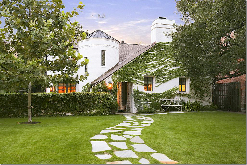
And wow – here is the façade all redone by Bobby McAlpine. Amazing what a can of white paint can do because that is basically the biggest change to the house. They did take out the azaleas which adds to the curb appeal along with the addition of the stone sidewalk, which is another great idea – and a low cost option that could be easily copied. Of course McAlpine added a new lantern and a few new windows – I would be shocked if he or Susan hadn’t – but basically not much changed here. This should give those who own houses with bad brick colors the confidence to repaint them. The transformation is absolutely amazing. And finally – no flower beds- just vines. How English looking – and how refreshing.
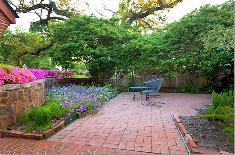
The front courtyard- there is a low stone retaining wall which is a hidden surprise and I love it! Brick patio.
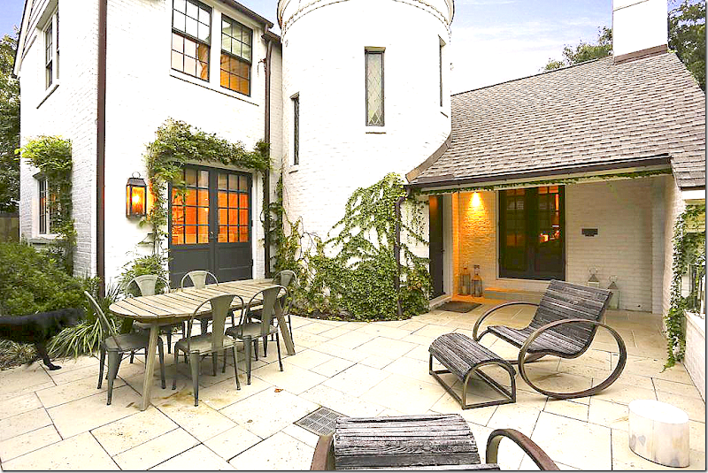
And here is the new courtyard – with white stone and black French doors that replaced the windows. The French doors create the indoor/outdoor feel inside. I love the white stone, but I would have opted for the much lower costing gravel courtyard myself. The sun wouldn’t bounce off the gravel as much as the white stone – which I think might be blinding at noon. The stone is pretty and easy to clean. Still, I can’t help but think gravel would have looked better. OK. I’m criticizing Bobby McAlpine? I don’t believe it!!!! And, ok, while I’m criticizing – would the stone wall have been better kept as it was? Or is McAlpine right – all white everywhere?
Ready to go inside?
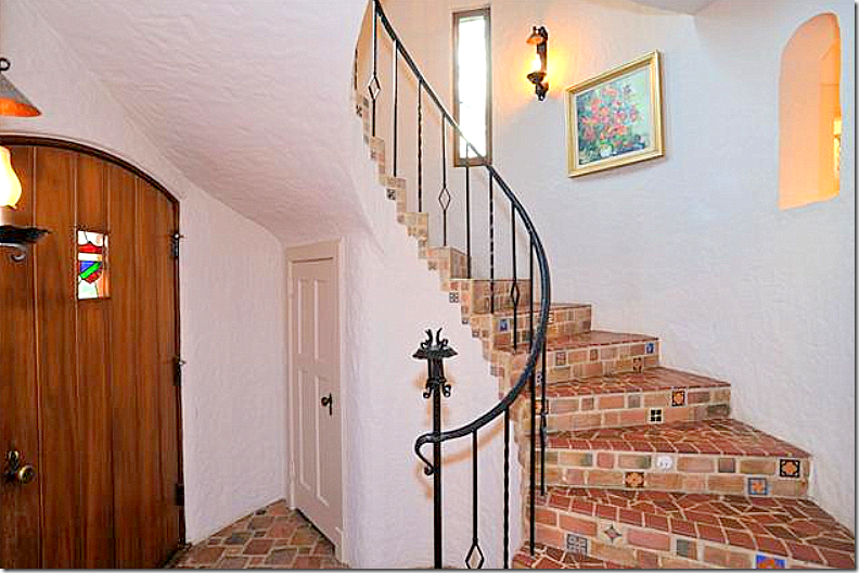
And – the focal point- the staircase inside the turret. The floor is tile and the walls are stucco. The arch at the upper right looks out towards the hall behind the entry.
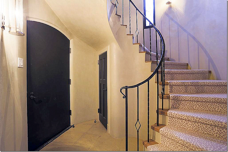
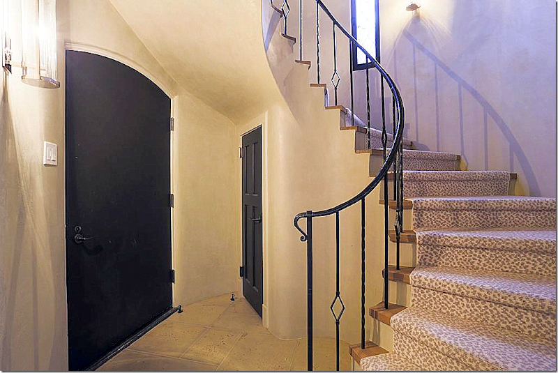
And today! WOW. How fabulous does this look???? I love it! The iron stair rail remains with just the post removed. The tiles were replaced with the stone and wood treads. The doors have been painted black. The entry was just cleaned up and streamlined and it is a huge improvement. Love.
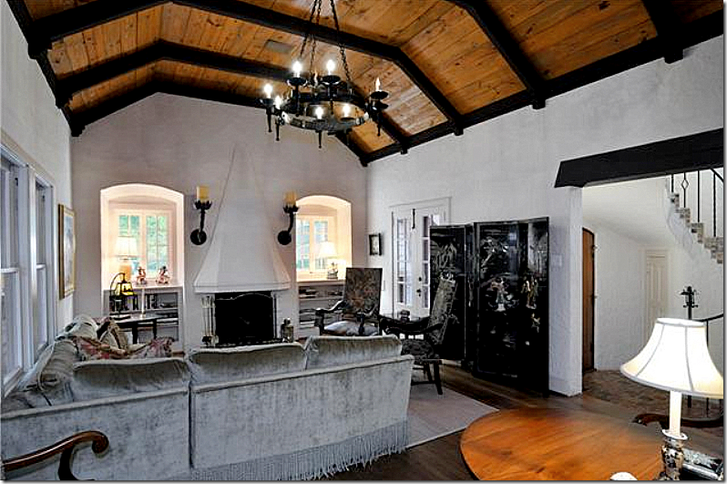
Off the entry is the large, high ceilinged living room with a fabulous wood ceiling and beams. Notice the fireplace and sconces and notice the charming windows on each side of the fireplace. It’s a great looking room even before.
And another view – looking toward the side view. An arch on the left leads into the study.
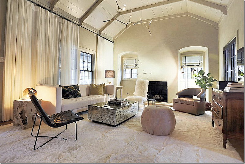
AND – here is the new living room!! The changes are mostly cosmetic – painting the ceiling and beams creamy white, which I love. Segreto Finishes did the stucco walls – which always adds so much to a room. The mantel is gone which I think is a shame, but I don’t miss the overbearing sconces. The décor is very contemporary – but very youthful. I love the ceiling fixture and think its perfect for the space and style. The dramatic curtains screen the side of the house with the too close fence and they stretch the window, adding a soft texture at the same time. I love the new colors on the ceiling and think it’s the absolute correct choice for the room. I must say – I really like the wood antique chest. I think every and any room looks good with at least one antique piece. I would love to see this photographed professionally.
Behind the living room and along the side fence is the study.
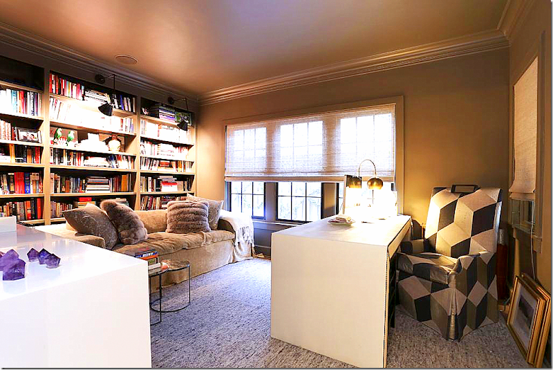
The study today – bookshelves were added along the back wall and the walls and ceiling were giving a darker metallic gold color.
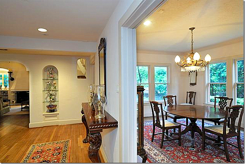
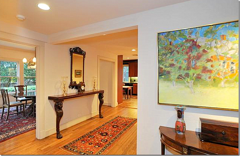
Off the hall that leads to the back portion of the house - you can see into the living room on the left. Next to the arched shelves – notice the higher arch which is open to the entry hall. To the right is the original dining room. In the renovation – this area becomes the kitchen. Where the windows are – these become French doors that overlook the front courtyard. The windows on the right become smaller ones which overlook the side yard and fence.
And how it looks today. The arches and shelves are cleaned up in the renovation. Besides the new stucco texture, a wall of wood shiplap boards was added for even more texture.
Looking from the living room towards the dining room and the kitchen in the back. Today – the kitchen is where the dining room was and the dining room is where the kitchen was.
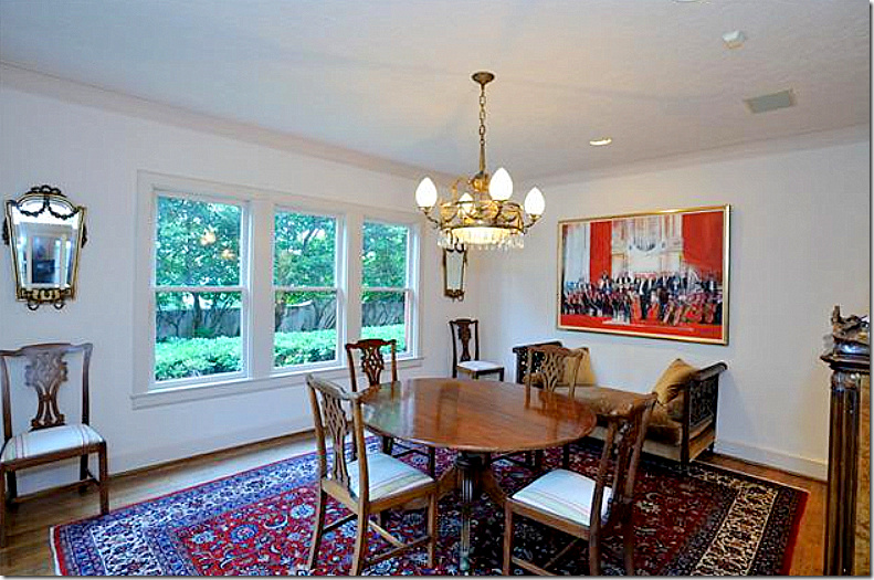
And the dining room. After this room became the kitchen, the wall on the right was broken through to become the butler’s pantry, shown further along.
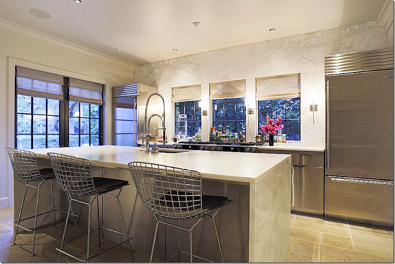
And the kitchen today! So beautiful. A contemporary, clean lined spaced filled with white marble and stainless appliances and cabinetry. The new French doors replaced windows that now overlook the front courtyard – making the courtyard an extra room. The three new windows overlook the side yard. The back wall is marble – just gorgeous!!!!! So luxe!!! I love the symmetry of the refrigerator and freezer being separated and framing the cooktop. The cabinetry doors are also stainless. Veddy nice!!
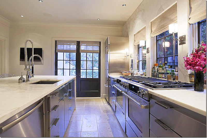
And looking towards the front courtyard. It seems that two ranges and two stove tops mimic a large professional range- great idea!!! The kitchen is fabulous – I love it. McAlpine and Ferrier are known for wonderful kitchen designs – and this doesn’t disappoint.
In the space where the kitchen and family room once were – a large butler’s pantry was carved out of the remaining space. Again, beautiful marble countertops and backsplash and open shelves. What a luxury of a space.
And at the end of the hall – on the left is the former kitchen and on the right is the family room. Both rooms overlook the back yard and garage. Today – this is now the dining room and butler’s pantry.
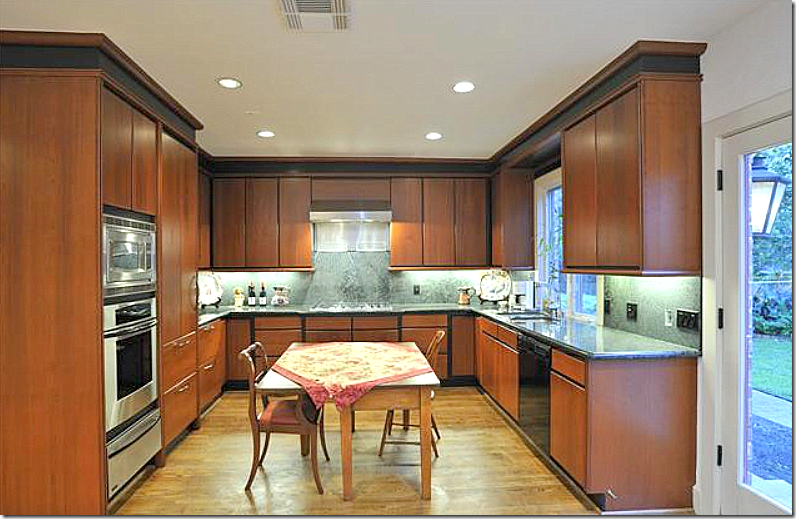
The original kitchen which was renovated at some point in time – half of this space is now the butler’s pantry.
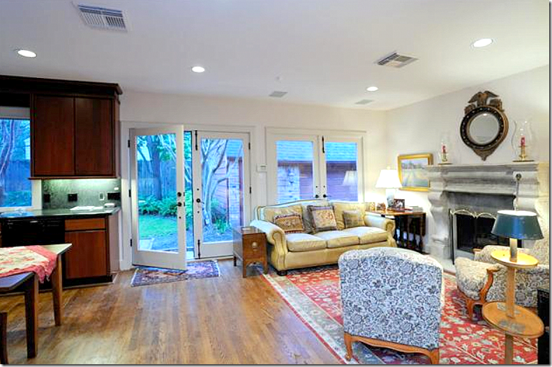
The family room – with a nice fireplace. It’s interesting how the front of the house is so charming architecturally with the gorgeous living room and entry hall in the turret, yet the back part is rather plain as if the architect ran out of ideas.
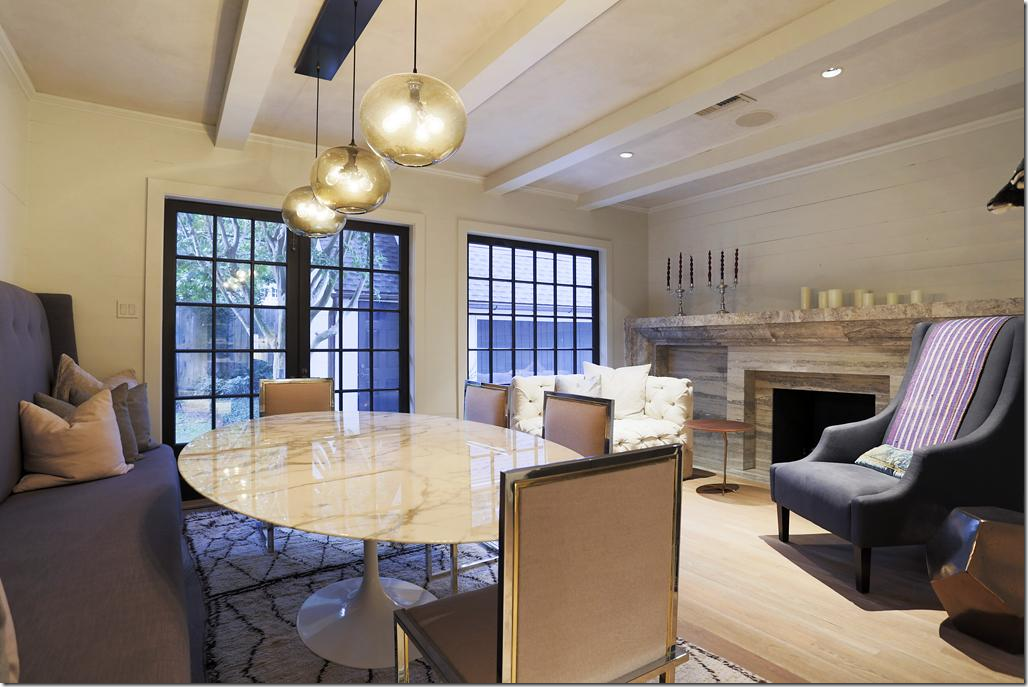
And today – overlooking the backyard – is the dining room. The fireplace has a new stone mantel, along with the shiplap wall for added texture. Beams were also added to create some needed architectural interest. Susan Ferrier designed a great banquette along the back wall – but the star here is the FABULOUS marble topped Saarinen table. LOVE!! These tables are available in different sizes from Design Within Reach HERE. I grew up with this table (sans marble top) and tulip chairs and this is the one piece of iconic midcentury designs that I covet. Well, not the only one – there are wonderful chairs and chaises that I love too, but this table just kills me. For those on a tight budget – consider this copy from IKEA to get the look.
On a budget, you can get the look for just $199 from IKEA. I would pair this large wicker chairs. The Design Within Reach marble topped version is so expensive – starting at $5k and going up to $13,000!!! But – it’s worth every penny.
Back to the dining room – by adding a love seat and chair by the fire place, the room becomes a sort of family area and not just a dining room. By adding the beams, new black windows and the wall to wall stone mantel – these elements add to the once architecturally plain room. What I do wonder is why the dining room wasn’t put where the study is – to create a connection to the front part of the house? Laughing while writing this, imagining Bobby hearing my suggestions while rolling his eyes.
Upstairs, the master bedroom – has interesting ceiling lines that follow the roof. This room overlooks the back yard.
Both the bathrooms and kitchen had obviously been updated at some point - but in this renovation, they were taken down to the studs.
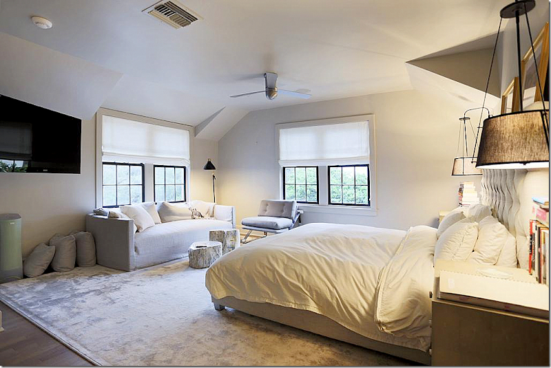
The master bedroom today. The windows were changed and made bigger. Susan Ferrier would have a fit if she saw this photograph – how it wasn’t staged. The pillows weren’t even put on the bed. And it’s a shame the photograph was taken at this angle because you can’t see the focal points – the headboard or the hanging lamps - which both look very interesting. It looks like there is a shelf over the bed with two framed prints. Wish we could see it!
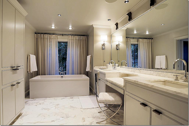
The master bathroom has the same cabinetry and marble as the kitchen and butler’s pantry – which I love – it creates a wonderful design continuity throughout the house. Beautiful sconces and tub.
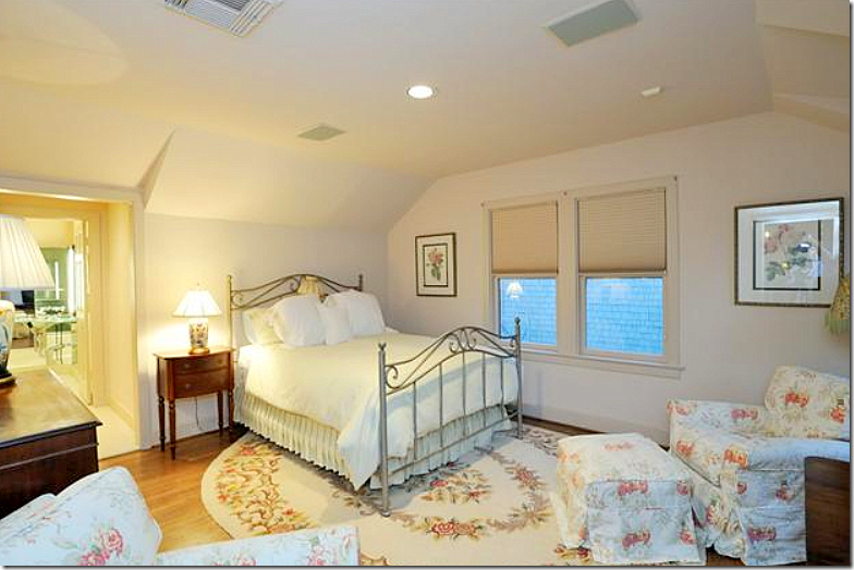
And the second bedroom, before.
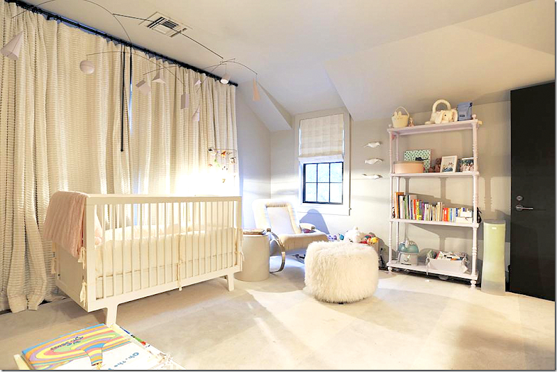
Today, the bedroom is a nursery. Love the light fixture. I’m sure the family is probably moving because they have outgrown the two bedrooms. This is a singles house or an empty nester, unless there is an older child that could stay in the garage apartment. Two bedrooms today are just so limiting. I’m surprised with the square footage that another bedroom couldn’t be added on somewhere upstairs? The two story living room really limits the number of upstairs bedrooms. This room looks large, 16x13 – could it have been divided into two?
The second bathroom with the gorgeous marble bath and a charming new window. Love the hardware that is found throughout the house – and all the sconces Susan chose.
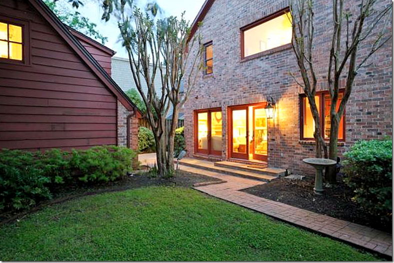
The back yard before. Here you can see what was once the open kitchen on the right and the family room on the left. The master bedroom and bath are seen above. Today – this back area is the dining room on the left and the butler’s pantry on the right. And you can see the garage apartment here, also.
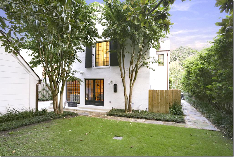
Basically the same view- with the renovations and the new stone walkway. The new windows and doors make such a difference, as does the white paint.
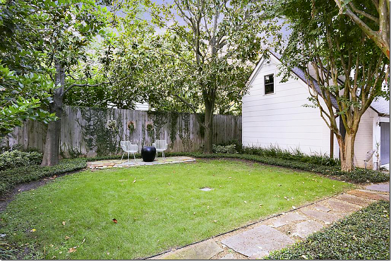
The backyard is just waiting for a swimming pool! This is something that a couple with a baby wouldn’t want, but for an empty nester – it would be perfect.
The house is sale pending now – not surprising at all. To have the combination of an original River Oaks Corporation house – updated for today by the master – Bobby McAlpine and Susan Ferrier – is a rarity in Houston.
And I hope you found it interesting to see what changes McAlpine made and what he chose to keep. Like the entry, which he basically left alone except for finishes……
…as opposed to the bathrooms and kitchen which were totally gutted and renovated – which was the right move. What McAlpine and Ferrier did was take an older, dated home and turn it into a more contemporary house perfect for a young family. What do you think?
Did you ever read Bobby McAlpine’s book? This was one design book I READ cover to cover. To order click on the image below:
AND – and new book by McAlpine and Ferrier – coming out in April! Can’t wait. Pre-order below:
Finally – did you ever listen to Bobby McAlpine when he visited the Skirted Roundtable? We kidded that he was the first guest to drop the f-bomb (more than once) but he was also one of our more intelligent visitors. I remember the three of us being just stunned. He was fascinating and we hung on for dear life, clearly out of our league. And nice? And funny? One of my favorite guests, ever.
Listen HERE.














No comments:
Post a Comment