Lately I’ve been a little defensive about my decorating style. When showing some of my jobs on the blog, I get comments saying – “it looks just like your house.” Or, “it all looks alike.” And yes, I have to agree. When allowed to decorate the way I want to, it does look somewhat similar. I mean, if I personally don’t care for chenille, why I would want a client to have it?
My family room with white slips, brown accents and seagrass.
A recent client with white slips, brown accents, and seagrass.
It’s not just me whose style is recognizable. There are may well respected designers who have a very distinct style – Kathryn Ireland immediately comes to mind, and so does Charles Faudree, Mario Buatta, and Darryl Carter; Thomas Pheasant, Barbara Berry and John Saladino are some others whose work is immediately identified.
Even growing up all those years ago, there was one diminutive designer who decorated many houses in my neighborhood. Walking in the front door of any home, you could immediately tell if she had been hired to do the house or not.
It’s not like I always decorated with white slipcovers and seagrass either. My standard go-to-look used to be linen, toile, and Bennison with kilims and lots of red and black accents. I mean I can and do do other designs, but left to my own devices, I’m going to design the way I want to. Is there anything wrong with having a signature look?
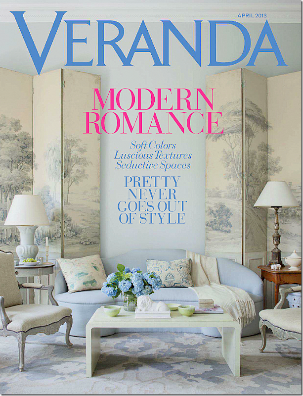
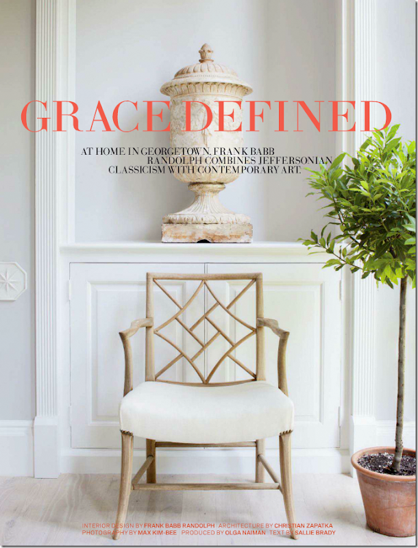
I started thinking about this when I was reading the new Veranda, with its gorgeous cover.
It wasn’t so much this vignette that gave away the designer. I might have even thought this was the work of Phoebe Howard or Bunny Williams at first glance.
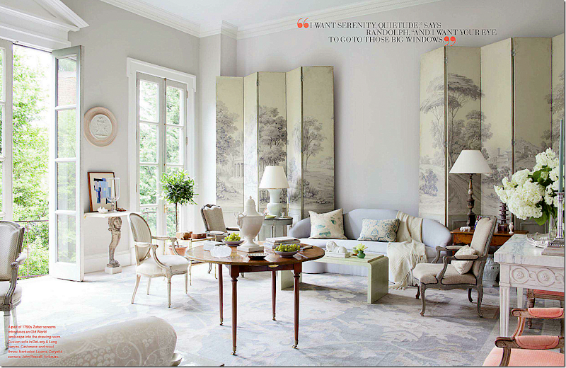
The first clue was the townhouse in Washington D.C. The location and the style of the house always gives you a hint of whom the designer might be.
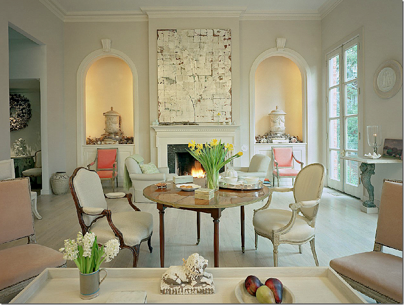
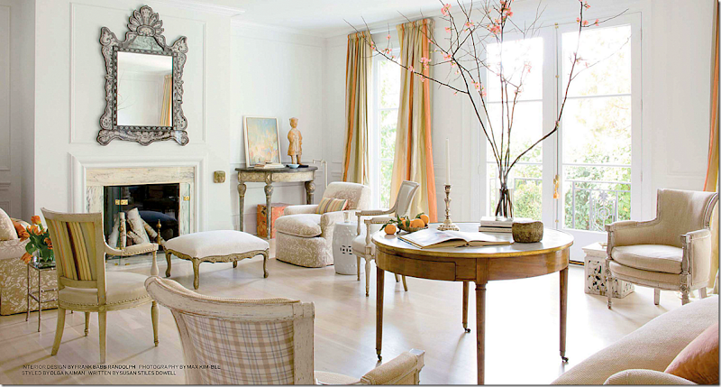
But it was this picture that really gave away the answer. The quiet palette, the subtle touches of color, the center table, the lime washed floors, the classic leggy chairs, the airy, sunny atomosphere. It all spoke immediately to me as the work of Frank Babb Randolph. Randolph has quickly become a favorite of mine – I just love his aesthetic. He makes choices I actually wouldn’t make – he doesn’t do a lot of curtains and more often than not, he leaves his floors exposed – but who only admires people who are a reflection of ourselves? Why follow someone who doesn’t challenge your norm?
This townhouse is Randolph’s own home, once owned by Henry Kissinger. Newly redecorated and remodeled, I looked up older photographs of this same space to compare what he had changed, and why.
The house, built in 1959, lacked formal moldings, so he first added a pediment over the center French door – in a homage to Thomas Jefferson. Next he added a flat patterned rug, so subtle it almost looks like a painted floor. In between the two fabulous 18th century Zuber covered screens – I thought, hmm. why no painting? But, previously he did have one, and seeing it without, he made the correct choice. Cabana striped slipcovered chairs were changed out for more sophisticated French beauties and his Swedish chairs are now long gone, but why?
Take a look at this same room before remodeling:
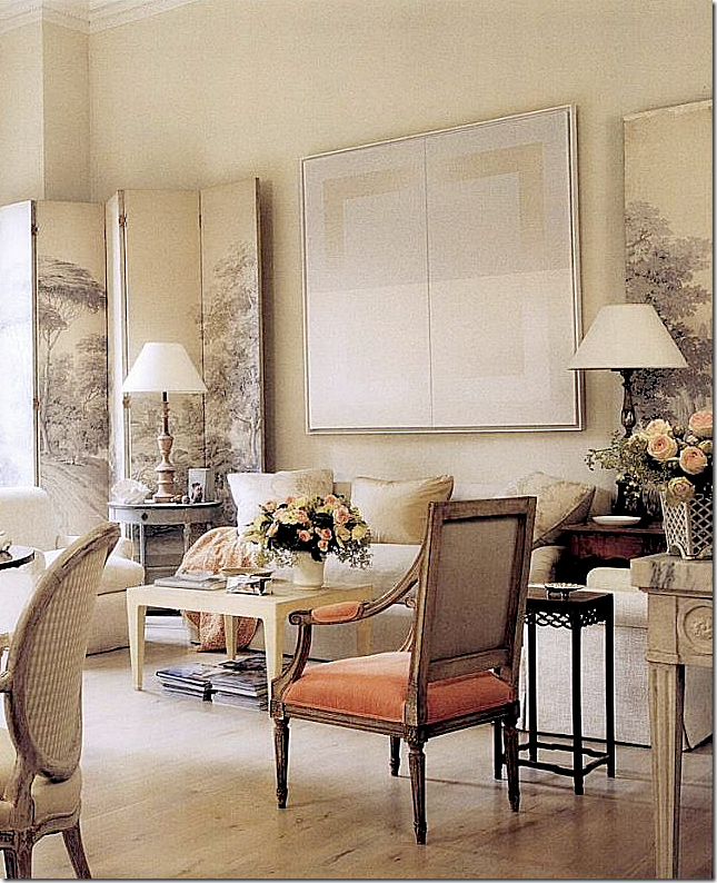
BEFORE: the layout remains basically the same, but key pieces have changed. As always, Randolph uses a center table. He likes the furniture to be light enough to move around – in the French style. Here, the limed wood floors are bare, the sofa has been changed, the cabana slipped chairs are gone, as are the Swedish chairs against the wall. Here, there are two French chairs with a pale peach fabric sitting next to the striped chairs – now moved to another room. Remaining are the two fabulous 18th century Zuber screens, though that center painting has now been, wisely, removed. Large sconces and console with mirror remain. Notice the French door without the Jeffersonian pediment – what a difference it makes! Which room do you prefer, then or now?
BEFORE: With the contemporary painting between the two Zuber screens – and no rug. Today, there is more blue in the room – with the addition of the rug and the sofa. Here is main color is beige and cream with punches of apricot. Such a beautiful photograph!
Randolph is the son a Washington lawmaker who served in Congress for many, many years. He grew up in Virginia and Georgetown and Thomas Jefferson, whom he calls the first interior designer in America, influences his work. Like Jefferson, he doesn’t care much for curtains, and like Jefferson, he rolls up his rugs in the summer!
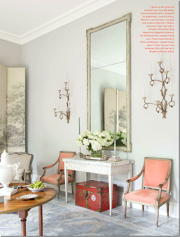
NOW: Against this wall, Randolph added his trademark soft pops of color with the apricot French chairs that were once placed across the room. The walls are painted a gorgeous gray – Farrow and Ball Elephant’s Breath. While the chairs are antiques, the console and sconces are Niermann Weeks.
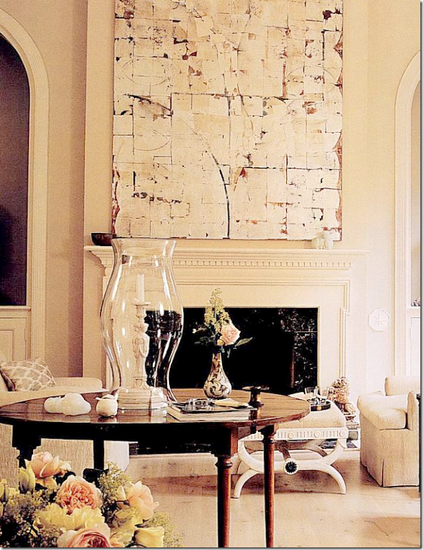
NOW: Across the room, the two club chairs, newly slipped, flank the fireplace. The beautiful painting is by Elizabeth Dax. While I’m not a fan of contemporary paintings, I have to say I love this! It’s so subtle it’s almost as if it was a mirror reflecting the room’s décor.
Beautiful crusty urns sit in niches that were once bookcases. This is the second time this week I’ve shown the dreaded niche with an urn, and suddenly, I’m a fan of niches! Note: if you have a niche, try copying this – use just one crusty urn.
NOW: Closeup of the niche with the urn and chair from Tone On Tone, whose own aesthetic is quite similar to Randolph’s.
BEFORE: A closeup of the urn in the niche which was once a bookcase. I also love the medallions he uses throughout the house.
BEFORE: the apricot colored French chairs were once in front of the niches – Randolph is a fan of “leggy” furniture, which he likes to move around as needed. The club chairs weren’t slipped here. And, you can see the beautiful very light peach chairs next to the coffee table – these are now on the landing and are from the Cole Porter estate. I love the two shades of peach, one light, one darker. Isn’t it amazing how different a room looks with the lights turned on!
BEFORE: A close up of the art work by Elizabeth Dax.
NOW: Ahhh, here are the light peach chairs! Randolph moved them from the drawing room to the landing! These chairs once belonged to Cole Porter and they still wear their original silk fabric. Love the painting with the touch of orange. Beautiful vases with leaves.
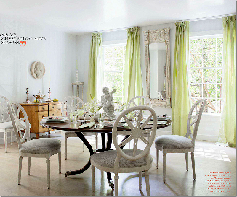
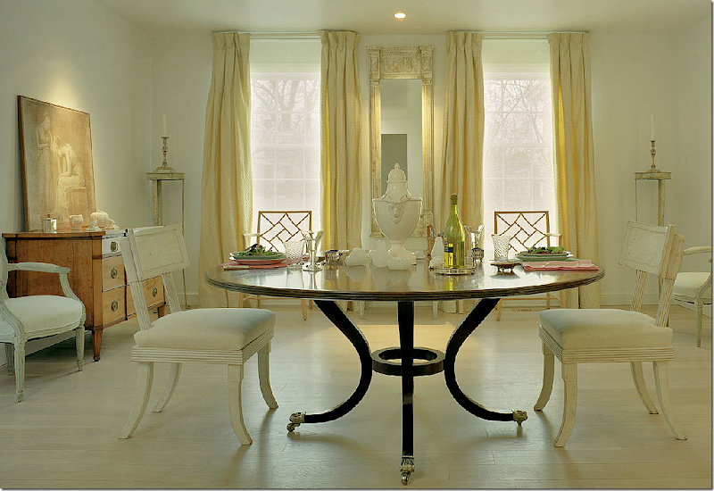
NOW: In the dining room, Randolph used draperies in this room only – here in a light silk chartreuse. Randolph uses a lot of Niermann Weeks and David Iatesta who once designed for NW before going out on his own. The new chairs are from Iatesta while the console in the corner is NW. This quiet room is so Randolph with the bare floors and muted tones. When entertaining he sets up several tables – and this is why he doesn’t use a central chandelier. This way he can move the tables around as needed without the worry of the placement of a light fixture.
BEFORE: the Swedish chairs used here were mixed with the cane back chairs now in the living room. I think I like the Swedish chairs better than the Iatesta ones, but that’s a personal choice. Here, the curtains look yellow – not sure which is the correct color? I do prefer the medallion on the wall above the chest rather than this painting. I love this photograph – the way the furniture is arranged, it’s so symmetrical, just like I love it. Still, if this was mine, I would use a light rug and a chandelier – but again, that’s a personal choice.
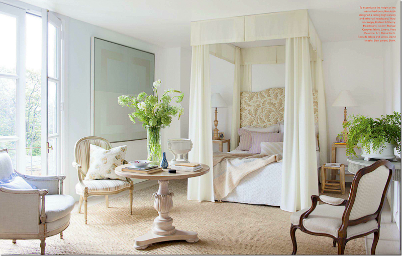
NOW: Isn’t this pretty? Here you can see how much Randolph likes to use a center round table in his designs. An over-tall headboard and canopy were designed to accentuate the height of the room. This is really a feminine bedroom designed by a man for a man. Men don’t always have to have dark colors and leather to be happy. This décor is a good compromise when designing a bedroom for both a man and woman.
The handsome and very debonair Frank Babb Randolph stands in the living room of a house he designed for a friend, artist Robert Rea.
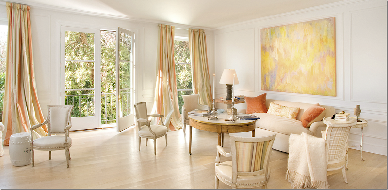
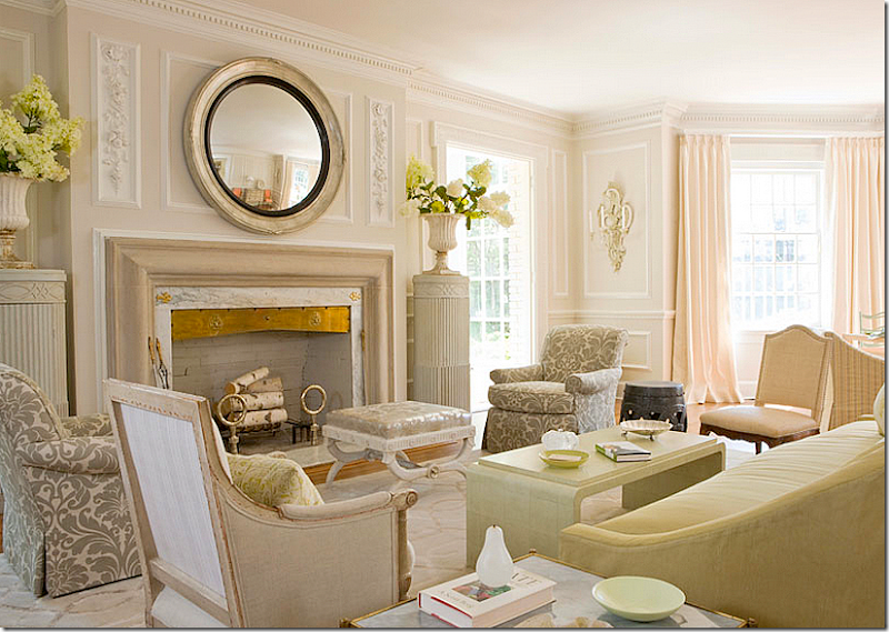
Two years ago, Veranda showed this Washington DC house that Randolph designed for a client. He used the same basic floorplan with a round center table, flanking chairs on the fireplace and placing the sofa on the opposite wall – just as it is in his own DC townhouse. This is a quiet, subtle, sunny and and airy room – which quickly identifies it as a Randolph designed room. Soft pops of color come from the drapery fabric. Other tell-tale signs that Randolph was here – bare, white washed wood floor, and an assortment of leggy, easily moved antique French chairs.
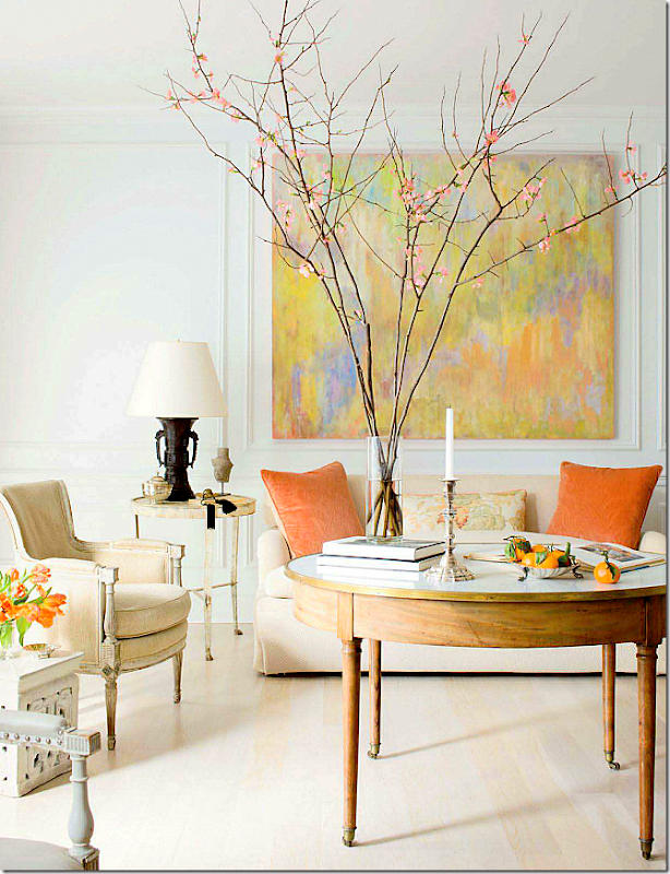
Across the room. Just beautiful! I love the pops of orange that come from the painting – the owner is the artist. Instead of a coffee table, Randolph uses the center table – on wheels for easy movement.
Same view, different day – different styling. I like this end table better than the one above. But I miss the garden stool and the flowering branch. Notice how the first photographer brought up the arm of a French chair – just a trick that good photographers know how to do – which sets them apart from novices like myself. He also set up a wider shot that shows more of the sofa and table. Interesting to see the subtle differences between photographers. Here, Morgan Howarth photographer. Above, Max Kim Bee.
Another view by a different photographer. Love the backs of the French chairs with the subtle patterns and colors. Love the silk striped curtain fabrics. Just gorgeous. But, I do miss a rug!!! I would do a seagrass, but a pretty patterned one like Randolph used in his own home would be great too. Love the pillows. LOVE!!!
Read what Randolph says about rugs and why he eschews them: “A puzzle pattern of rugs would break up the flow from room to room. I like the cleanness of furniture legs dancing on the pale wood.”
And color: “Colors pop on a neutral canvas. I like bringing in select colors as accessories and then changing them out again as the mood suits.”
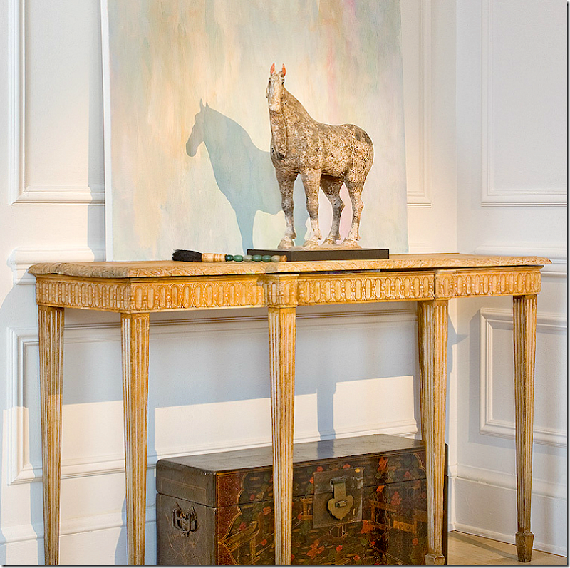
Against one wall, a console with a chinoiserie chest underneath.
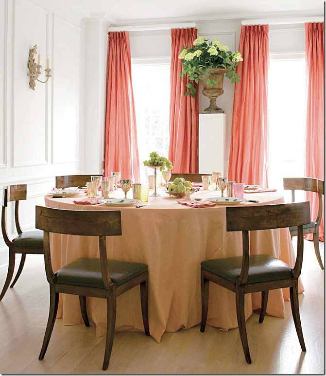
The dining room here has a skirted table in a lighter shade of the curtain fabric – which is a great idea! Again, subtle, and quiet, and spare, three hallmarks of a Randolph interior. And, like his own dining room – no chandelier. Love the tall urn.
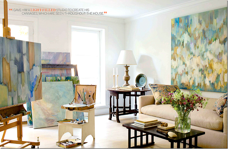
The studio – with lots of the artist’s work.
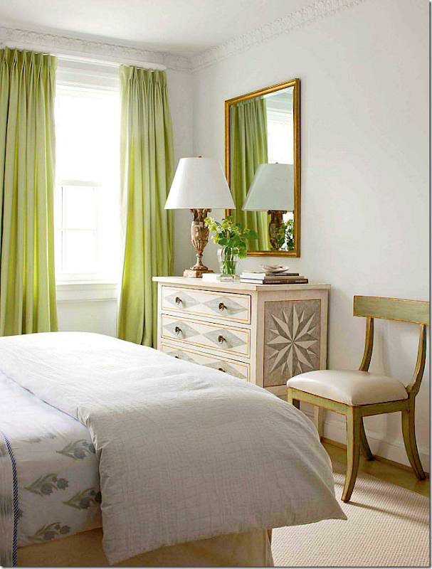
The bedroom is pretty and quiet – with a painted chest and chair.
This beautiful room was designed by Randolph for a local showhouse. Love the fluted pedestals with urns. So pretty!!!
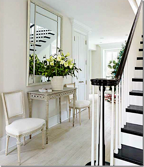
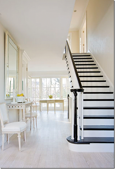
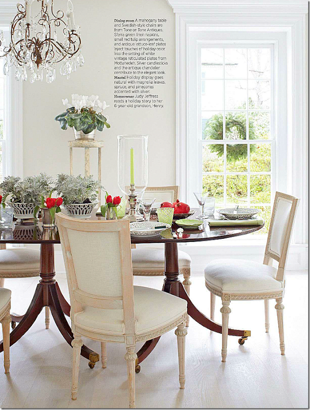
This house was shown in two magazines (the photoshoot in Traditional Homes was for the Christmas edition.) This older stone house was remodeled for an empty nest couple who had raised their family here. Randolph turned it from dark, closed off interiors into light, bright and airy rooms. The floors are now his standard limed wood. Antiques from Tone on Tone found throughout. Beautiful black stair treads and bannister.
In this second view, you can see how airy and bright the interiors are now. Love the black against the limed floors.
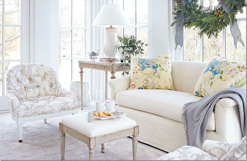
Decorated for Christmas, club chairs flank the fireplace with an antique Swedish ottoman acting as the coffee table. The bench by the window is Niermann Weeks.
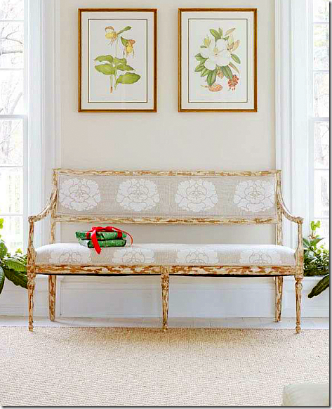
Love the Swedish bench. A small tree sits on the an urn table in an alcove.
The alcove - love that table!.
Love the bench with the Manuel Canovas fabric.
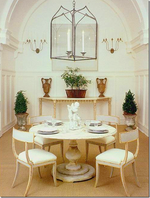
In the dining room, Randolph mixed a wood tabled with painted Tone on Tone Swedish chairs. Love the chairs!!!
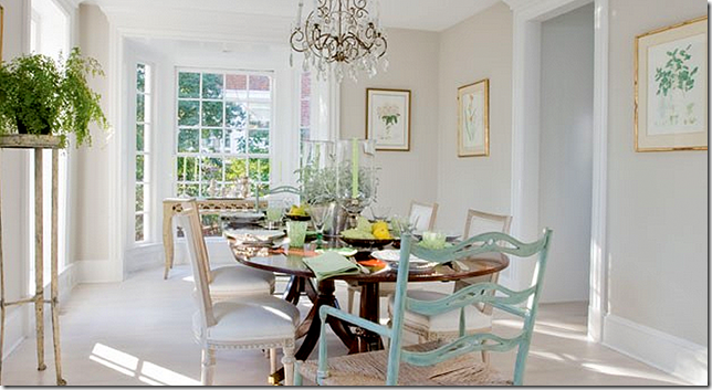
The dining room, looks so different from this angle! Love the light gray walls and white floors. It’s all so ethereal.
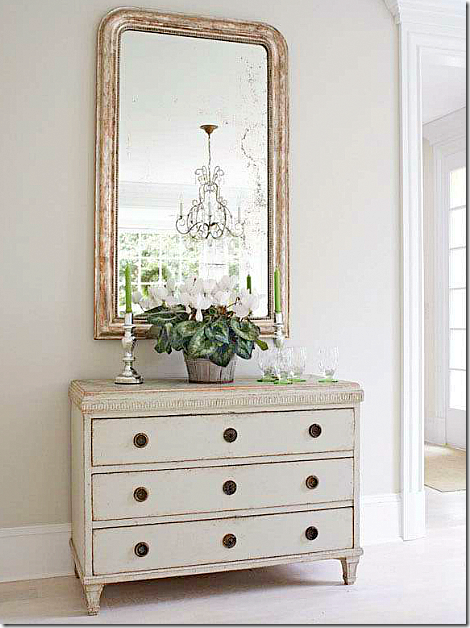
A vignette of Tone on Tone Swedish antiques in the dining room.
In the sunroom, beautifully tailored sofa in cream linen, with two Swedish pieces.
Niermann Weeks: Randolph designed a collection for NW and uses many of their products in his interiors. Here, he helped create this showroom using all NW items. Love the chairs and table! Beautiful! And those sconces are a personal favorite.
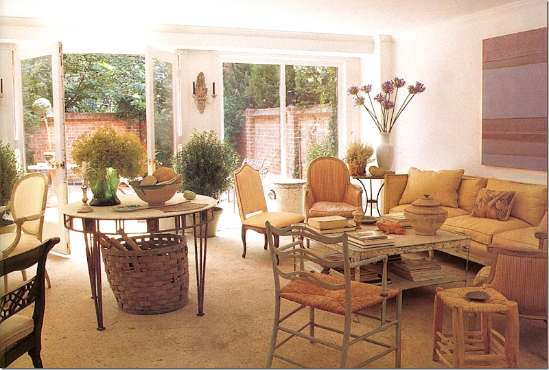
A terrace room from an early Randolph design shows the center table used even way back then! Bare floors and an assortment of leggy chairs, still a trademark of Randolph’s. While his décor today is more monochromatic, his basic style has remained the same throughout the years.
I hope you have enjoyed this view of the work of Frank Babb Randolph! I know it has made me feel better about decorating using a certain aesthetic and not having to make excuses for it.
Unfortunately, Frank Babb Randolph doesn’t have a web site. ![]()
NOTE: In Tone on Tone’s own house, Loi Thai has an Elizabeth Dax oil painting too. Her works go so good with painted Swedish antiques.
Tone on Tone HERE.
















No comments:
Post a Comment