Today we have two questions - about blinds and curtains - stemming from the post I wrote about my own curtains getting sent out to be cleaned. And yes, the pet stains came out completely. Thank you, the good people at Coit!
Question #1
The reader actually calls it a conundrum:
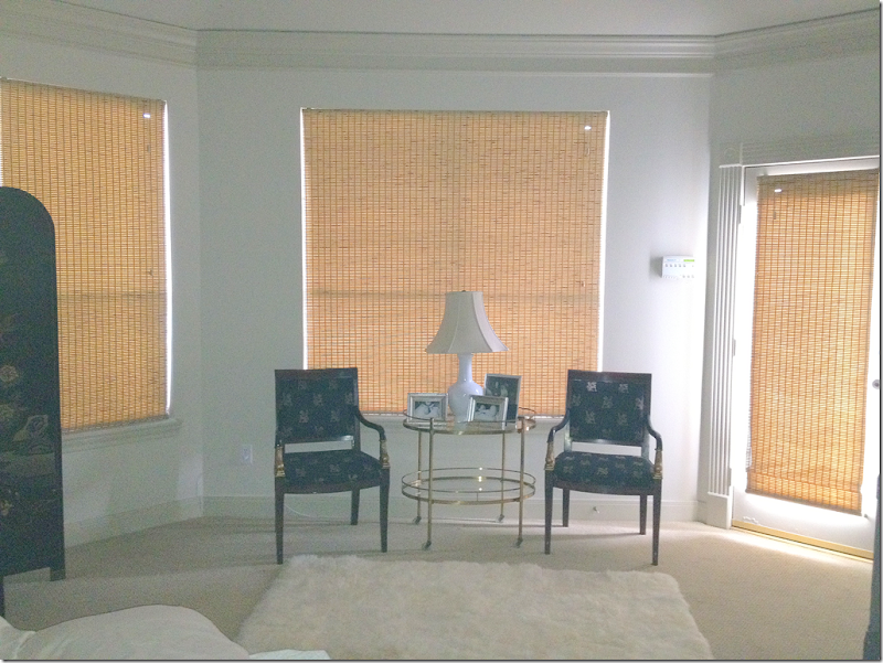
“Miss Cote de Texas, I have a conundrum for you that I hope makes it onto your blog because I have a feeling that I am not the only one dealing with, ahem, "difficult" architecture. Anyway, I am trying to pull together a plan for decorating our master bedroom, which has sat untouched for five years while we started a family. Here is my embarrassing before shot:”
“We installed the blinds soon after we moved in because we needed privacy and I could no longer live with those awful paper shades. The bamboo blinds were expensive and I am stuck with them as is (inside mounted on the windows and outside mounted on the door). Horrible, I know, but I was youngish and ignorant and received no guidance from the guy who sold them to me. Blinds or not, this marvel of architecture has got me stumped. If I could afford it, I would replace the door with a window that matches the one opposite to make this more of a proper bay. Since major construction is out of the question I need to somehow disguise this imbalance. My first thought is drapes, but how do I apply drapes here? Thank you!'’
THE ANSWER:
Well, this is a hard one. First, this is an elongated bay window, except there’s a door on the right, instead of a window, that throws off the balance. This should probably be a story about builders who, with no architectural experience, should not be designing houses! This is really a problem seen around the country – even in the most expensive of neighborhoods. Builders are not architects and this is why our Reader has this confounding problem. An architect would never have designed a bay window like this!
The homeowner is well aware of the structural problem here. Instead of the door, there should be another window on the right to balance out this “bay window.” And, additionally, the windows should be wider, with less wall space between them, and they should be trimmed in molding.
Reader: have you gotten a quote for the construction cost of replacing the door with window? I wouldn’t think it would be that major of a job nor that expensive. If I were you, I would have someone quote me a price before I proceeded.
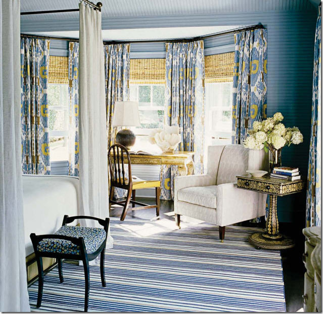
Example: This client had a similar wide bay window that I dressed with curtains hung to the crown molding and blinds hung right under the curtain rod. This way, the three windows look connected. This solution would be the ideal one for the reader. In a perfect world, she should take down the door and replace it with a window which is the same size as the window on the far left. But, this is out of question, expensive wise. So, what should she do?
Since she ordered her blinds to sit inside the windows, one thing she should do – regardless of anything else - is to add molding to the windows. This would frame the blinds and make the “dead space” between the windows and the crown molding smaller. Look at this picture:
Originally I pointed out that the curtain panels should have been placed within each window. But as several readers said – and they are correct – the molding is so attractive, why cover it up? The reader could add trim that matches the trim around the door and hang the rod above the window. The “dead space” between the window and the crown molding would be much smaller with the molding around the windows.
Another problem the reader has is the disparity between colors – the yellow in the blinds is sticking out like a sore thumb on the white walls.
Example: To solve this problem I would do what I did with this client: I would pick out a fabric for the curtains that plays up the color in the blinds and then pick a wall color that ties it all together. Here you can see, the brown blinds contrast with the aqua curtains and the aqua walls tie it all together – making the windows an asset to this family room.
Example: And here too, for this client, the curtains tie in with the dark shades and the paint color, creating a thought out design.
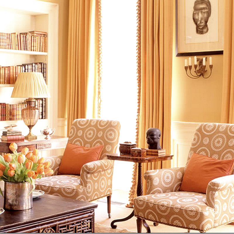
Here, from a magazine, these shades are not pulled up to the rod, but the dead space is somewhat camouflaged by the papered walls that match the curtains, which match the shades – tying it all in together.
Plan #1:
If this was my bedroom, this is what I would do, after I added molding to the window frames:
1. Since replacing the door with a window is out of the question – I would get one long rod that hangs above all three “windows.”
2. The rod would be hung, right under the crown molding.
3. I would pick a print fabric that coordinates with the color of the blinds and then get bedding that blends with the curtains.
4. I would paint the walls to tie it all in together, thus helping to camouflage the dead space between the rod and the windows.
5. Then, I would hang panels – double width, lined and interlined with blackout lining.
6. Be sure to order the curtains pleat free. Ask for – no ironed in pleats – this will make them look fuller and give them more movement. This is especially important if your curtains are silk!
Plan #2:
If you don’t have the courage to do your curtains as in Plan #1. I would then go with this plan:
1. Hang 2 curtain rods above each window, right under the crown molding. The door will just be left undraped.
2. Pick out a fabric that coordinates with the color of the blinds, then blend it in with bedding fabrics.
3. Paint the walls to tie it all together and to camouflage the dead space between the rod and the curtains.
4. Hang curtain panels over both windows – 1 1/2 width, lined and interlined with blackout lining.
5. Be sure to order the curtains to be pleat free. No ironed in pleats.
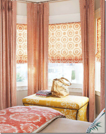
In the end, this is what you want to avoid: a tall, obvious dead space. This design makes the windows look short and squat instead of tall and elegant. If the walls were a deeper shade or more of a coral tone, the dead space wouldn’t be as noticeable. But, these shades should have been hung right under the rod, eliminating the dead space altogether. And, notice there is no lining. The light shining through makes the fabric look flimsy and cheap (which I’m sure it isn’t.) Unlined curtains are fine for open weave linens and burlap. But for silks, dark and patterned fabrics – always use a lining and interlining. I use a blackout lining which blocks the sun, allowing you to see the fabric. And again, notice here the curtains are only one width – making them look skimpy. The fabric here should be fuller – either double or at the least 1 1/2 widths. And finally, the ironed in pleats makes these panels look like stiff columns. Notice the panel on the right – it looks so thin and mishapen. This window treatment could have been beautiful – if just a few tweaks to the design were made.
Reader: Follow those guidelines above. Make your choice between Plan 1 or 2. Plan 2 would certainly be less expensive, but I do think Plan 1 would be more attractive. Send in a picture when you are through with the project!
And readers, if you have a better idea for this “conundrum” – please tell us in the comment section what you would advise. I’m truly interested in hearing a better idea than I came up with!!!
Question #2
This one I have been asked so many times, I can’t even count:
“Miss Cote de Texas: Can you please tell me where you bought the rod hardware for your draperies in your family room?
Was the hardware professionally installed?”
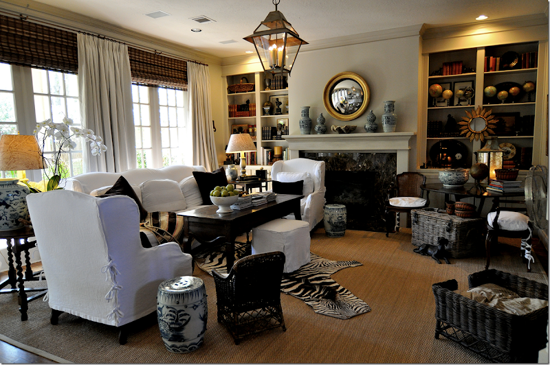
Most of the rods I order for clients come from The Antique Drapery Rod Company. I’ve found they are very, very reasonable and I like the quality. In my own house, I used the 5/8” round rod in the Antique Bronze finish paired with the smallest of rings.
And yes, my curtains are all hung professionally. I use Monica of Custom Creations by Monica. She measures for my curtains, blinds, bedding, pillows, etc. She places the order with the workman, and she hires the installer, Mr. Bennie Davis, hanger extraordinaire, and artist! He has a web site HERE. Monica’s web site is HERE. In all my years in business, I have never done a job without these two! Monica is available for out of state jobs also.
If you have a design question, send it in email to me at mrballbox329@aol.com
If I think it would be of interest to the readers, I’ll answer it on the blog. If it’s a more personal question, I’ll answer in email.
As always, thank you so very much for your support!












No comments:
Post a Comment