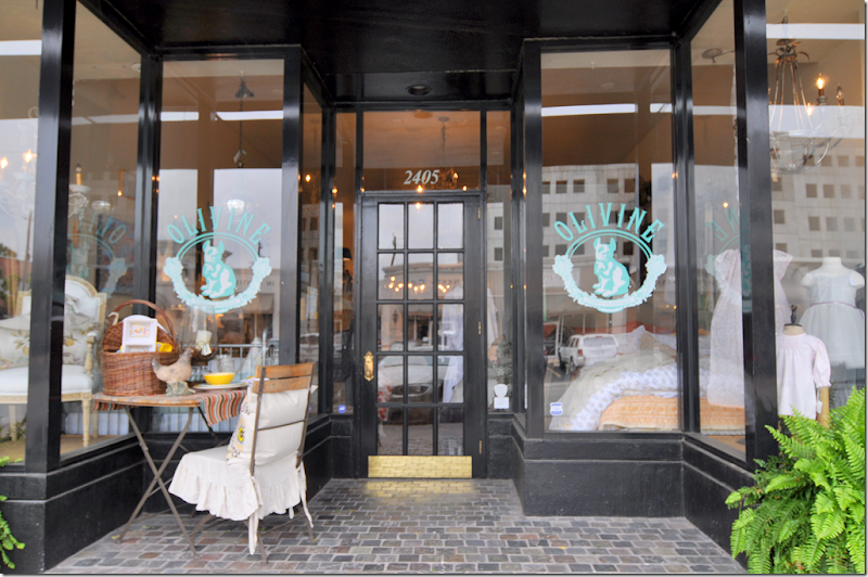
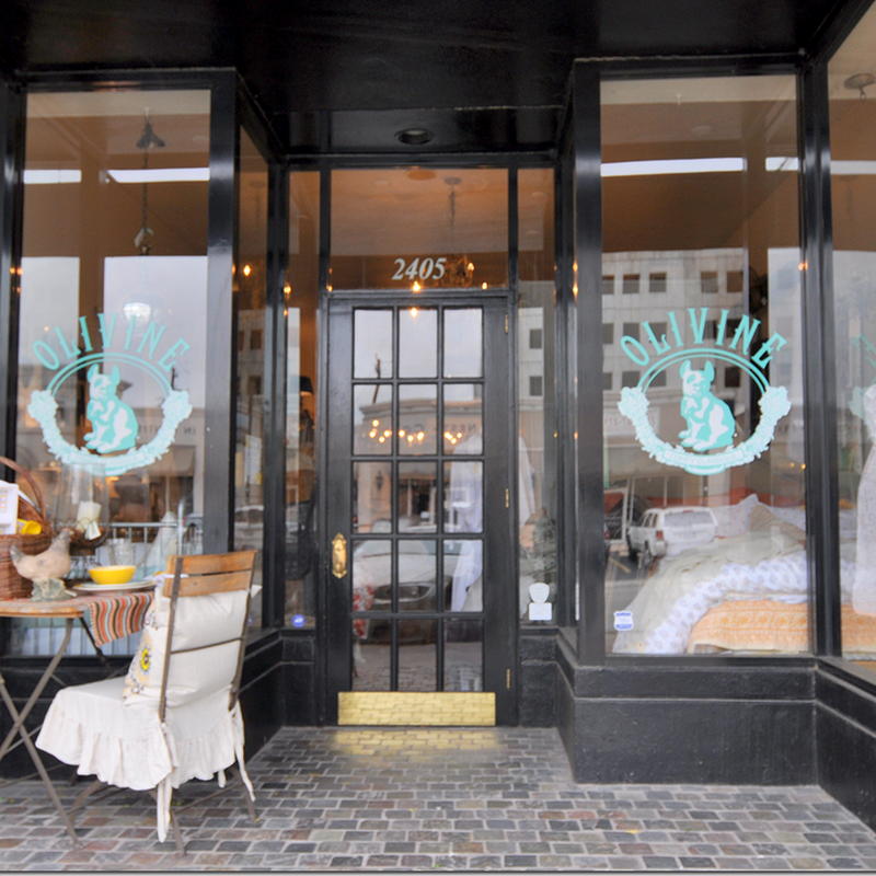
Olivine’s old fashioned storefront
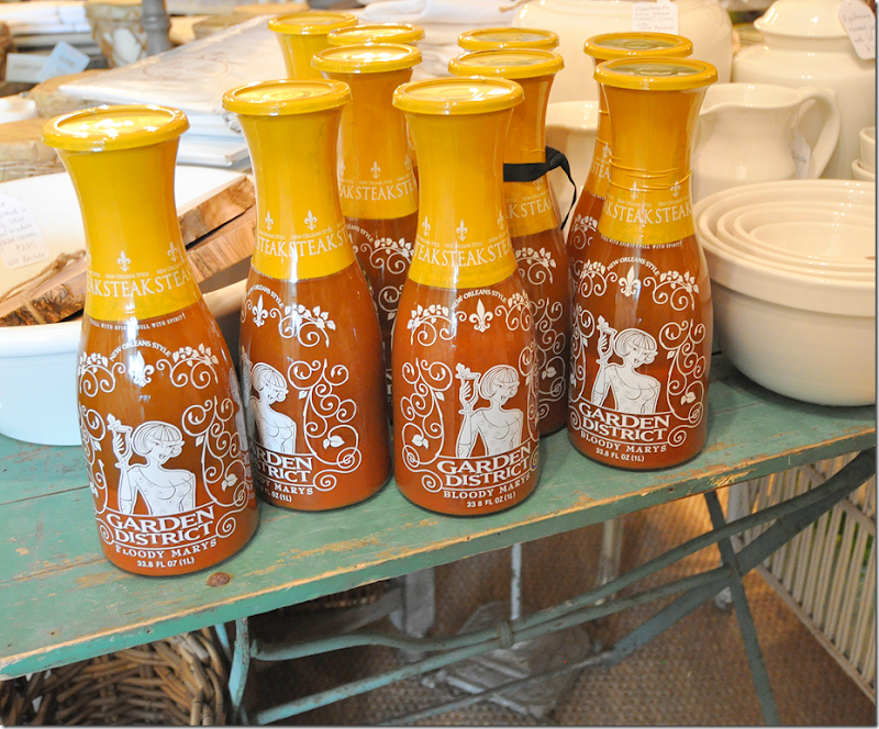
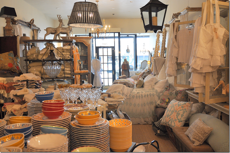
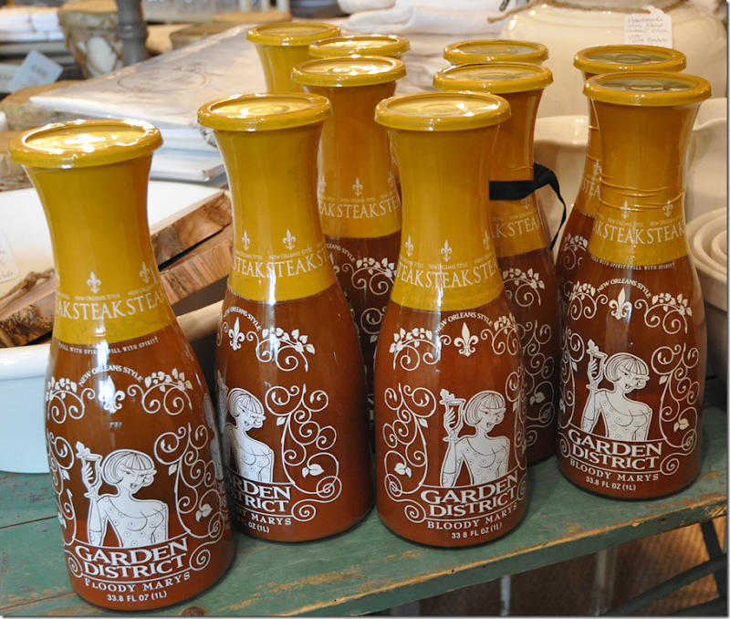
I stopped by Olivine the other day looking for accessories and lamps for a client. I love Olivine – with its overflowing and layered displays. You have to go around the store two or three times just to see everything – so much merchandise is hiding about. I found some great sconces from Aidan Gray and a white female bust for my client – along with tiny glasses in rattan shelves just for me! And, not stopping after a few glasses, I bought some new candles too. But… what really caught my eye was a big display of Bloody Mary mix! WHAT????
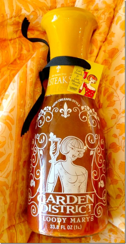
The mix is called Garden District Bloody Marys and it’s been gaining fame after it was recently featured on Marlo Thomas’ Huffington Post blog HERE. It’s such a great story about how the mix came to be. Naturally, it features a flamboyant Great Aunt Gladys from New Orleans whose mix was quite popular in the Garden District. Fast forward several decades and Aunt Gladys's great niece Stephanie Sonoja found herself out of work after toiling away in the advertising and marketing business. Her mother had somehow finagled from Aunt Gladys the super secret recipe with its 21 ingredients. The long trip from idea to grocers shelves took several years. Stephanie learned that there are 8 ingredients in a Bloody Mary mix that when mixed with vodka causes it to burn and turn bitter. Once Stephanie’s chemist was able to overcome that hurdle (Garden District Bloody Marys is one of the few mixes that does NOT turn bitter!) the next roadblock came from the bottler. A large order from Costco had to be turned down when the bottler wanted to put the mix in a typical decanter. Of course, the marketer Stephanie had other ideas. In the end, she designed a beautiful carafe for the mix that is as useful empty as full. It even has a illustration of the infamous Great Aunt Gladys.
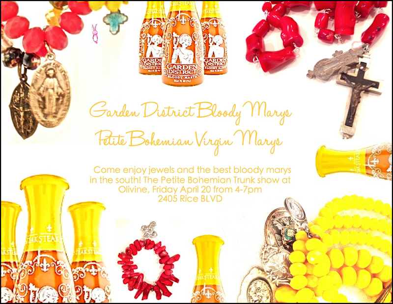
Since Olivine’s owner, Helen, is from Louisiana, she was naturally drawn to the mix, which she drinks while visiting her restored historic Galveston house. What a perfect place to drink Bloody Marys since the architecture of Galveston’s historical districts is so similar to New Orleans's Garden District. AND being such a huge fan, this Friday, the 20th, Helen is hosting a party at Olivine to introduce the mix to Houston. The event is open to the public, so please drop by for a taste of what is promised to be the best Bloody Mary you will ever have!! Along with the Bloody Mary mix, Olivine is also hosting a trunk show for Petite Bohemians jewelry.
The invite to the party this Friday!
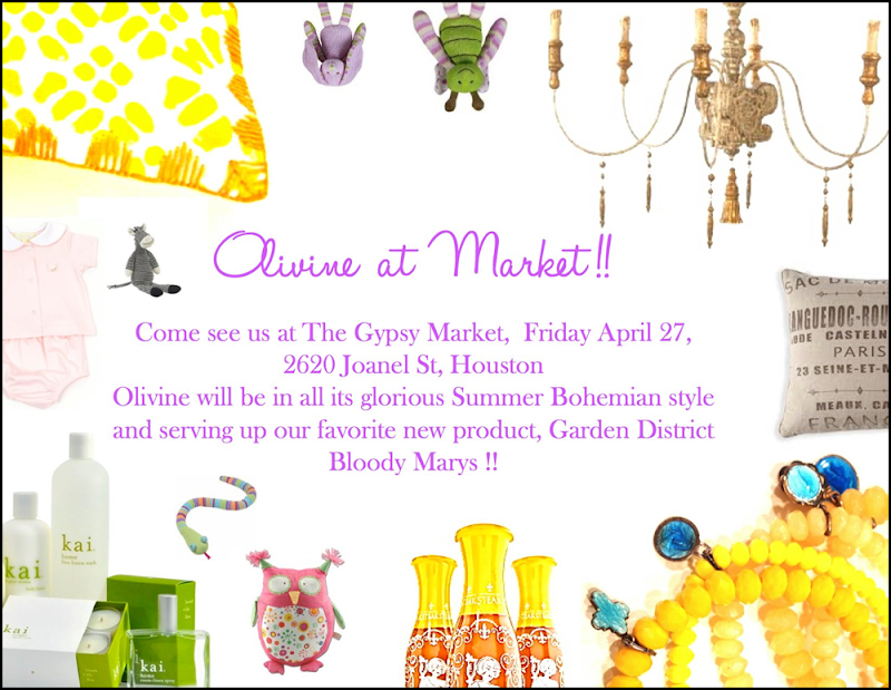
Now, if you can’t make it to Olivine, Garden District Bloody Marys and Petite Bohemian jewels will also be at the Gypsy Market the following Friday, April 27th. The Gypsy Market is Houston’s newest antique/decor market hosted by 2620 at 2620 Joanel. Ideally, you should probably make it to both events. Go Houston!
And here is the invite for the Gypsy Market at 2620 Joanel – NEXT Friday, April 27.
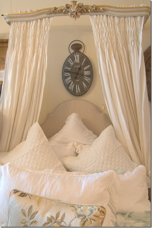
Of course, I want to show a few of my favorites in store right now at Olivine. They have so many headboards and these great coronas. Some are old and some are new. Too cute!
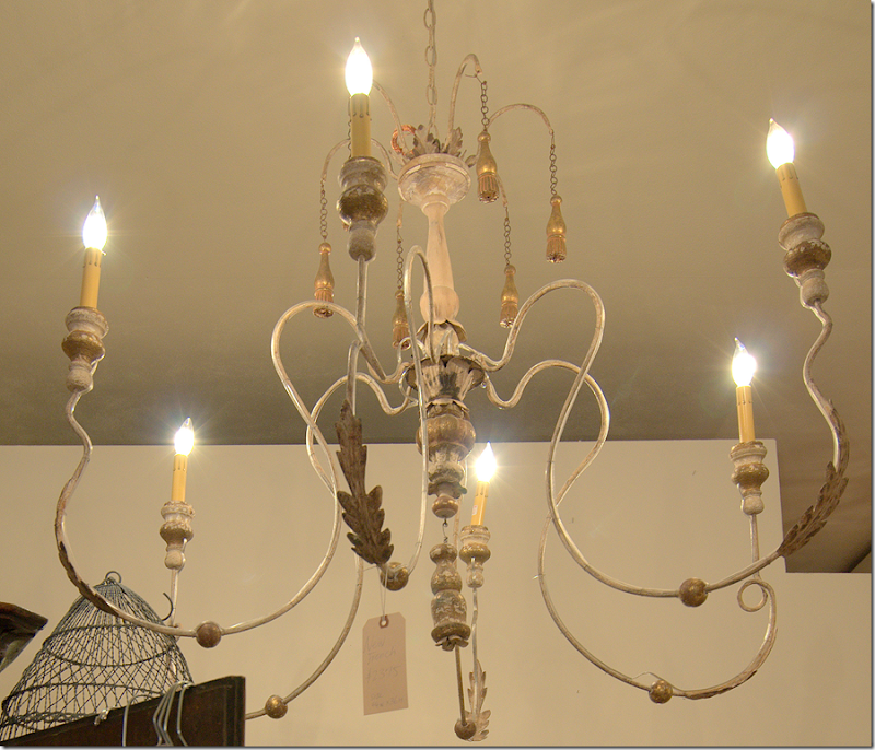
Great chandeliers – like this Italian style that is so popular right now.
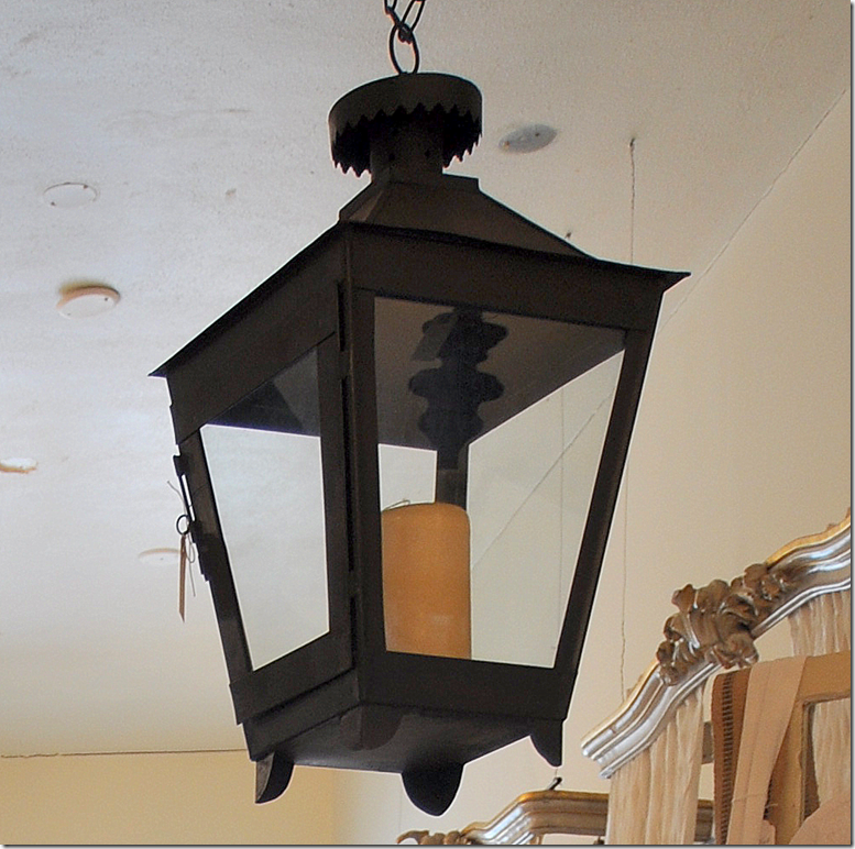
These lanterns are great for the tabletop or outside. BUT BUT BUT – if I were looking for an electric lantern, I would buy this for under $300, and take it to a lamp man and have him electrify it. For under $500 – you could have a fabulous lantern. And if you didn’t want it black – paint it! This is a great buy.
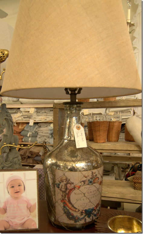
I liked this pair of lamps.
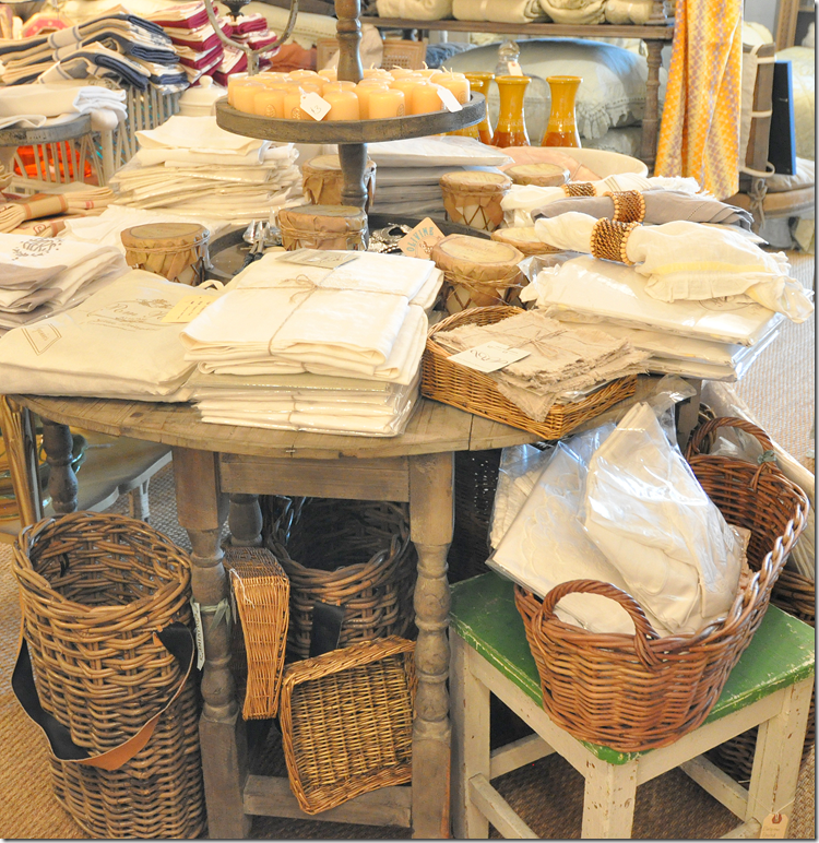
This gray gate leg table would be great in an entry hall piled with books, or as an end table next to a sofa. It would also make a cute high coffee table.
There is so much to see – this isn’t even 1/2 of the store!!
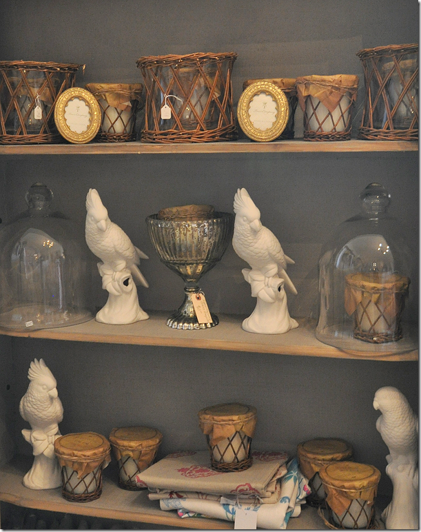
Cloches and birds and rattan wrapped candles.
Vintage kidney styled dressing table. I wish I was doing a bedroom now.
I bought the prettiest angel there awhile ago. Now, she has a Joseph in stock. At least I THINK this is Joseph!
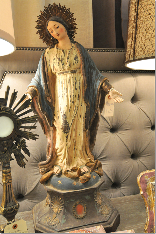
And the prettiest Madonna. Look at the base and her crown.
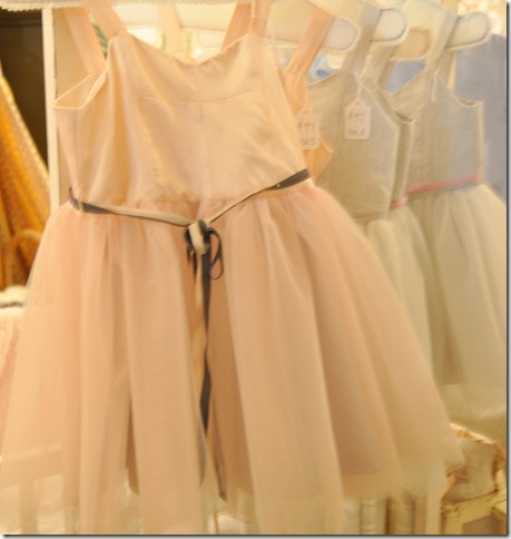
I wish my baby was still a baby! This tulle and silk dress in blush pink is to die for. It also comes in blue.
NOW, don’t forget to join Helen at Olivine for a taste of Garden District Bloody Marys this Friday, from 4 to 7 pm at 2405 Rice Boulevard. For more information, see Olivine’s web site HERE.
Leon Max in England by Henrietta Spencer Churchill. Minimalist? NEVER!!
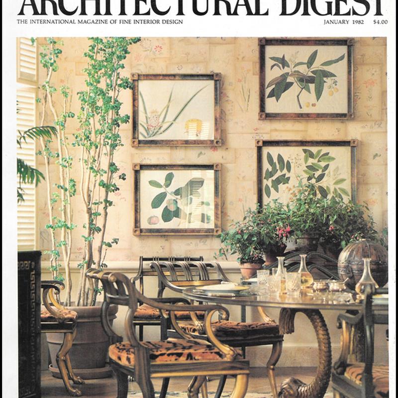
A little news from the publishing world. Have you seen the new May issue of Architectural Digest? What is going on with this magazine? It keeps getting better and better and better. Margaret Russell has really turned this once tired publication around and made it so elegant with the most outstanding houses and photography. The pictures are big and clear – no more small, boring pics. Russell is a genius. If you have ever doubted the importance of the Editor in Chief – the new Architectural Digest should settle it for you. There is a world of difference between the last editor and Margaret and boy, does it ever show.
The master bedroom sitting room at Easton Neston! Must be nice. Notice the desk with the attached clock. Photography by Oberto Gili – a master with the camera. His own recent book is gorgeous HERE.
This month’s Architectural Digest issue is called “Grand Tour – Ravishing Homes Around the World.” If you are a minimalist, don’t bother. The interiors are filled with clutter and antiques of the best kind. The cover story – Easton Neston by Mitchell Owens is drop dead gorgeous. OMG! Talk about just bring a toothbrush and move in, I’m ready!!! I loved this sentence from Leon Max, the owner of Easton Neston: “All the tables should be old and the chairs should be new if one can help it.” Spoken like a man. Men HATE antique chairs because man is so much bigger today than man was a few hundred years ago. (Which is so weird when you think about it. Why are we so much bigger today? I mean, I know why I am bigger – too much candy and cheeseburgers, but why is man – the species – so much taller than man was just a century ago?)
Interior designer May Daouk’s Beirut Villa – photography by Simon Watson. Notice the console on the left piled high with blue and white porcelains.
There are EIGHT houses featured this month. EIGHT. When was the last time you saw a magazine that featured EIGHT houses? The funniest thing is at first I counted seven and thought that was incredible. But I went back and recounted and was stunned to discover it was EIGHT! Now, if only they would change the font, I’d never say a bitchy word about AD again.
Timothy Whealon in Monte Carlo. Simon Watson.
And on top of all this – there is a new AD web site with huge photographs. Hear that House Beautiful? Vogue and Architectural Digest (both Conde Nast) have finally embraced the digital age and have given us these beautiful images online. Thank you!
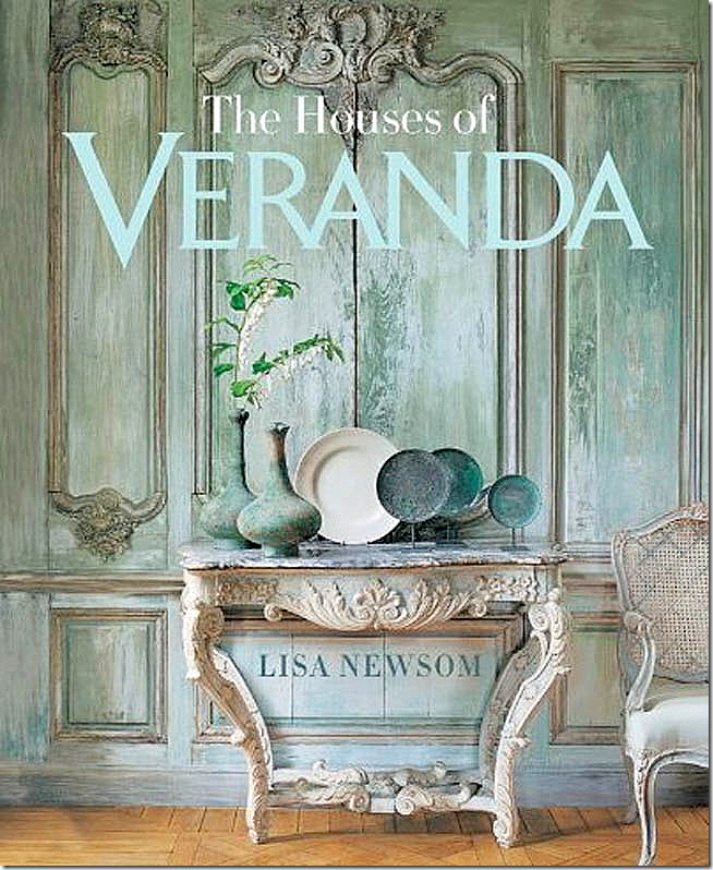
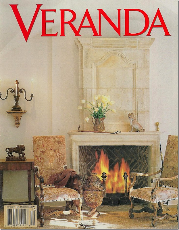
And finally, I received the best package in my mail yesterday. From Amazon. The new book by Lisa Newsom: THE HOUSES OF VERANDA.
Pick me up off the floor, I’ve died and gone to heaven. Drool is collecting on my chin. My eyes are in bugged out so far they may never recover. I look like I have Graves disease.
OK – people, listen. I’ve told you about some of my favorite books this year – Phoebe Howard’s and Segreto’s – both gorgeous. AND now, add a third one to the list. If you like Veranda, get this book. That’s all I will say. RUN. There’s nothing really new here. It’s all your favorite houses from past issues. But that’s the point, isn’t it? To have all your FAVORITE Veranda houses together in one HUGE book – with extra large photographs, without all the writing over the pictures like it happens in the magazine. Just clean, huge, beautiful photographs of your favorite houses.
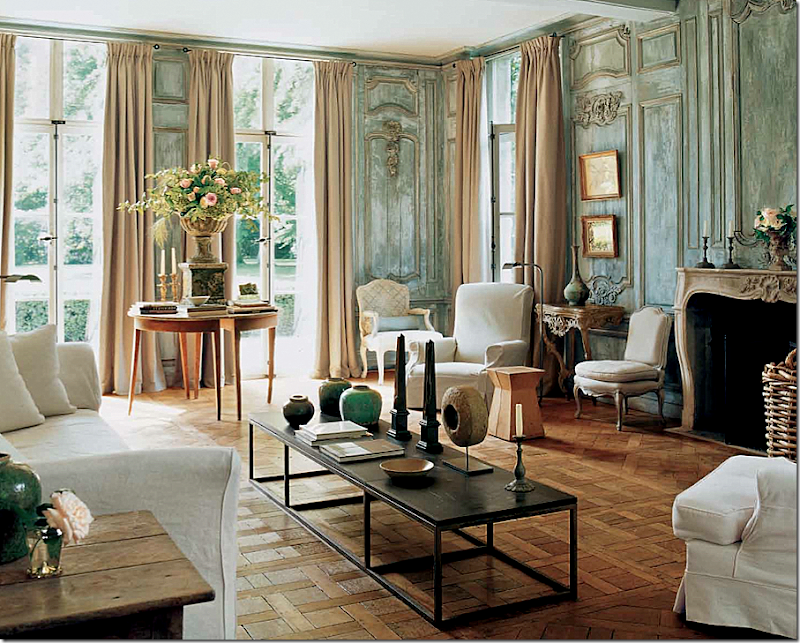
Like this. The most beloved cover story ever – it is the cover of the book and the first house featured. This house is the home of clothier Edourard Vermeulen. From Belgian (naturally) – it is a stunner. I’ve always loved that urn filled with roses. And that table – so hot right now in America, but this house was designed years ago.
The photographs are so much bigger than they are in the magazine! I LOVE IT!!!!!!!!!!! Each house featured – almost each single house in the book was a favorite of mine. Did I edit this book? I was wondering??? Ha! Seriously, Newsom picked out each house that I myself would have picked out for the book. There are tons of houses, 30 in all, and I think there were only two that weren’t absolute favorites over the years. And even those are beautiful.
The next house is a classic by Dan Carithers (my favorite of all his houses – well one of them!) I’ve always loved the curve of the sconce – it looks like sculpture.
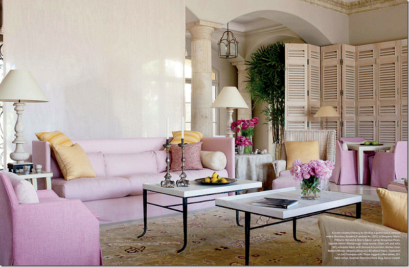
The next is a house by John Saladino. Oh my. And on and on it goes. It’s a feast for the eyes.
You can throw out all those dog eared, yellowing and torn clips from Veranda. It’s all here in one place now – in this book. Some of the pictures were fresh again – it had been a long time since I’d seen them. Others were more well known. A real bonus - there are two gorgeous houses by the Houston great Babs Watkins, including the first house I saw of hers that made me fall hopelessly in love with her aesthetic. Such great memories. And that is what this book represents – memories. Memories of falling in love with design and designers. Remembering the first time you saw Bobby McAlpine’s work. Or those gorgeous aqua beach houses. A reader emailed me saying “I wish you lived here so we could sit and look at the book together.” Yes – I understand what she meant. If you do too – this is the book for you.
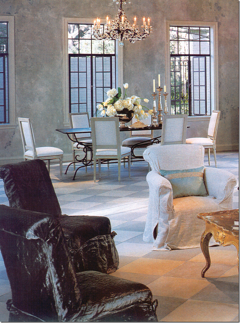
Babs Watkins – the first house of hers that I had seen – Love at First Sight!
My only complaint? At 288 pages, it’s still not enough. Do it again, Lisa, come on, one more please!!! Volume II.
AND hint, hint, someone at Southern Living should do the same thing with all the great Southern Accents houses. If that would only happen….
Order the book from Amazon HERE!







No comments:
Post a Comment